The Diary game | Progress in Power Bi Dashboard | 1/11/2024

Date: November 1, 2024
Mood: Excited and Curious 🎬📊
Morning: Planning the Dashboard ☀️
Today, I decided to dive into a fun data analysis project: creating a dashboard for Prime Video content using Power BI. I've been working on enhancing my Power BI skills lately, so I thought, why not apply them to something I enjoy—movies and TV shows! This would be a great way to practice while analyzing a dataset I'm genuinely curious about.
I began by organizing my data. The dataset had some interesting attributes like total titles, ratings, genres, directors, and even release years. Seeing the entire scope of Prime Video’s library at a glance would be both challenging and rewarding.
Afternoon: Building the Dashboard 💻
I jumped into Power BI, imported the data, and started designing. Here’s what I managed to create:
1. Title and Rating Overview
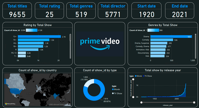
I started with the basics—displaying the total number of titles, ratings, genres, and directors. It turns out, Prime Video has 9,655 titles, classified across 25 rating categories, spanning 519 genres, and involving 5,771 directors! Seeing these numbers laid out was impressive; it’s clear just how diverse and expansive Prime Video's content is.
2. Rating Breakdown
Next, I created a bar chart to display the distribution of ratings. The dataset had categories like "13+", "16+", "ALL," "18+", and so on. The 13+ category had the most shows, followed closely by 16+. It’s interesting how much content is geared toward teenage and adult audiences. This insight might reflect the popularity of genres suitable for these age groups on streaming platforms.
3. Genre Analysis
I wanted to see what genres were most common, so I visualized the genres by the total count of shows. Unsurprisingly, Drama led the way with 986 titles, followed by Comedy and combinations like Drama, Suspense. It’s fascinating how much people love drama—whether it's comedy-drama or suspense-drama. This chart alone gave a glimpse into viewer preferences and Prime Video's focus on popular genres.
4. Show Count by Country
I added a map to see the distribution of content across regions. North America and parts of Europe had the most content, which makes sense since these regions are significant markets for streaming. As a visual element, this map brought a geographical dimension to my analysis, and it was fun to see where content is focused around the world.
5. Content Type Distribution
A pie chart showed the distribution between Movies and TV Shows. Movies made up only 19.18% of the content, while TV Shows dominated with 80.82%! This distribution points to a strong emphasis on series—probably due to viewer engagement with binge-watching, which is easier with series than with standalone movies.
6. Release Year Trend
Finally, I plotted the number of shows released each year over time. It was fascinating to see the sharp growth in recent years, particularly post-2000s. It’s amazing how streaming has accelerated content production in recent decades. This graph alone shows how the demand for online content has skyrocketed.
Thank you for reading my diary game.
Hello @ahsaniqbal24
We're so delighted that you made a post in our community. Thank you for your valuable contribution. We have carefully reviewed your entry and are excited to share our feedback. Below, you will find the detailed results of our assessment. 🙂
Great work on your Power BI dashboard. It is impressive how you combined data analysis with your passion for movies and TV shows. The insights you’ve shared especially the genre breakdown and release year trends are fascinating and show how streaming content has evolved over time. Keep up the amazing work, and I’m looking forward to seeing more of your data projects.
Best Regards
ammar2021
Thank you ammar.