Effective Trading Strategy using Line Charts ]-Steemit Crypto Academy | S6W1 | Homework Post for @dilchamo
It is such a great feeling to finally get going in this new season. I believe the experience with Prof @dilchamo and the whole @steemitcryptoacademy will be worthwhile as usual. I will go ahead to give the input for my assignment below.
Define Line charts in your own words and Identify the uses of Line charts.
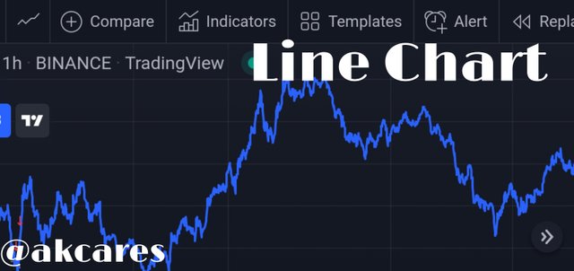
Line chart is a form of represent the dynamics of an asset by graphically showing the performance of an asset in terms of price value over a period of time using a single continous line that links a serious of closing price points.
A line chart is developed using just the closing price of an asset. This chart is evolved from the theory of Charles Henry Dow, the American who was the co-founder of the Wall Street Journal.
His theory holds that it is better to have a streamlined analysis of an asset based solely in the closing price.
Accordingly unlike some other types of charts used to represent cryptocurrencies, the line chart does not take into consideration all the other price points like the open, the high or the low. This is a simplified two directional chart patterns that precludes noise and complexities.
Line charts have a number of uses. Generally, they can be used to show the performance of any financial asset over time.
Specifically, due to some of its unique features this chart type is more suited and fitted for some uses. Some of these uses include:
- Showing Price Behavior *
The chart is used to show what is happening to the asset in terms of its value. By the rise and fall of the chart line, it is quite easy to tell if an asset is doing well or poorly, if there is great demand for the asset or traders are taking their profits and selling off the asset.
- Obtaining Trading Signal
A careful study and understanding of the line chart helps traders to be able to identify points to open trade positions. This is particularly effective when combined with other technical analysis tools. Line charts offer straight forward trading information.
- Demarcation of Key Zones of Support and Resistance
A line chart is very useful in marking out areas where the price tends to stall and reverses with while increasing upwards in form of resistance or when decreasing downwards in form of support. Using a line chart, a trader can easy identify support and resistance levels which constitutes key data when undertaking technical analysis.
- Tracing of Market Trends
Line charts are very useful in determining what trend the market is on at any particular time period. Since, the chart is very clear and visible, traders can tell where the price is going just by looking at the chart.
- Data Collection
Line chart provides vital data and critical information that traders require to base their trading decisions. The chart presents relevant time and price information.
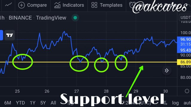
How to Identify Support and Resistance levels using Line Charts (Demonstrate with screenshots)
One of the uses of line chart as listed above is to demarcate support and resistance levels. This can be easily done because of how direct and plain this chart it.
A lot of trading decisions and analysis make reference to these zones. At these zones critical market moves are made. For there to be a support or resistance, it means that a what lot of activities are taking place at the point and there are lots of market orders placed.
These market orders are huge and as such have the potential power to either bounce, reject and reverse the price or breach the zone and break the opposition force depending on which set of traders are exerting more force.
Support Level
This is usually found in a downtrend when the price of an asset plummets and loses value. This is the point where buyers step in to halt the dip by placing a lot of buy orders to keep the price from falling further down. When this happens, once the price gets to this point, it reverses upward.
Sometimes, this is not the case when the selling pressures exceeds the buying pressures and the price drops below this zone. Most times when support level is invalidated, it transforms to become a resistance level.
Resistance Level
Resistance level shows a rally by sellers to bring down the price of asset after it has been pushed up by buyers. This is usually found in an uptrend when price has been gradually going up. At this point, sellers pills up heavy sell orders so as to lead to excess supply and decrease the price of the asset. It
As price approaches this point, it begins to be pushed back down by the selling forces and it begins to fall back down. However, in some cases, the sellers' rally is not strong enough to oppose the buyers and halt the price rise.
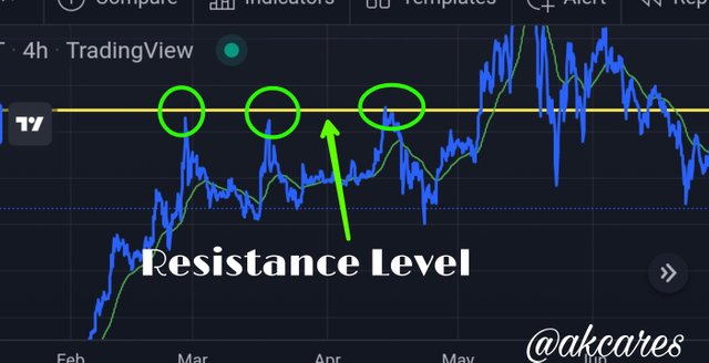
In this case the price climbs above this point and breaches the resistance level. Most times when this happens, the resistance level then turns to a support level.
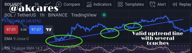
For support or resistance level to be recognized as valid, there has to be at least 3 touches and bounces of the price at that level. This means the price must have reversed on reaching either the support level or the resistance level on three different occasions.
Differentiate between line charts and Candlestick charts.( Demonstrate with screenshots)
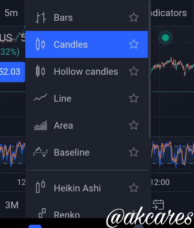
To represent crypto currencies graphically, there are a number of different chart patterns that can be used. Some of these chart patterns include:
- Renko Chart
- Japanese Candlesticks Chart
- Heikin Aishin Chart
- Kagi Chart
- Bar Chart
Line chart has a number of differences from these other charts as well as some similarities. I will now go ahead to state the particular differences of the line chart and the Japanese candlestick chart
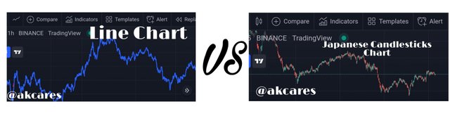
| LINE CHART | JAPANESE CANDLESTICKS CHART |
|---|---|
| It is better suited for higher timeframe trading. | I favours short term trading regime. |
| It uses only the close to produce the chart. | More data sets are use including the open, close, high, low and even the shadows or wick. |
| It does have have a collection of different information | It represent a wide range of information. |
| It is less complex and very simple to interpret | The series of information makes it more complex and technical to read |
| It is well fitted for beginners and amateur traders | It requires greater experience and skills in interpreting and applying. Not very convenient for novice. |
| There is no differentiation or demarcation of the information. Minor details are not represented on the chart. | There is a level of grouping and differentiation of the data presented. Greater details are incorporated into the chart. |
These are some the areas where the line chart is in disparity with the Japanese candlestick chart.
Explain the other Suitable indicators that can be used with Line charts.(Demonstrate with screenshots)
Generally, it is agreed by most people that other technical analysis tools need to and combined with information from price action so as the increase the winning probability of a trade by getting more confluences and confirmations.
Line chart just like other charts can be conveniently analysed with technical indicators.
Some of these technical indicators include:
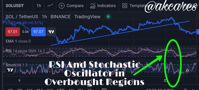
This indicator is useful in signaling potential trend reversal and retracement. It has a region of overbought and oversold. Once price enters this regions, there is high tendencies that it is going to start moving in the opposite direction.
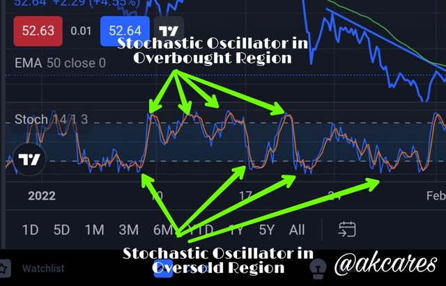
Accordingly, when the line chart is combined with this indicator, a trader can determine what the possible situation of the market will be. With this information, if a trader was on a trade before the price entered either of the zones, the he can close his positions.
Also, once the price enters these regions, it can signal for a trade to prepare to open positions in the direction that the price will now proceed in. The oversold region here begins at the 20 mark and extends below while she overbought region starts at the 80 mark and extends above.
This is another high- probability indicator. It is quite similar to the Stochastic Oscillator in its operation. This indicator also has the extreme regions of overbought above and oversold below, but generally, it is divided into the upper region, which is the overbought, middle region and the lower region, which is the oversold.
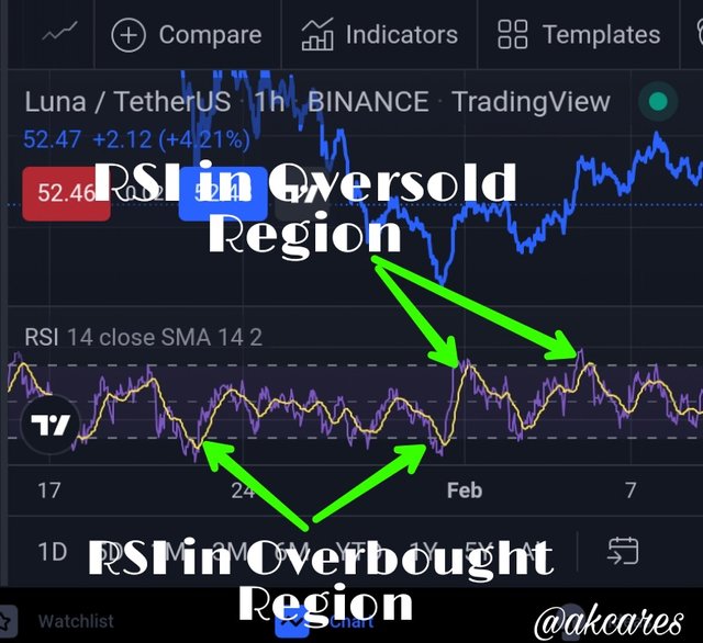
The upper region mark is from 70-100, the lower region begins from point 30-0.
When the indicator shows the price being above the 70 mark, the asset is being overbought, as such a trader should expect an impending reversal. When the indicator drops beyond the 30 mark, the asset is being oversold meaning price might soon be going up.
With this indicator, a trader can easily detect which the asset's price is likely to take an opposite turn and can either use the information to open a position or close an existing one.
Stochastic Oscillator and Relative Strength Index are mostly classified as Volatility Indicators.
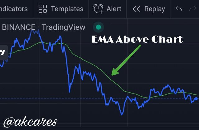
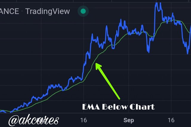
This technical indicator can also be conveniently used with the line chart. This indicator is calculated using historical price data to predict the overall direction of the trend over a certain period of time. This is a trend-based indicator unlike the other two discussed above.
This indicator can be used to tell what trend the market is on. When the indicator line is seen to be hovering over the price chart, it shows that the general trend is going down in a bearish move.
When the indicator line is seen to be under the line chart, it shows that the general trend is going up in a bullish move. The indicator can also predict if a trend is a about to reverse. This is shown by the indicator crossing over the line chart.
If the trend was a bullish one, meaning the indicator line was under the chart, then the indicator moves up towards the price chart and crosses over to the top part, this shows that that the price of the asset might soon be dropping. That is changing the trend from bullish to bearish.
Also, it the indicator line was hovering over the price chart initially, then goes down to cross over the chart and goes below, it shows that that the preceding bearish trend is turning towards the bullish direction.
These signals can be used by a trader as a guide for his trading regime.
Prove your Understanding of Bullish and Bearish Trading opportunities using Line charts. (Demonstrate with screenshots)
The cryptocurrency market is not static and it does not move in a particular direction only. From time to time, the market goes up or down in an impulsive move and then corrects itself out and takes on another impulsive move.
In any of the two directions that the market moves, a trader has great opportunities of opening positions and making profits from them. These trading opportunities can be to the upward direction or to the downward direction.
These constitutes bullish and bearish trading opportunities.
In this case I will use some technical analysis tools and indicators to show the trading opportunities. I will combine the Relative Strength Index RSI, the Stochastic Oscillator and the Exponential Moving Average EMA.
These will be used to authenticate the trendline break and retest strategy. I will use the pair of Solana and Tether US Dollar (SOL/USDT) for both trades.
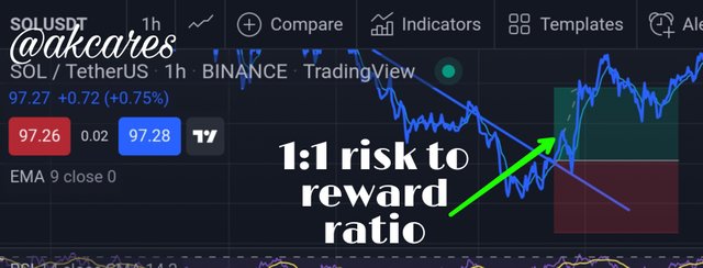
These are market situations which offers a trader profits if he opens a long position because in this case, the price is rising in an uptrend and is expected to continue rising.
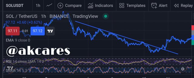
In my trade setup, there is a bearish descending trendline which is very valid because price has touched it more than two times.
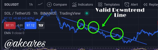
The bearish trendline is first broken by the price. The price then goes ahead to retest the trendline.
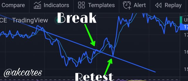
The break is my first sign that the intitial bearish trend has ended and it getting reversed.
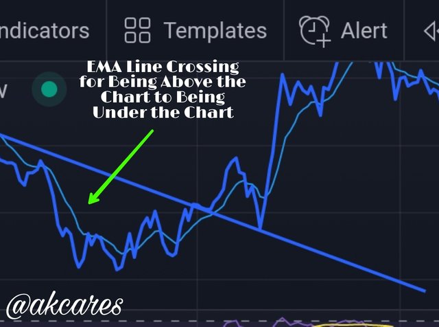
Here, the EMA line which was initial over the chart has crossed over and is now below the chart.
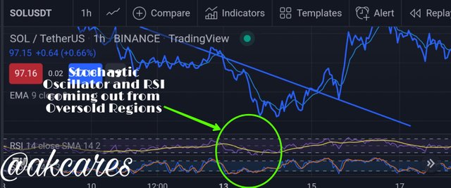
Both the Stochastic Oscillator and the Relative Strength Index indicators had just came out of oversold regions which meant a coming reversal to an uptrend.
With these conditions, It shows a clear set up for a bullish trade. As can be seen, the stop loss and take profit has been set at a 1:1 risk to reward ratio and the trade is a positive one as the price is now going upwards.
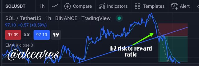
Bearish opportunities indicate market setups which offers a trader profits if he opens a short position that is a sell trade, because in this case, the price is dropping in an downtrend and is potentially going to continue falling.
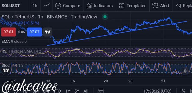
In my trade setup, there is a bullish ascending trendline which is very valid because price has touched it more than two times.
The bullish trendline is first broken by the price. The price then goes ahead to retest the trendline on two quick succession.
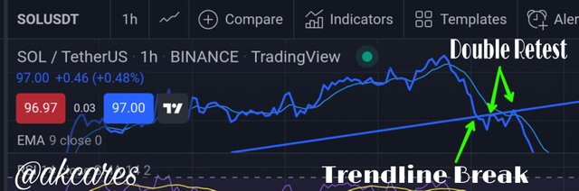
The break is my first sign that the intitial bullish trend has ended and it getting reversed.
Here, the EMA line which was initial under the chart has crossed over and is now above the chart.
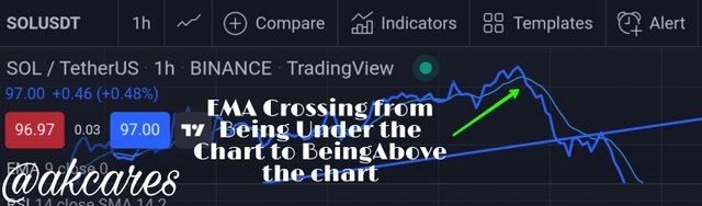
Both the Stochastic Oscillator and the Relative Strength Index indicators had just came out of overbought regions which meant a coming reversal to a downtrend.
With these conditions, It shows a clear set up for a bearish trade. As can be seen, the stop loss and take profit has been set at a ratio of 1:2 risk to reward and the trade is a positive one as the price is now going downwards.
Investigate the Advantages and Disadvantages of Line charts according to your Knowledge.
I always remember this popular saying that everything that has a merit, has a demerit. Line chart has some amazing characteristics that makes people like using it and makes it a choice of sims traders.
At the same time, it also has weaknesses and limitations which other traders avoid it and adopt other chart techniques. I will discuss a couple of these below.
- Fitting for Starters
Due to its direct and simple nature, the line chart is very useful for those starting our in cryptocurrency trading. It is less complicated and gives basic information needed in easily comprehensible form. It has a lot of simplicity.
- Easy Trend Identification
While making use of line chart, a trader does not need to apply too much analysis to be able to fins our what direction the market is moving in. Brief observation of the chart indicates which party is in control of the market at that particular time.
- Eradication of Noise
One of the strongest point that this line chart has is that because of its nature, a lot of irrelevant and distractive information has been taken out. Thus, the information presented is highly targeted and qualitative.
- Time Saving
As users do not need to go through a large chunk of information or draw several kinds of inferences, the trader is made to saved a lot of time.
- Easy Drawing of Key Levels
Marking out support and resistance zones using line chart is very easy.
- Sending Clear Signals
Users of line chart are saved the stress of having to filter through tons of data and information. The chart has a lot of clarity and less ambiguity. User will rarely get confused with this chart.
- Scanty Information
At times, a trader will need more information to guarantee trade validity. Line chart only take into consideration the close price. This leaves a lot of room for speculations and the trader cannot use the chart to carry out a holistic analysis.
- Buyers and Sellers Interaction and Pressure are Not Indicator
With the lone chart, a trader cannot tell how much pressure was exerted by the buyers and the sellers at particular time interval before the price finally closed. It does not show how high the price was pushed up and how low it was dragged down by market forces.
- Limitations of Time Frame
Line chart is best suited for long term traders. Scalpers do not find the chart to be very useful since its signals on short time intervals are comprehensive enough.
- ** Inability to Detect Volatility**
Line charts do not show sharp moves and changes. It does not give real time information about how the price is an asset is fluctuating. Highs and lows are absent
- It Does not Show Size of Market Players
The line chart has no means do showing the number or the power of market players. It does not show how strong the buying or selling forces are.
In all frankness, most of the people who come into the crytopcurrency trading space do not have idea that there are other chart patterns much less know about line chart because of the more popular chart patterns around.
But from the lessons in this academy, it can be seen there are other amazing charts that can favourably represent crypto assets and cane be used to make guide trading decisions.
The Line chart is a great option of a graphical price representation. It has great features and can be used for a number of interesting trading purposes. Careful understanding of the chart can help a trader increase his profitablity.
However, one must be conscious of some of the limitations associated with this kind of price chart and do well to add other technical analysis tools like indicators to get more confirmations before taking a trade. This has been a great lesson by Prof @dichamo Kudos!
Congratulations @akcares
This is the most positive post amongst

top 100hot posts on steemit at this moment.