crypto art + steemit cover design
Yesterday I started a new Crypto Artwork, to be honest I’ve missed spending an unjustified number of hours, focusing, only on making something beautiful under a simple set of rules.
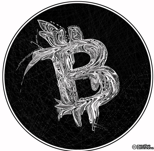
This is actually my guilty pleasure when making art. I design a set of rules to consider during the entire creative process, and after, I focus to follow it to my best ability.
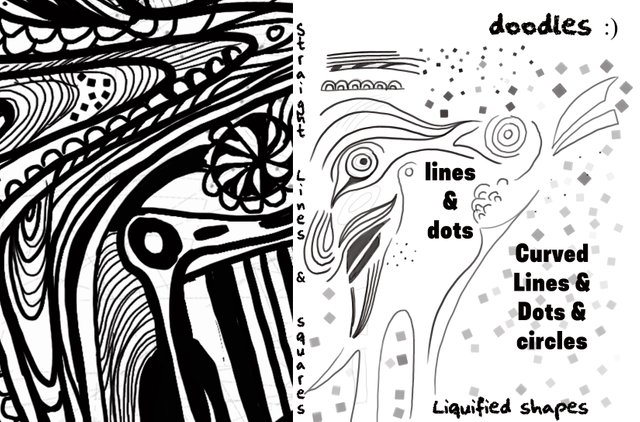
To better understand, what i mean by “set of rules”....
It is a concept guideline sketch of the idea, that ends up deciding the overall style atmosphere and subject of the artwork.
Color =>Use only black and white / negative and positive interlaps;
Subject =>Bitcoin Logo

Style/ mood => free hand drawing; doodles;
Design elements and symbols: curved lines & dots & circles; liquified shapes; straight lines & squares.
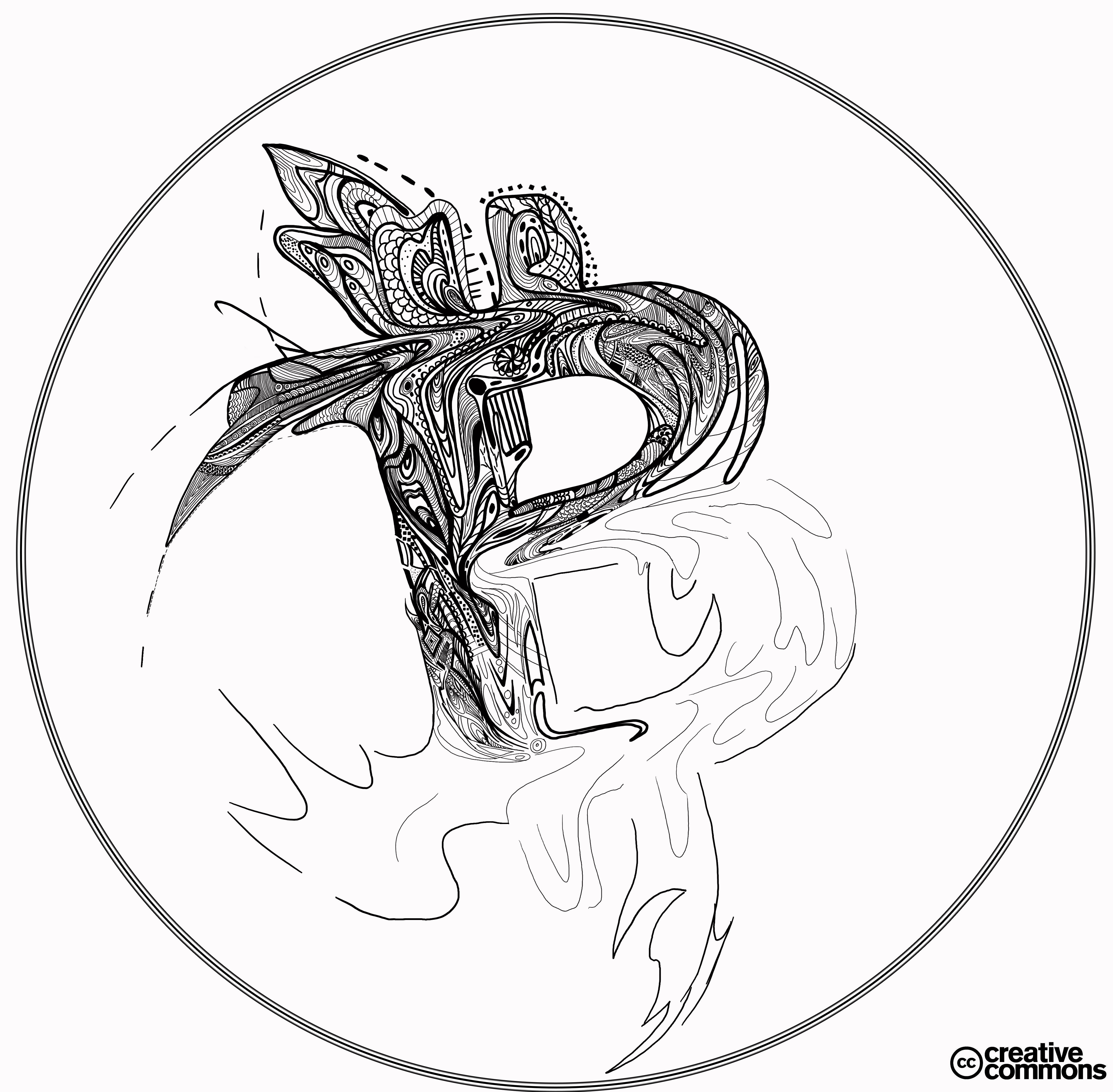
first saved work in progress
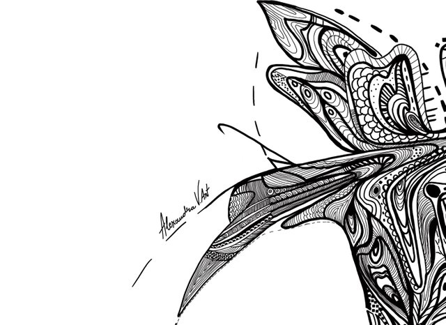
Details:
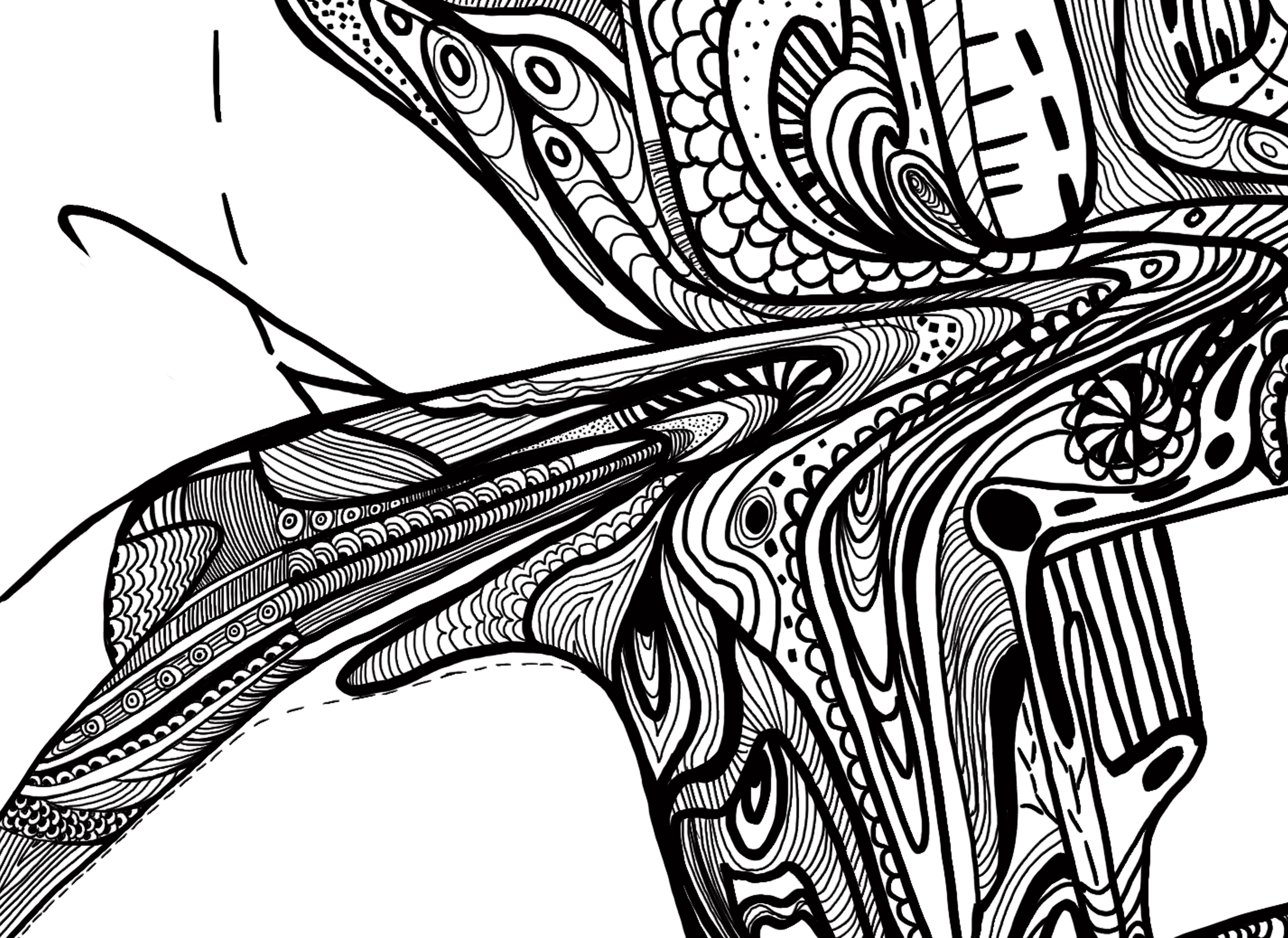
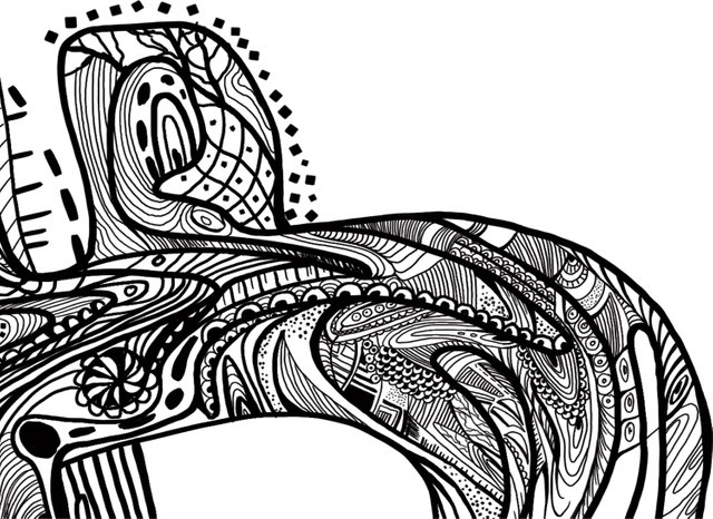
I could not decide on the final version of the artwork, so I am asking for your help with this one :P
Variations:
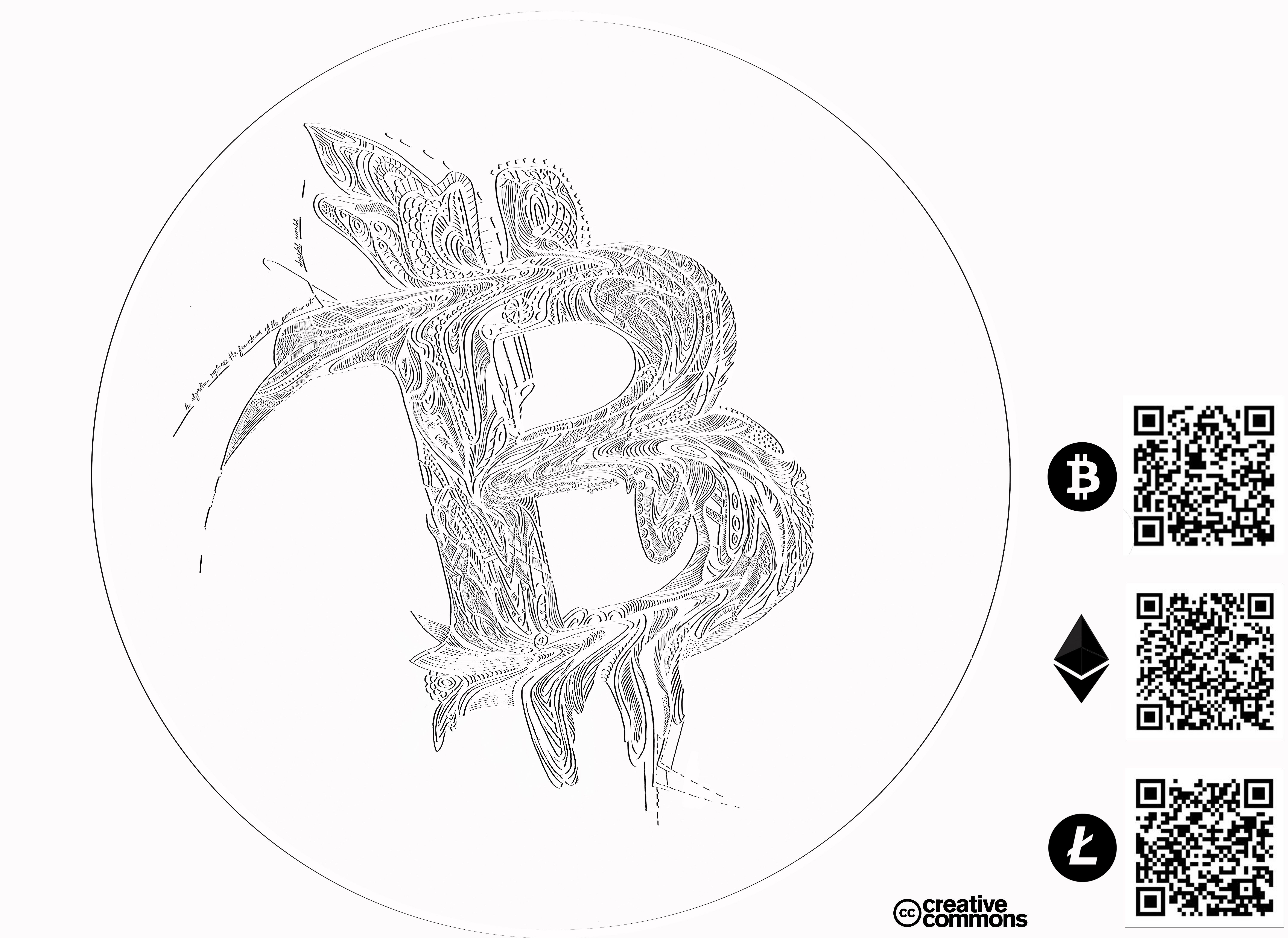
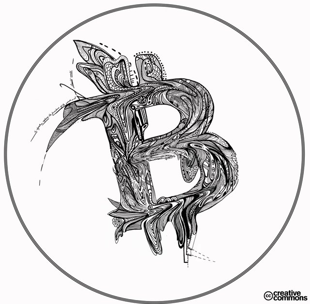
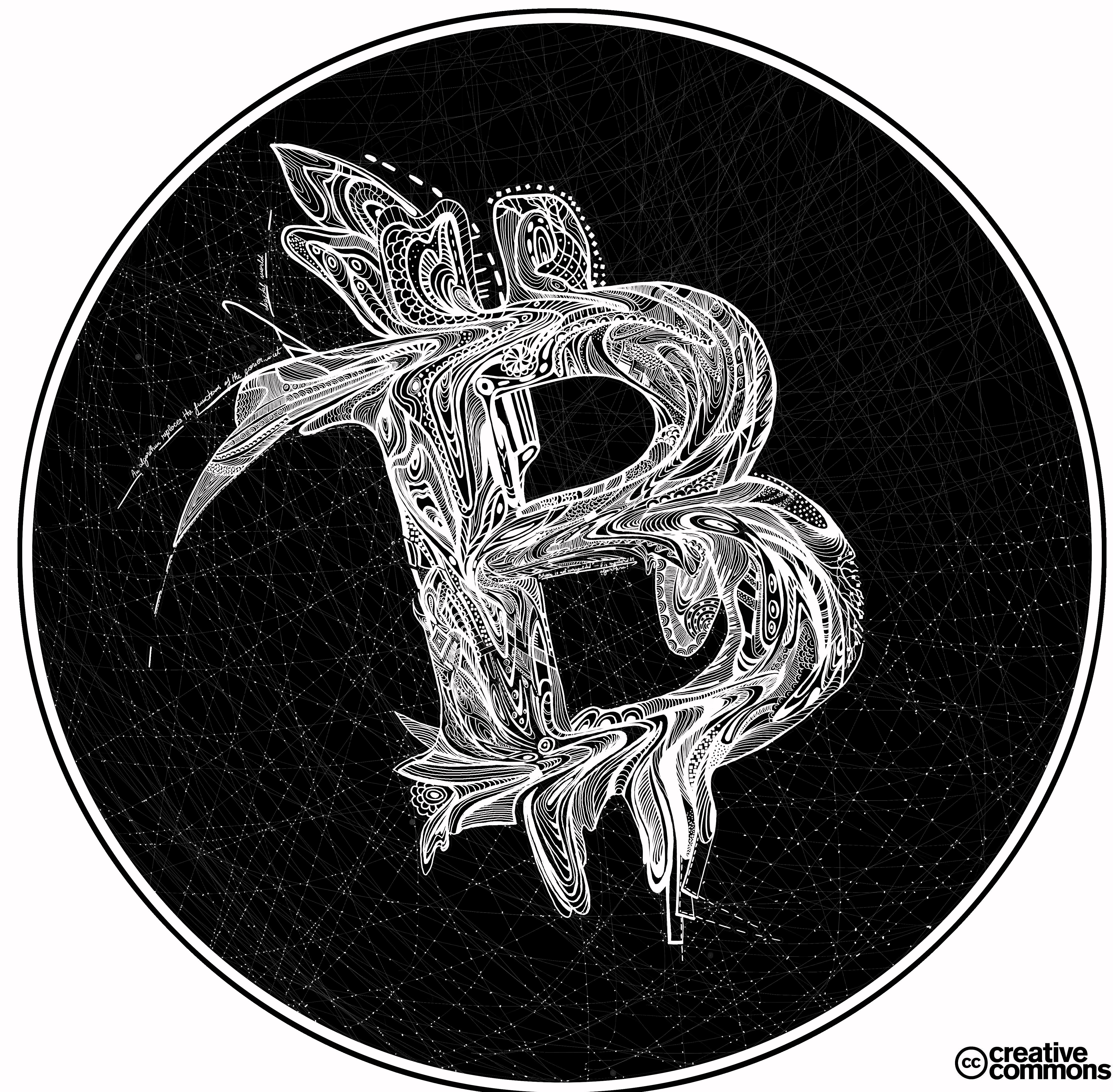
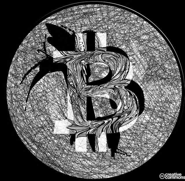
 )
)
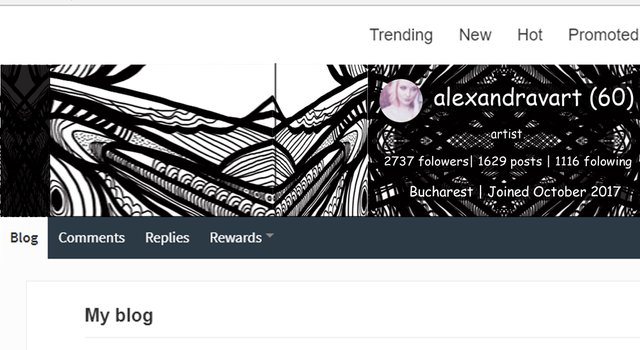
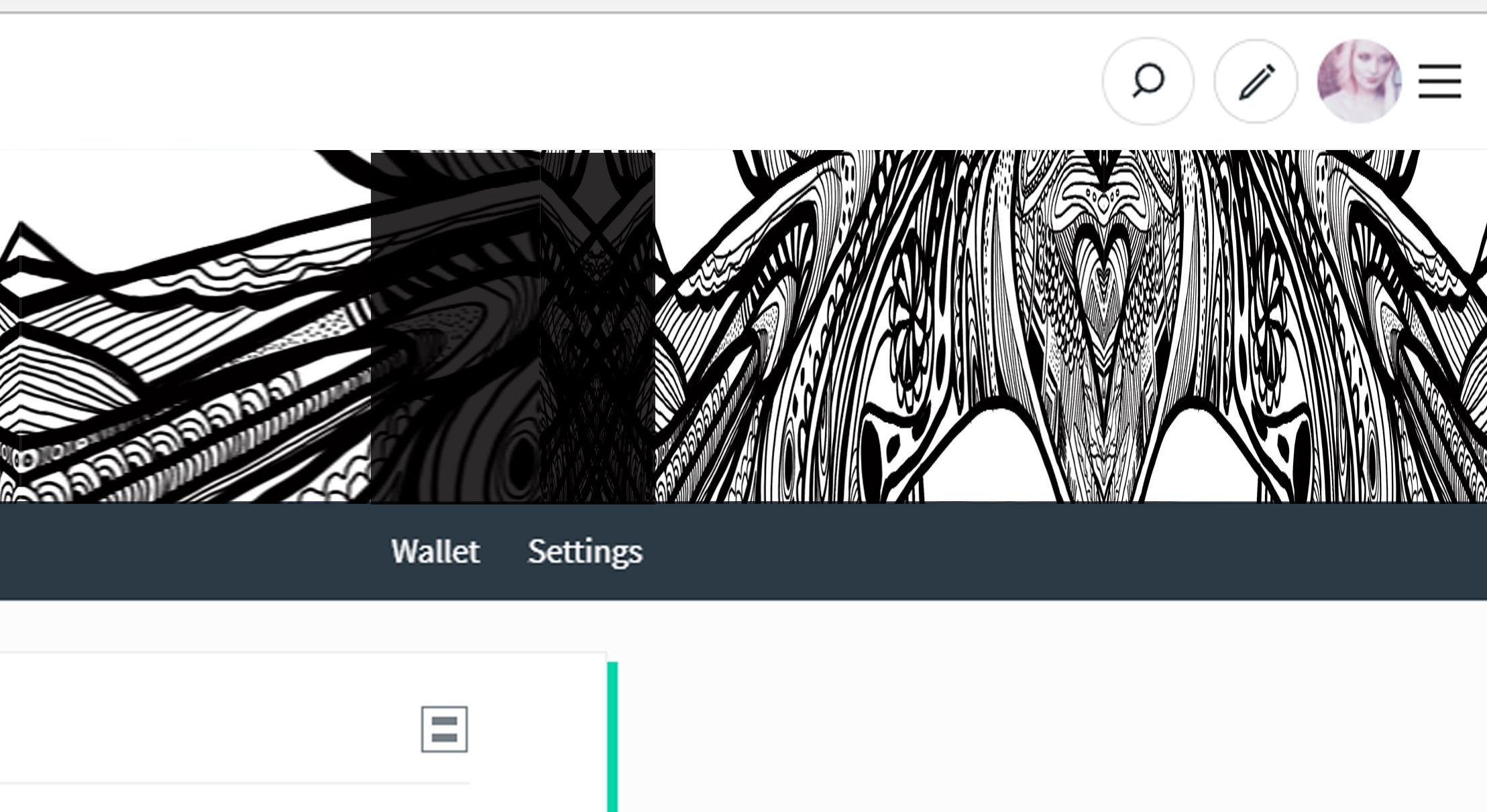
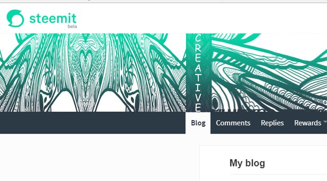
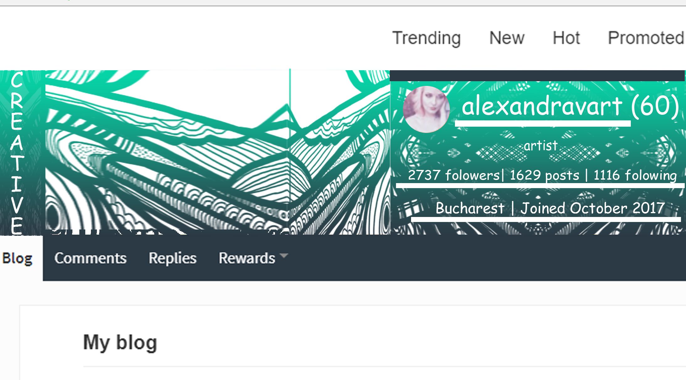
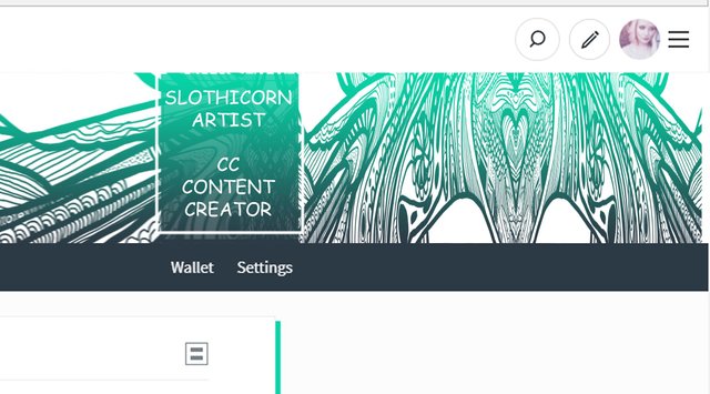
From the same patterns I created a few steemit covers for the @covermaker project.
To find out more about this project, or to get yourself a cover created by an artist for you, check this posts:
https://steemit.com/steemit/@covermaker/covermaker-is-honoring-ashleykalila-and-humansofsteemit
https://steemit.com/steemit-austria/@covermaker/another-cover-design-from-covermaker
Here are a few designs :P




Your works are always amazing to behold. Your display of creativity is simply incredible. It takes a great level of dedication to set rules in the work process and stick to those rules never to loose focus or track.
I must confess that I love what I am seeing. It is a total display of professionalism. Wait a moment, it comes natural to you because it's in you....
Great work @alexandravart
thank you :) inventing the rules is the most fun :)
Wow, this is quite enjoyable to look at. Great work, thanks for sharing!
thank you for visiting and appreciating my work :)
Amazing works! Can hardly decide, which I like most. But if I had to, I'd probably would go with this version:

As I prefer dark colored t-shirs, it would probably look best on them.
Just one tip: It's a bit confusing to label those "creative commons" without adding a specific license. Are those CC0 or CC-BY or some other license?
ooo I forgot have to edit :) thank you for mentioning as for the final piece I think I like this one most too :)
Great work in full expression, these are what I've been missing while you were away on vacation... Glad to have you back with beautiful images
glad to find you here :) thank you
You are welcome, hope you are good?
What is the text that is located on the upper left corner of the symbol?
I have been reading about the works of MC Escher and the idea of black/white colours with 'simple' rules is something that he has exploited to create some truly unique designs. This is a unique and beautiful work that has a 'living' quality about it :)
it's great work