SLC21/WK1: Introduction to Gradients and Application
This is my homework post for Steemit Learning Challenge Season 21 Week 1 assignment of Professor @lhorgic’s class, Introduction to Gradients and Application.

Note :
- I performed this task on Windows 10 PC, Google Chrome.
Task 1 - Discuss about Gradients the way you understand it. Also mention other types of gradients not captured in this lesson
- Terminology. In terms of terminology, in graphic design, a gradient is a technique of subtly transitioning colors from one to another, and is often used to create interesting visual effects, depth, or dimension. Gradients have an interesting history in graphic design and their role continues to evolve with trends and technology. Gradients have become a frequent choice alongside flat design to create a “flat 2.0” or “semi-flat” style that looks modern yet dimensional.
- The Change in History. There was a time when gradients were often used to show change or progression in diagrams and infographics. Today, gradients are not only used for that purpose (providing information) but can also convey mood or emotion, depending on the colors used. This has to do with color psychology, for example, a blue-purple gradient gives a futuristic and calm impression, while red-orange is more energetic and warm.
- Psychological Effects of Gradients
Gradients can change the way we perceive a design. In color psychology, softer or pastel gradients can be calming, while contrasting and bright gradients can be bold and dynamic. This is why gradients are often used in wellness or meditation applications to calm, while sports applications tend to use bright, energizing gradients. - Gradient Fame in Logos of Popular Brands
Gradients have been utilized including in logos of well-known brands such as Instagram which has an orange-purple gradient that creates a bright, unique look while differentiating it from other social apps. It also shows how gradients can be a strong visual identity. In addition, some well-known brand logos that utilize gradients are: Mozilla Firefox, and Messenger (from Facebook).

Logos of 3 famous brands. Sources: Instagram, Messenger, Mozilla Firefox - Another Types of Gradients. Professor Lhorgic in his course has mentioned the 3 most popular types of gradients, namely linear, radial, and angular gradients. In addition, there are several other types of gradients, for example:
- Diamond Gradient. A gradient that forms a diamond or square pattern, with the color fading from the center to the outer diamond-shaped corners.
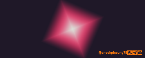
Created with Adobe Photoshop 2021 - Mesh Gradient. This type of gradient uses a grid or mesh to allow for more complex and soft color transitions at some points, often used in more realistic illustrations and graphics.
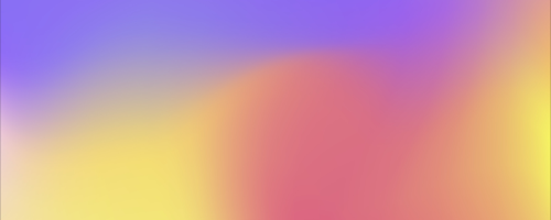
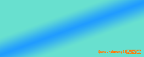
Source - Reflective Gradient. This is a type of gradient where the color transitions repeat with a bouncing pattern, creating a symmetrical or “reflection” effect.
Created with Adobe Photoshop 2021 - Multi-Color Gradient. This type involves more than two colors arranged in a specific order, allowing a gradual transition from one color to another in several steps. It is often used for a more color-rich look.
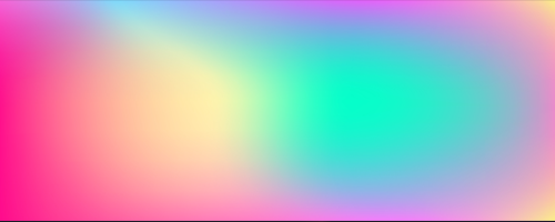
Source
- Diamond Gradient. A gradient that forms a diamond or square pattern, with the color fading from the center to the outer diamond-shaped corners.

Task 2 - Create 3 gradients using the following guidelines.
a. The first gradient should be made with just one colour having different complementary shades. Ensure you reveal their hex codes.
- Open Canva. Press the [Apps] button.

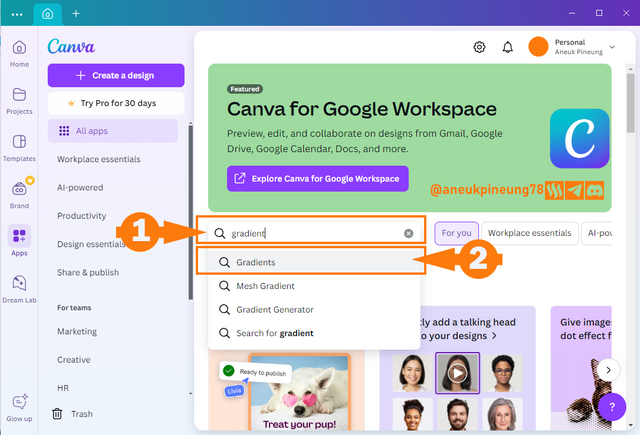
- Perform a gradient search on the search bar (1), select [Gradient] from the drop-down list of search results that appears (2).
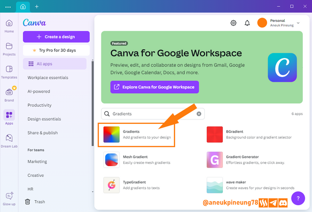
- To create a gradient, click the [Gradient] button in the search results list, as shown in the image below.
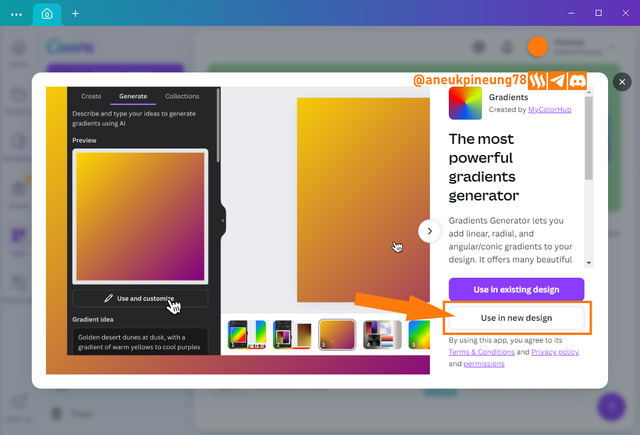
- In the next window decide whether the gradient to be created will be used in an existing design, or will be used in a new design. In this case, I chose a new design by pressing the [Use in new design] button.
- Determine the size of the design you want to make.
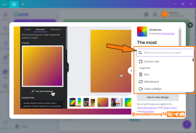
- I filled in the size of 500 x 500 pixels, and pressed the [Create new design] button to execute it.
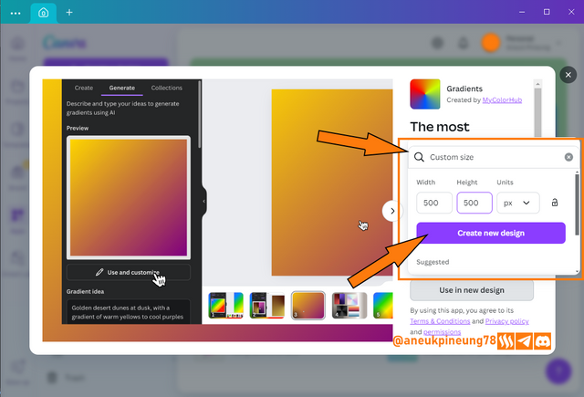
- A 500 x 500 pixel canvas appears next to the Gradient window. For the first image, I will create a linear gradient.
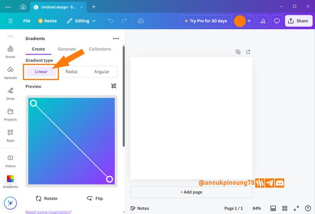
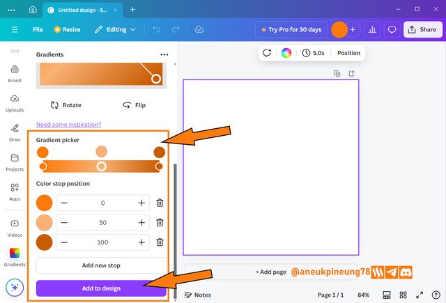
- I chose 3 shades of orange, each of which is:
#FD7B0D,#F8B175and#C85C01. For the three colors, I set their placement with values 0, 50, and 100, respectively. Once done, I pressed the [Add to design] button.
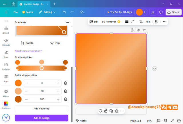
- I set the size of the gradient so that it covered the entire canvas. And here's what the Canva interface looks like with the final gradient I created.
b. The second gradient should be made with two different colours (hex codes) that blends so well. See your colour theory lesson on how to combine colours.
- This time I utilized the Canva Color Wheel https://www.canva.com/colors/color-wheel/ and used the Complementary method to generate two colors,
#591DE2and#A6E21D.
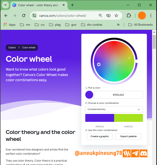
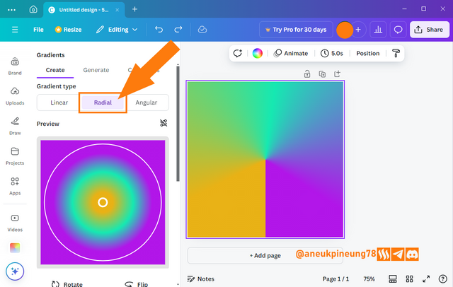
- My preferred gradient type this time was Radial.
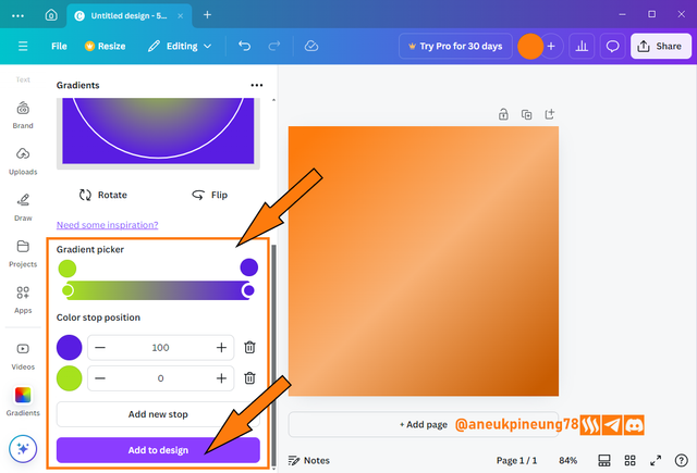
- I entered the color codes that I got from Canva Color Wheel and hit [Add to design] button.
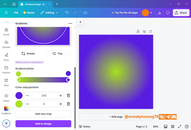
- And the result is like this:
c. The third gradient should be made using three colours (hex codes) that blends perfectly.
- The third gradient I created is of Angular type.
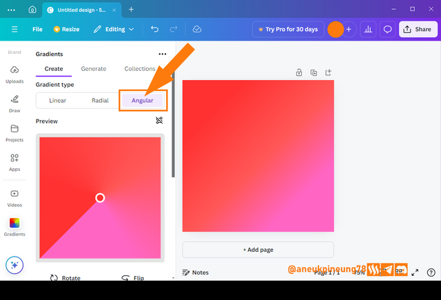
- The colors I used I got with the Triadic method utilizing Canva Color Wheel,
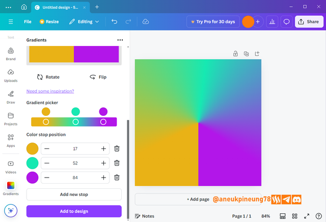
#E9B216,#16E9B2, and#B216E9.
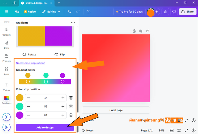
- And the result:

Task 3 - Create a Text gradient using the tool shown. Ensure not to use the default colour on the app, rather use your own combinable colours.
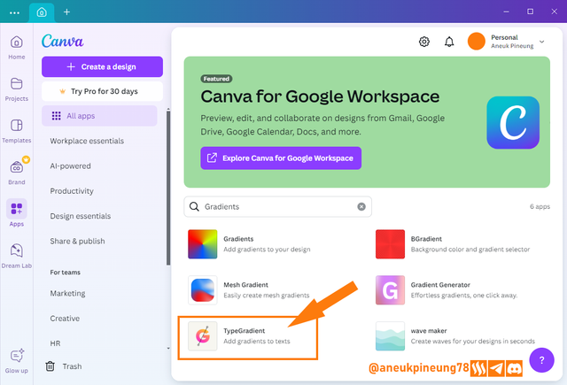
- In the Canva app, I pressed the [Apps] button.
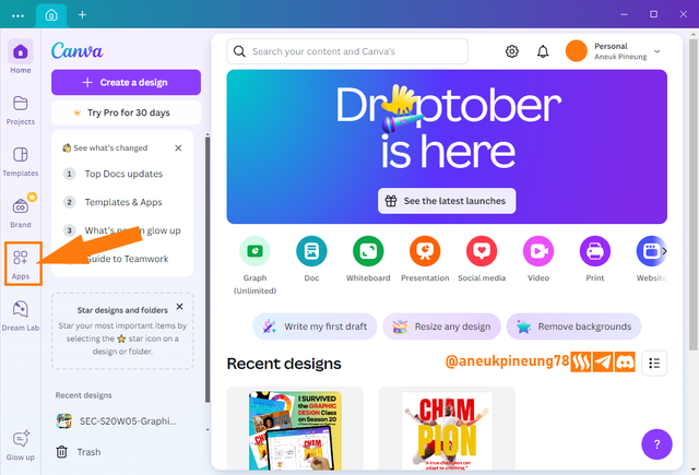
- I did a search with the kumci word “gradient”.

- On the search results list, I pressed the [TypeGradient] button.
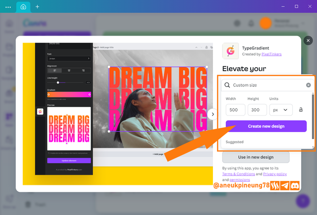
- In the next window I chose new design, and filled in the canvas size of 500 x 300 px (landscape), when finished I pressed the [Create new design] button.
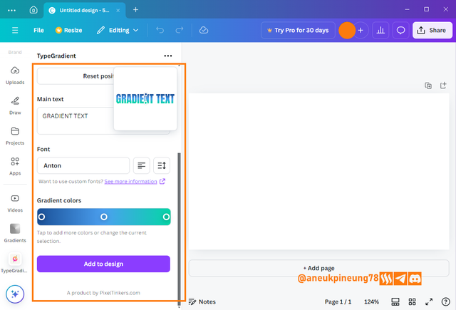
- This time I used 3 colors that are identical to Steem and Steemit, which are the two colors found in the Steem logo (
#1a5098and#4ba0f0) and the color in the Steemit logo (#04d6a7). Text: GRADIENT TYPE (all caps). Font: Anton.
- After inputting all the colors, I can adjust the position of the handlers to get a gradient that suits my taste.
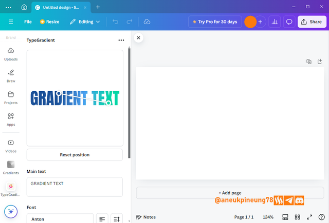
- Once I found a suitable gradient pattern, I pressed the [Add to design] button.
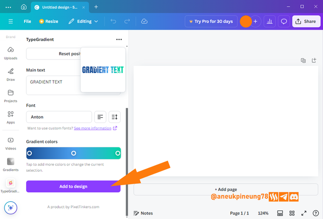
- This is how it turned out:
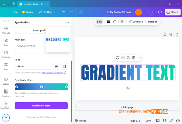
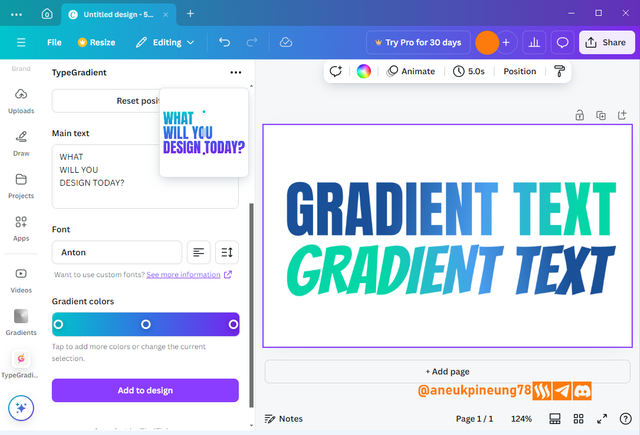
- I can also duplicate the gradient text and do various experiments such as changing the font and the style and color of the gradient.

Task 4 - Pick one of the background gradient you made and create a beautiful flyer design with it. Ensure you do not reproduce my design, rather do something entirely different from mine
- Inside the Canva app, I pressed the [Create a design] button.
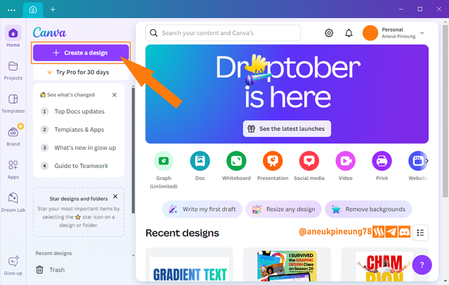
- On the next window, I clicked the [Upload] button.
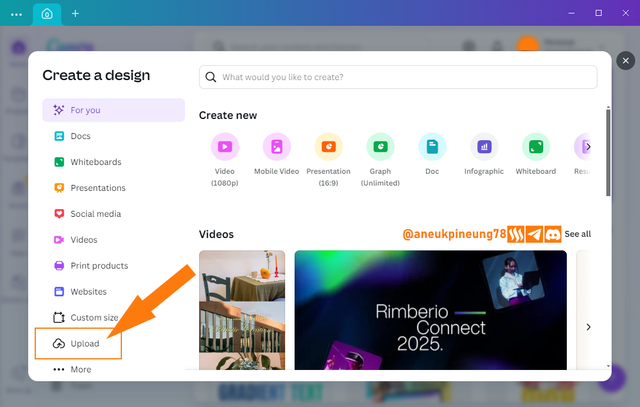
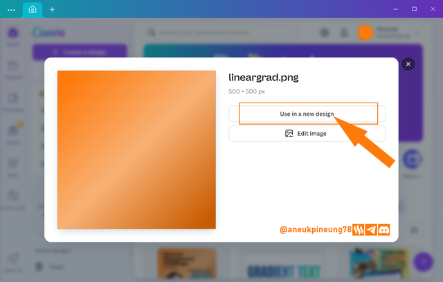
- I browsed my PC and searched for the linear gradient image I created before and uploaded it to Canva. In the window that appeared, I chose [Use in new design].
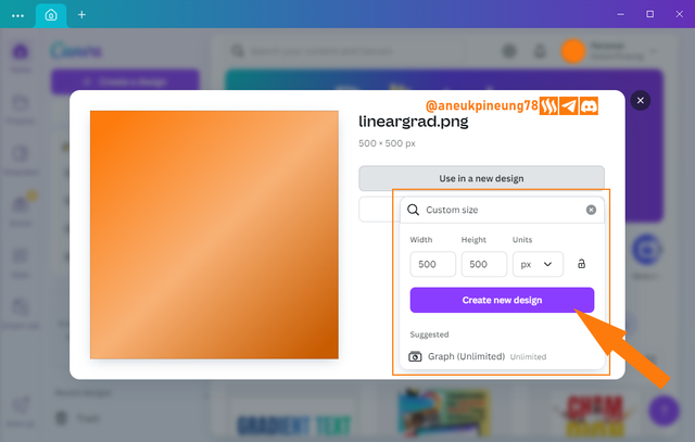
- I decided the new design size (500 x 500 pixels) and I hit the [Create new design] button
- I needed to upload another image to this design, I clicked the [Upload] button (1) followed by the [Upload files] button.
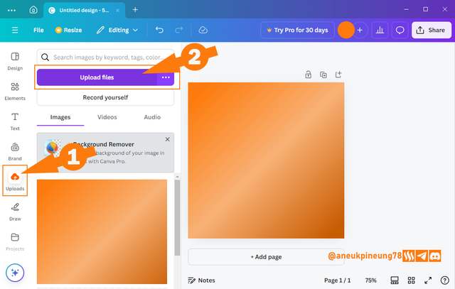
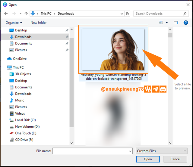
- This was the image I wanted to be in this design, an image of young woman smiling, a free image from www.vecteezy.com which is free to use with attribution. See the picture here. I chose it and clicked [Open].
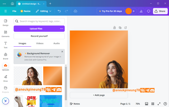
- Once it was completely uploaded to my Canva library, I clicked on it to bring it on to canvas.
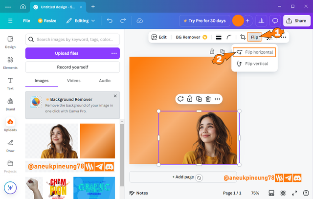
- I needed the girl to look the other way, So I had to flip it. I clicked on the girl image to choose it. I clicked [Flip] on the menu that appeared above the screen, and from the drop-down list of options I chose [Flip horizontal].
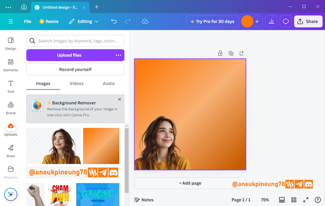
- I arranged the flipped image to meet the need. I guessed it was okay, so far.
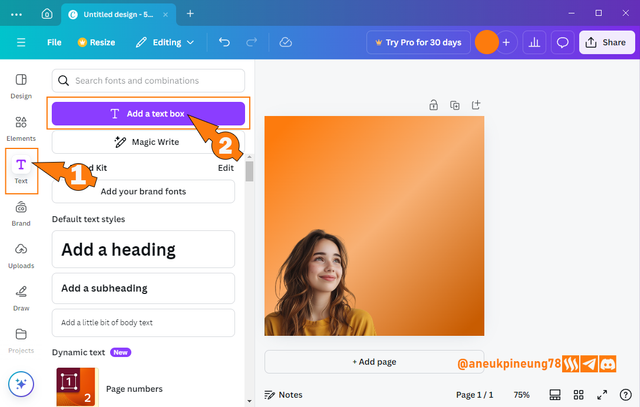
- The next thing to do was adding some text. I did it by clicking on the [Add text] button (1) followed by [Add a text box] (2).
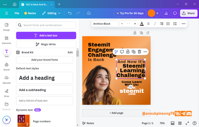
- Some text was added. I only used 1 font in this design: Archivo Black.
- I guessed some gradient text would be good. I used the colors that build Steem and Steemit logos for the gradient text reads "Steemit Learning Challenge".
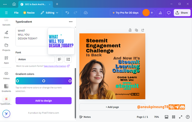
- And the result is


Thanks
Thanks Professor lhorgic for the lesson. Inviting @rayfa, @anroja, @seribubulan.
Pictures Sources
- The editorial picture was created by me.
- Unless otherwise stated, all another pictures were screenshoots and were edited with Adobe Photoshop 2021.
Sources and Reading Suggestion
- https://www.tailorbrands.com/blog/gradient-logos
- https://dribbble.com/stories/2020/01/28/get-creative-with-gradients
- https://international.binus.ac.id/graphic-design/2021/07/09/the-psychology-of-color-and-graphic-design/
- https://99designs.com/blog/tips/color-psychology/
- https://www.align.vn/blog/7-types-of-gradients-in-graphic-design/
- https://www.digitalsilk.com/digital-trends/gradient-design/
- https://618media.com/en/blog/gradients-effectively-in-web-design/
- https://medium.com/@abhishek.abhishek.m446/color-gradients-in-design-from-backgrounds-to-text-effects-3c4fd5f4eb6f
- https://www.teknody.com/menggambar-menggunakan-gradient-tool-di-photoshop/




https://x.com/aneukpineung78/status/1851221121640853808

Saya pikir Anda telah menguasai setiap sudut dari gradient sebelum pelajaran ini dimulai 😁
Gradient adalah salah satu sisi paling umum dalam desain grafis, saya sering menggunakannya termasuk dalam gambar-gambar yang saya buat untuk artikel Steem saya (terutama sekali pada gambar editorial), tetapi walau begitu, selalu saja ada hal baru untuk dipelajari. Terimakasih telah mampir, Bang @fajrularifst. Sukses selalu untuk Anda.
Siap Bang,, Salam Hormat Saya untuk Anda..
Semaki lama tugasnya semakin kreatif dan menantang ya. Saya yakin yang ikut dalam pembelajaran ini akan semakin kreatif dalam menghasilkan poster yang berkualitas.