SLC21/WK5: Hands-On Practical
This is my homework post for Steemit Learning Challenge Season 21 Week 5 assignment of Professor @lhorgic’s class, Hands-On Practical - Using Any Design App/Software Of Your Choice.
Note :
- For the past month or so I have had almost no time for Steem activities, but I still follow this class, even though I don't participate in it. I enjoy how this class is evolving. It felt really good when this week I was able to find time to participate again in SLC especially through this class.
- I performed this task on Windows 10 PC, Google Chrome. And, Adobe Photoshop 2021 is my choice of design software in completing this assignment.
Task 1 - Design a logo for your brand.
The following are the steps I took in creating a logo for my business in the men's shoe trade. I started by taking the shape of a shoe from a picture (as seen below) of a shoe model I downloaded from unsplash.com. The shoe image is under the free to use unspalsh license, which the complete license for it (and pretty much all other the unsplash free images) can be seen here: https://unsplash.com/license.
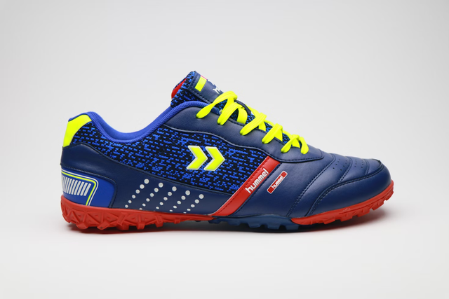
- I opened the shoe image in Adobe Photoshop 2021.
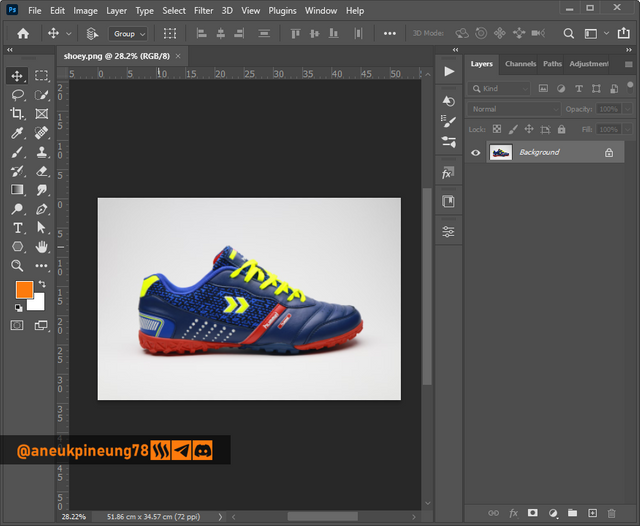
Image is clickable and might show larger resolution. - I separated the shoe image with the background, utilizing the [Select] > [Subject] command.
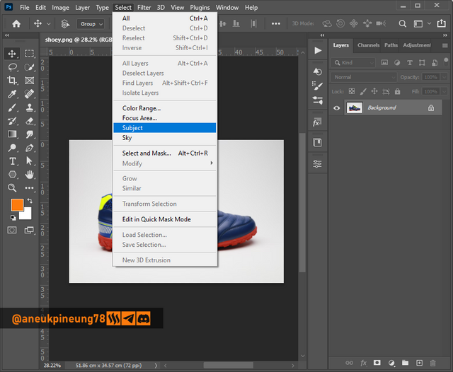
Image is clickable and might show larger resolution.
It's not perfect, but the selection of objects done with the [Select Object] command is quite helpful when compared to the method in older editions of Photoshop. Here was the result.
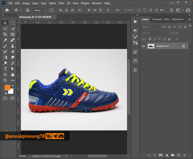
Image is clickable and might show larger resolution. - I duplicated the image of the shoes that had been selected and separated from the background, and then disabled the background layer.
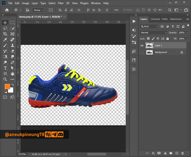
Image is clickable and might show larger resolution.
The image still needed a touch-up to make it perfect. - I utilized the Pen Tool to select and delete unnecessary part of the image and added the part that was missed on the duplicating process.
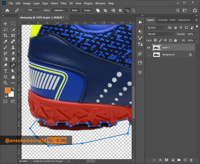
Image is clickable and might show larger resolution.
After some adjustments using the Pen Tool, the shoe image looked better.
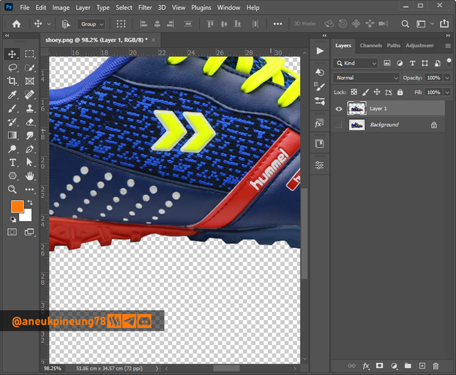
Image is clickable and might show larger resolution. - Next, I turn the shoe image to all black by adjusting the levels. I accessed it from the menu [Image] > [Adjusments] > [Levels...].
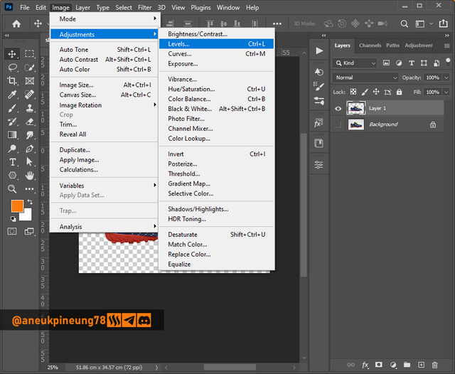
Image is clickable and might show larger resolution. - I dragged the white Output Levels slider to the left (black area), until the shoe image turned all black.
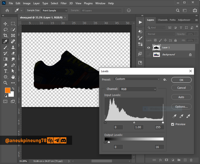
Image is clickable and might show larger resolution. - Next, I differentiated the bottom of the shoe (sole) by giving it a different color. Once again I used the Pen Tool to create the new shape in a new layer above the shoe layer.
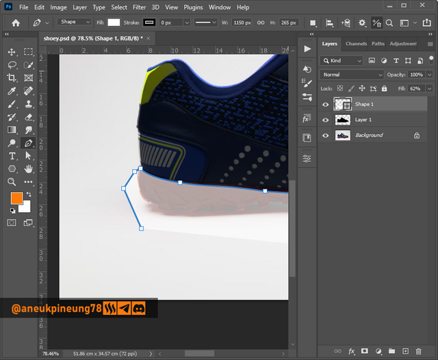
Image is clickable and might show larger resolution.
Here was the result.
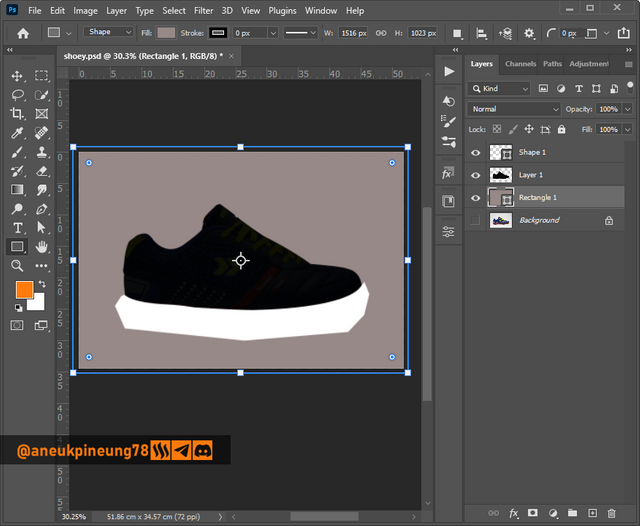
Image is clickable and might show larger resolution.
With the masking, the new shape on the new layer which was placed on the bottom part of the shoe fit perfectly with the bottom part.
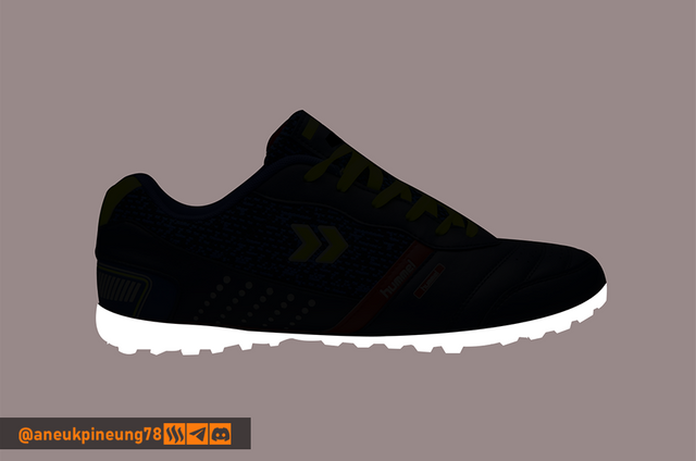
Image is clickable and might show larger resolution. - Next thing to do was adding the laces. I used the Rectangle Tool and create some rounded rectangles.
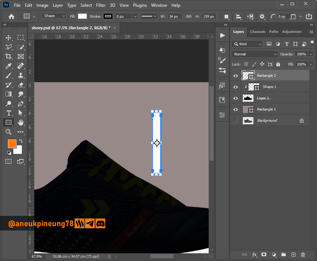
Image is clickable and might show larger resolution.
I guessed, 4 strips of laces looked good.
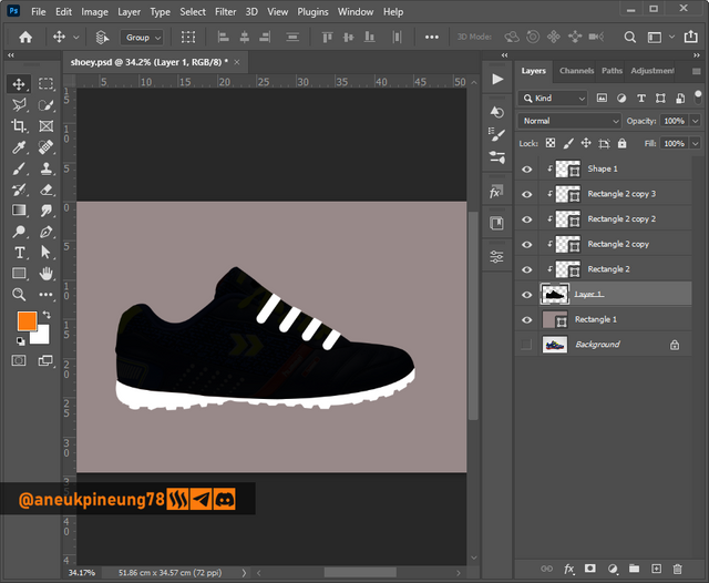
Image is clickable and might show larger resolution. - I grouped the layers that make up the shoes and gave it a stroke, this is so that the shape of the shoes can look perfect when placed in various backgrounds (bright or dark).
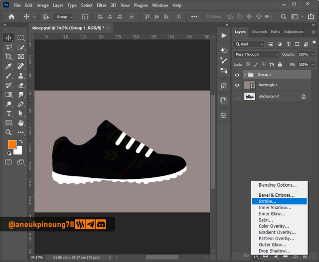
Image is clickable and might show larger resolution.
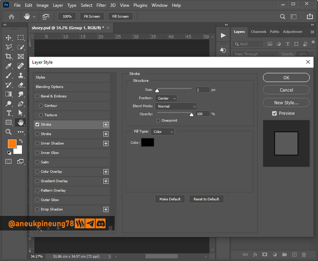
Image is clickable and might show larger resolution.
This is how it looks when the shoe image with the stroke placed on a white background.
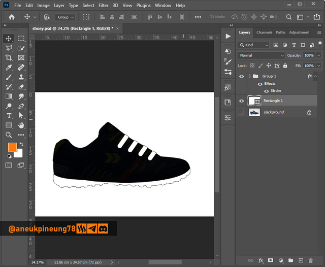
Image is clickable and might show larger resolution. - I added the text element for the symbol. I used the font Bebas Regular, which is a display typeface in sans-serif typeface.
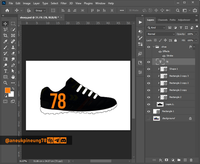
Image is clickable and might show larger resolution.
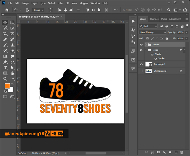
Image is clickable and might show larger resolution.
There were two versions of them.
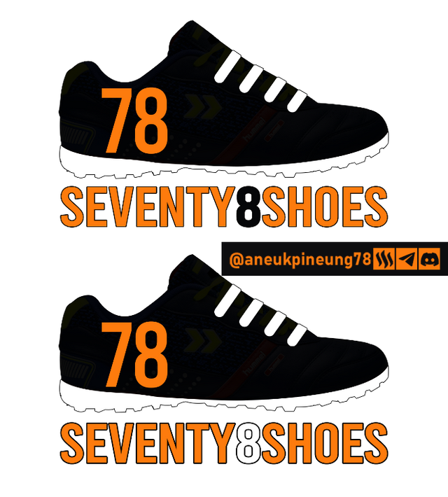
Image is clickable and might show larger resolution.
The two versions of the logo above have only slight differences, and that will find its relevance with the brightness level of the background where the logos will be placed. If a design needs more information about the entity that the logo represents, then something like the design below I think will fulfill that need.
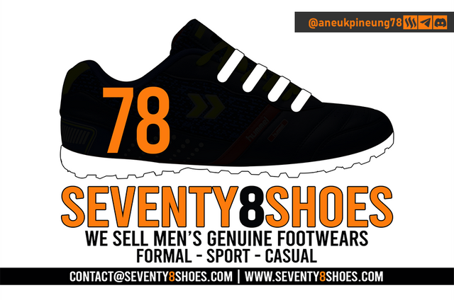
Image is clickable and might show larger resolution.

Task 2 - Design a promotional flyer/banner/poster for your brand using any design app/software of your choice. Kindly be sure to be very detailed, showing every relevant detail as this could be your leverage.
For this assignment I designed a promotional poster, and I took the theme of Christmas and New Year. It was still a little less than a month away from Christmas and it was a good time to build awareness that there would be sales with attractive discounts.
- I created a new document in Adobe Photoshop 2021, 1200 x 1600 pixels at 300 pixels/inch, RCB Color, white background.
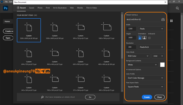
Image is clickable and might show larger resolution. - I started the next things by adding a text layer on the canvas with the white background. I used the font Montserrat, a geometric sans-serif font.
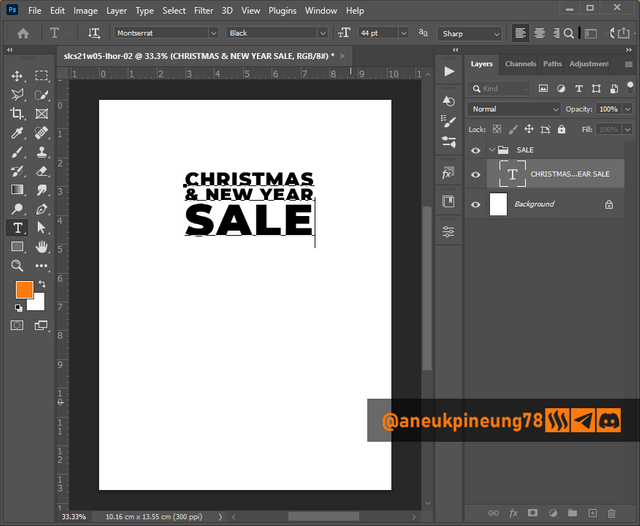
Image is clickable and might show larger resolution.
And more text.
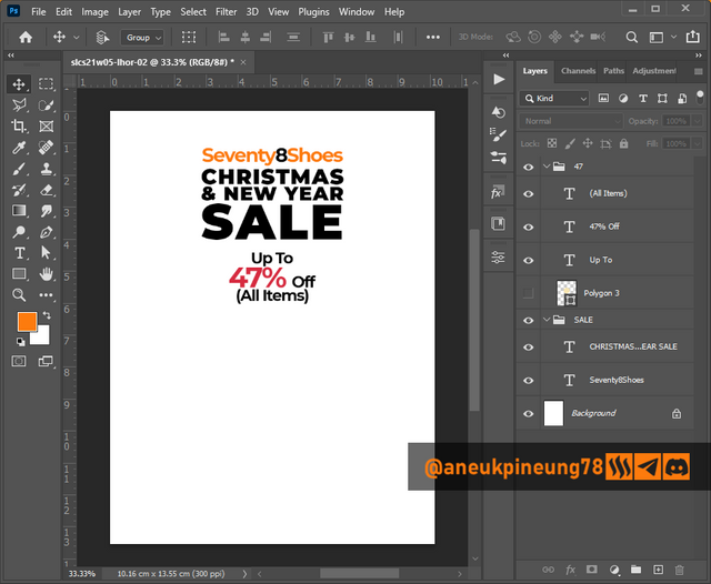
Image is clickable and might show larger resolution. - So far it was good, I repositioned the text layers.
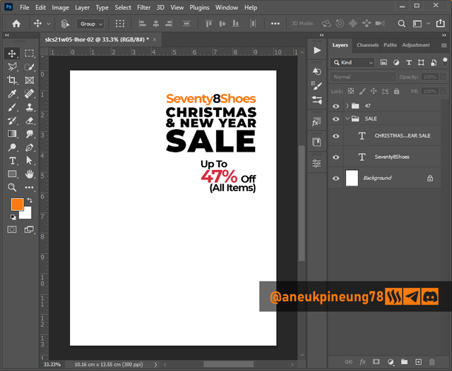
Image is clickable and might show larger resolution. - Adding the main element of the promotional poster – the shoe(s). The photo of the shoes I used in this design is from my personal collection.
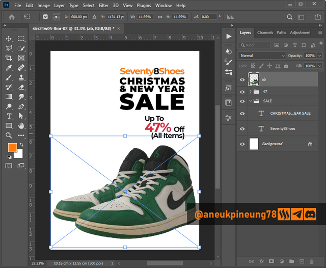
Image is clickable and might show larger resolution. - And, relevant to the celebration of Christmas, a picture of a Christmas tree that I downloaded from freepik.com, the attribution guidance can be read here.
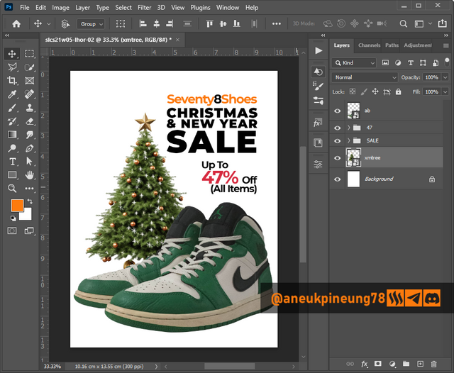
Image is clickable and might show larger resolution. - Added some shadow under the shoes for a more realistic feel.
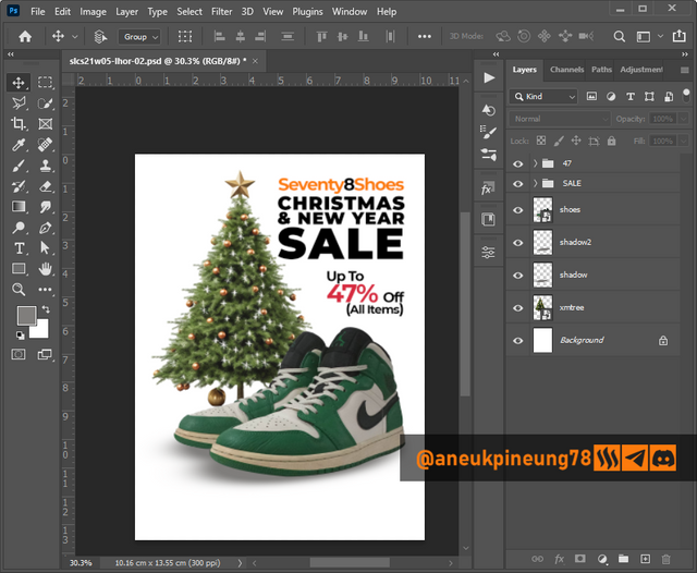
Image is clickable and might show larger resolution. - It's been pretty good so far. Next, I attached the information about the entity the poster represents at the bottom of the design, and separated it from the rest of the design by providing a background in the similar color as the main object in the poster.
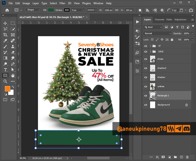
Image is clickable and might show larger resolution.
Added logo and some relevant informational text. Made a little adjustment on the design, including positioning and font changing, I thought BEBAS font works better in this desain, it’s more elegant, mainly because of its taller anatomy than the Montserrat font and hence being able to cover more surface which is what the design needs.
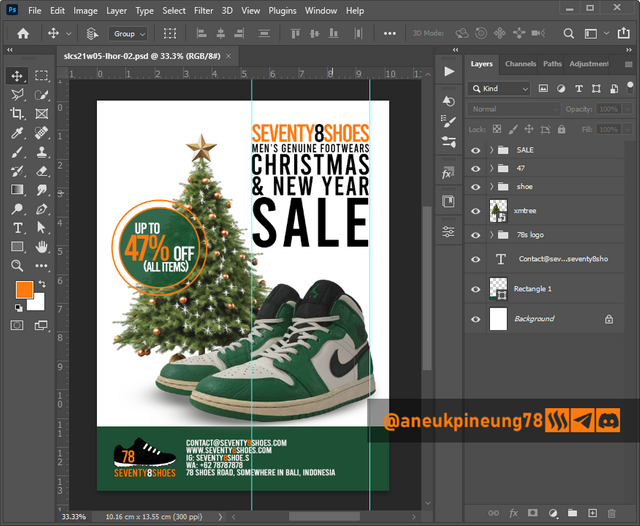
Image is clickable and might show larger resolution. - The result.
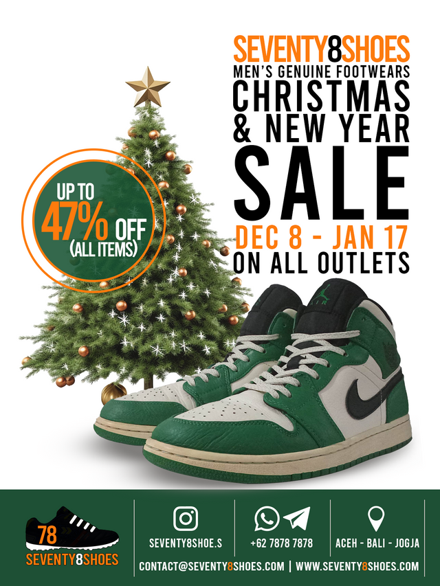
Image is clickable and might show larger resolution.
It was a simple design that I thought effectively conveyed the message to the audience.

Task 3 - Dedicate a section to talk about the graphics design principles engaged in making your design.
- Simplicity is Power. In creating this promotional poster design, I hold the principle that simplicity is power. The most important thing is that the message can be conveyed to the audience effectively through the design. The messages to be conveyed through the poster are the joy of welcoming Christmas and New Year for those who celebrate and the discount party at Seventy8Shoes store in welcoming these two moments. Therefore, there is a Christmas tree that represents the Christmas moment which of course is not separate from the New Year, and another main element which is a pair of shoes that explains the entity of Seventy8Shoes as a men's shoe store.
- Color Theory. In the creation of this design, I did not use any special method to select the colors, I just go along with what elements had and combined them with what I wanted while still considering the important aspects in the color theory.
- Color Scheme. The most dominant color is greenish and it was like a coincidence that the photo of the shoes has a dominant portion of green color so that in turn it matches the Christmas tree. The other colors are black, white, and variations of orange. The hex codes:
- Some variants of Green including
#1e5035; - Black
#000000and its variants; - A variant of Orange
#fd7b0d; - White
#ffffff;
- Some variants of Green including
- Contrast. What I did with these colors was to make sure that they didn't “kill” each other by paying attention to the contrast between each element and the background or foreground, and I was helped by the fact that this was a simple design, so the job wasn't too energy-draining.
- Color Psychology. The possitive association of the used colors, amongst all, are:
- Green = balance, harmony, life, grow, freshness, security, stability, creativity;
- Orange = energic, creativity, optimism, happiness, adventouristic, bravery;
- Black = authority, strength, elegance, luxury;
- White = openness, simplicity, peace, freshness, purity;
- Color Scheme. The most dominant color is greenish and it was like a coincidence that the photo of the shoes has a dominant portion of green color so that in turn it matches the Christmas tree. The other colors are black, white, and variations of orange. The hex codes:
- Typography. In terms of typography, a few things were noted regarding this design, namely:
- Hierarchy and Emphasis. The textual elements in the design have a clear hierarchy and can be seen from the different font sizes and varying colors between each text element.
- Alignment. The alignment used as much as possible is sought so that the text becomes harmonious with other elements in the design.
- White Space. There is enough room for every textual elements to “breath”.
- Contrast. Each text element has a good enough contrast against the background, so that readability is guaranteed.
- Fonts. In the design, I ended up using only 1 type of font, which is a font in the Display category called BEBAS from the Regular variant. Bebas is a font in sans-serif typeface. Bebas Regular only has capital letters and is not lowercase. Bebas has an elegant, sturdy, professional and modern look, a font that is suitable for posters.

Task 4 - Use a suitable mockup to promote your design.
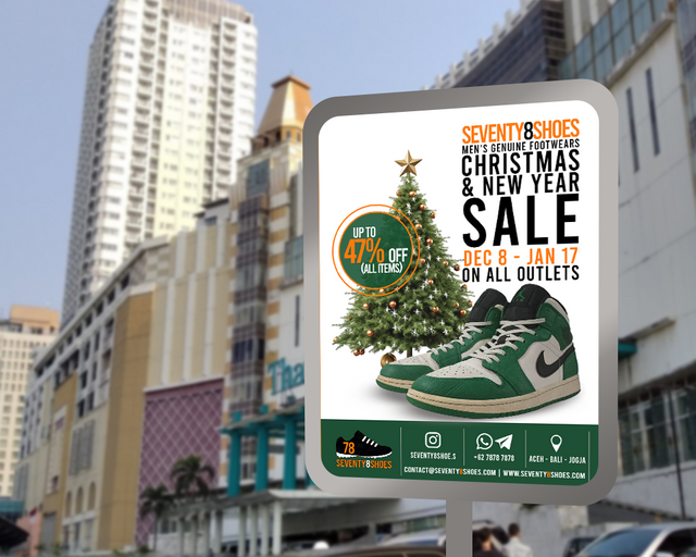
- I created my own mockup with the background of a photo of a famous commercial district building in Jakarta that I took myself some time ago. I opened the photo in Adobe Photosop 2021 document which was 1000 x 800 pixels in size and 300 ppi in depth.
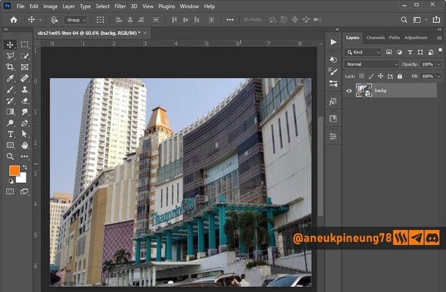
Image is clickable and might show larger resolution. - I inserted the commercial poster I created earlier.
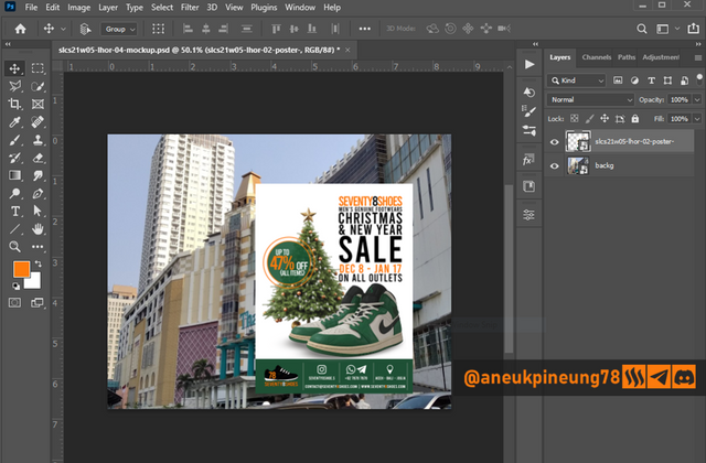
Image is clickable and might show larger resolution. - Using the rectangular tool, I created a kind of frame that represents the plate and pole to which the poster is attached.
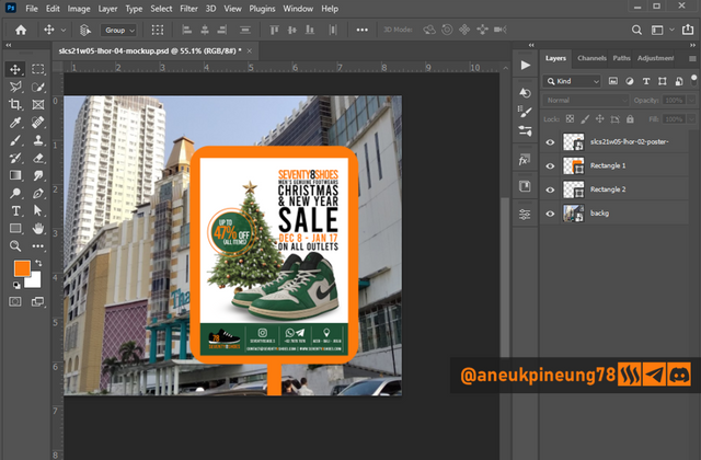
Image is clickable and might show larger resolution. - I made some adjustments to make the poster look more natural and blend in with the background.
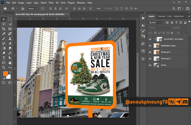
Image is clickable and might show larger resolution. - Added some metallic effect to the plate and pole.
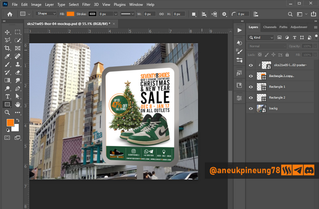
Image is clickable and might show larger resolution. - To give further realistic look and to set focus to the poster, I blurred the background image a little.
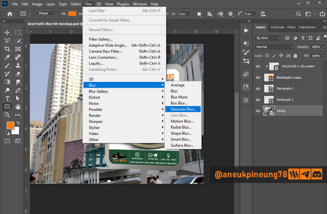
Image is clickable and might show larger resolution.
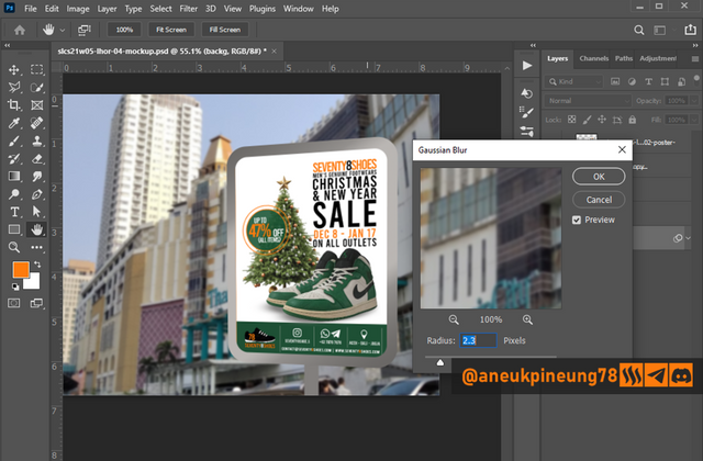
Image is clickable and might show larger resolution.
The result:
Materials Used in Completing This Assignment
| Thumbs | Sources |
|---|---|
 | https://unsplash.com/photos/black-and-red-nike-athletic-shoe-wYVKRBIchV0 |
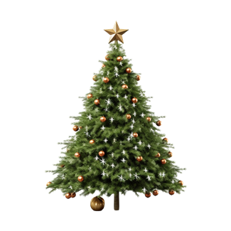 | https://www.freepik.com/free-psd/christmas-tree-with-star-it-isolated-transparent-background_89206112.htm |
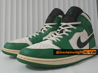 | Private collection |
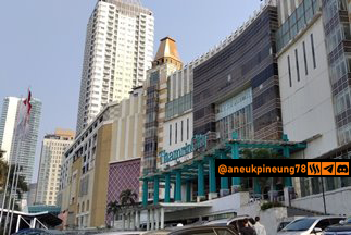 | Private collection |
 | Private collection |

Thanks
Thanks, Professor @lhorgic for the lesson. Inviting @rayfa, @josepha, @simonnwigwe.
Pictures Sources
- The editorial picture was created by me.
- Unless otherwise stated, all another pictures were screenshoots and were edited with Adobe Photoshop 2021.



Hello @aneukpineung78 thank you for participating in this week's lesson. We have assessed your entry and we present the result of our assessment below.
Feedback:
Welcome back to class dear student.
Let me start by commending you for a job weldone, the effort put in this work is quite commendable.
You logo design is cool, I appreciate the fact that you had to create a logo out of an existing material. You still have a little more to do with that logo design to improve it aesthetically. So I would say there is room for more editing and adjustments.
Your flier design is nice and simple, do not stop exposing yourself to graphics material so you can continue to improve. I wish you all the very best, Weldone!
Regards
@lhorgic❤️
Thank you.
on x : https://x.com/aneukpineung78/status/1862787998573813949
Waooh I am so impressed by your work, it looks very beautiful I must say. However it would take me a long hours to do what you have done. I wish you success
Creating the logo and the poster and the mockup is not the real challenge, the real challenge is to come up with ideas. Once the idea is there, the creation process will follow. The imagination becomes idea, idea becomes thing. That's why I agree with Einstein, “Imagination is more important than knowledge”, because much of the times, things started as imagination.
Thanks for your appreciation, I myself think that so many more things I can learn about Graphic Design. This subject -graphic design- has been my hobby for quite some times and I also sometimes work on banner, leaflet, flyer design orders, usually from my colleagues in universities basically for seminars, scientific gatherings, and other events.
You yourself have contributed great value on Steem, basically in the Learning Challenge, and especially in the graphic design class, I believe. And I respect you. Good luck to you, too.