SLC21/WK6: Summary on Lessons So Far [Hands-on Practical]
This is my homework post for Steemit Learning Challenge Season 21 Week 6 assignment of Professor @lhorgic’s class, Summary on Lessons so far [Hands-on Practical].
Note :
- The graphic design class run by Professor @lhorgic is one of my favorite classes in the Steemit LEarnig Challenge (or previously the Steemit Engagement Challenge). However, since the beginning of Season 21, I have not had enough time to engage in the Challenge including and especially in this graphic design class. But I will follow the assignment of the last week of this season and try my best.
- I performed this task on Windows 10 PC, Google Chrome.
Week 1 - Introduction to Gradients and Application
I happened to attend the first class of this season entitled Introduction to Gradients and Application. My article can be read here. In this class, I learned about the various aspects of gradients, including the different types of gradients, their functions and uses in design, and also how to place them and use them as one of the “bullets” to make a design attractive to viewers.
And what made this class even better was that, although I have often used gradients in the designs I have done so far, in this class I had the opportunity to create a design using a linear-type gradient, which I applied to the background and text as shown in the image below.


Week 2 - Introduction to Logo Design
In week two, for the class titled Introduction to Logo Design, I still managed to complete the assignment as can be seen here. In this class, as the title suggests, I studied the aspects of logo creation. Through this class, students are made to realize the importance of logos in relation to the image they want to build of the entity they represent. Various aspects such as simplicity, eye-catchy, the impression caused to the memory, as well as the broader aspects of graphic design, namely color and color psychology are also aspects that students get from this class.
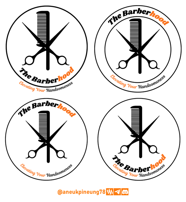
At the end of this class, each student was asked to create their own design and I came out with a logo design for a barbershop, where I came up with 4 proposals as seen in the following picture.

Week 3 – Logo Design - Part 2
Week three was titled Logo Design - Part 2. I didn't find the time to do the assignment although I still read the class articles.
Through this class, Professor lhorgic made students understand the types of logos and how to determine the right type of logo for an entity (brand). Some important things that I noted from this class are:
- There are many types of logos that can be an initial reference for creating a logo for an entity, including: WordMark, Monogram, Brandmark, Abstract, Mascot, Emblem, and so on.
- Each of these types of logos has its own strengths and values, and it is important to look at the suitability of its style with the values of the entity it is associated with that the logo is trying to represent.
- Determining the type of logo to be created to represent an entity must be done with various considerations, including: message delivery and representation of the values attached to the entity.
- Basically a logo designer will come up with ideas and proposals but ultimately, the entity that wants the logo is the decider.
I have long had a logo that I dedicated to the community on Steem. It dates back to mid-2017 when we, a bunch of low-powered steemians, got together and combined forces to support each other on Steem. We consolidated our power on Discord. At that time Steem did not have the community features that we see today.

The logo is a very simple logo with features that can be described like this:
- The emblem has a main shape of a circle with triangular ends that help shape it into a speech-bubble like shape, suggesting that this is a community that emphasizes togetherness and bridging communication between members.
- The circle inside shows unity of purpose and determination.
- The stumped triangle that forms the letter A with a dot in the center is the Upvote symbol which means that the community has a goal for all members to be successful together on Steem, as well as the initials for the word ARTEEM (the community name).
- The middle dot symbolizes focus.
- The black color symbolizes seriousness.
- The orange color symbolizes adventure.

Week 4 – Mockups in Design and Application
In week four, Mockups in Design and Application, Professor lhorgic took the students to dive into one of the practical sides of graphic design: mockups. A mockup in graphic design is a visual representation of a design that is meant to show how a project or product would look in its actual context. Mockups are usually used to present ideas or concepts to clients, teams, or stakeholders before full implementation takes place.
This means that the client can make initial observations and can expect how the results will be obtained when the design is later placed on various types of media (printed on garments, or pasted as posters or in digital form).
Mockups are created to give a real picture of the final product, including colors, fonts, layouts, and other design elements.
Among the functions and uses of mockups are to communicate ideas, which helps designers explain ideas to clients or teams visually; and provide an opportunity to see if the design fits the needs before implementation.
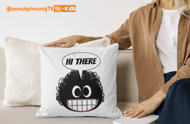
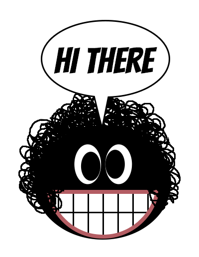
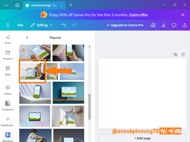
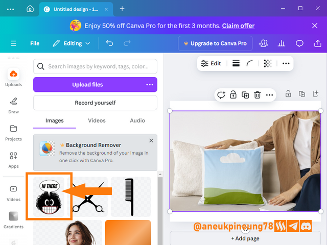
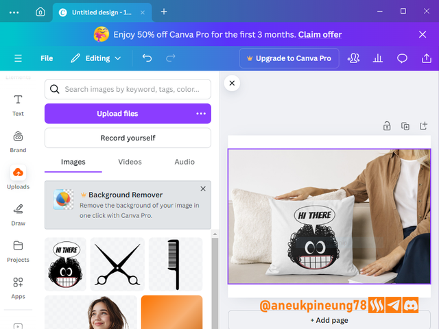
A simple example of using a mockup is as follows. I have a cartoon design that I want to print into sofa cushion covers. Before doing so, I made a mockup first to get an idea of what kind of results I can expect with this design. In this case, I used the mockup provided by Canva.

Week 5 – Hands-On Practical Using any design App/Software of your choice
After 10 meetings since season 20 of the SEC, in week five of season 21 Professor lhorgic decided to make the students put everything they had learned so far into practice by designing a promotional poster. And .... Professor let the students choose their preferred design application. I happened to find time to get involved again, and my participation this week can be read here.
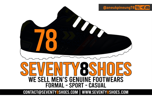
The assignment for the week was another interesting one, a combination of logo and poster creation. So I needed a logo before creating the promotional poster. I happen to have a hobby of collecting shoes, so I decided to create a logo for a shoe buying and selling business and I called it 78 Shoes. The logo I created for this imaginative business is as shown below.
For the promotional poster, I chose a Christmas and New Year theme. So the concept is that the 78 Shoes store chain welcomes Christmas and the turn of the year by giving discounts on all items at all outlets. The promotional poster that I produced that week is as shown below.

And to close the week 5 season 21 lesson, Professor lhorgic asked the students to put their posters into the mockup. I created my own city-themed mockup using one of my personal collection photos and inserted the poster I had created as a billboard into the mockup, as seen in the image below.


Thanks
Thanks Professor @lhorgic for the lesson. I invite @rayfa, @waqarahmadshah, @stream4u.
Pictures Sources
- The editorial picture was created by me.
- Unless otherwise stated, all another pictures were screenshoots and were edited with Adobe Photoshop 2021.




Hello @anuekpineung78 thank you for participating in this week's lesson. We have assessed your entry and we present the result of our assessment below.
Feedback:
Welcome back to class dear student.
Let me start by commending you for a job weldone, the effort put in this work is quite commendable. You have done a nice summary of the lesson and this you did practically which is quite commendable.I want to also salute your courage for staying through the lesson and for taking every form of correction in love and patience. I hope you would maximize all of these lesson and use them to your profiting. Thanks for staying through.
Regards
@lhorgic❤️
https://x.com/aneukpineung78/status/1865701452272029705
keren memang kalau suka yang beginian, sebagai penikmat hasil karya orang.. aku mau bilang ini "Bereih!!"