Steemit Crypto Academy Season 5 Beginner's Course - Task 10: Candlestick Patterns

Questions
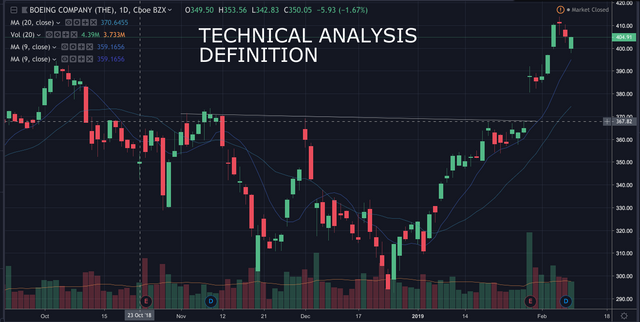
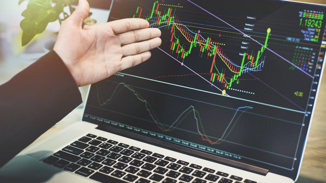
a) Explain the Japanese candlestick chart ? (Original screenshot required).
b) In your own words, explain why the Japanese candlestick chart is the most widely used in the financial market.
c) Describe a bullish and bearish candle. Also, explain their anatomy. (Original screenshot required).
a) Explain the Japanese candlestick chart ? (Original screenshot required).
The Japanese candlestick charts are one of the most used technical analysis systems in the financial world. Since it is an instrument that is responsible for studying the value of an asset. Candlestick charts have been one of the most sought after tools and used by many investors for their extensive information that they provide to traders when interpreting price movement. Offering a design that allows investors to have a better view of the price in the market.
It is a graph that is developed by two red and green colored candles (black, white) that allows to detect the value of an asset in the market. Where the red candle means the value of the asset, while the green candle means that at the beginning it has experienced a rise in price. The Japanese candles are designed in a rectangular shape, where this shape represents the changes that the price perceives from the opening to the closing of the price. The graph focuses on analyzing the value of an asset, by studying the opening of the price, the maximum and minimum prices reached, as well as the closing of the price in a certain time.
In the candlestick chart we can analyze the value of an asset in real time, once the price rises or falls in a certain time, as well as the range that the price reached in a set period.
b) In your own words, explain why the Japanese candlestick chart is the most widely used in the financial market.
Japanese candlestick charts are one of the tools most used by many investors globally, this is because it is a system that provides us with information about the current price trend through patterns and price movement in the market.
It is a graph that is very easy to use and to interpret the price changes, when deciding to place a buy or sell order in the market for a specific asset. By interpreting the Japanese candles we can identify the upward or downward trend of the market.
The Japanese candlestick charts is one of the tools most used by many beginner and expert traders for its different instruments that can be used on the chart, which allows us to point out and identify resistance and support points in the market through the lines of arrows between other As it is also a tool that provides us with information on the different currencies and assets that are traded on the day. The chart provides us with data on the opening price, the closing price, and the highs and lows of the price.
Traders use Japanese candlestick charts to study and analyze the current price trend, as it is a market that requires a lot of preparation due to its popularity as it is highly volatile. Being one of the most important tools when it comes to identifying possible losses and gains in operations.
It is a tool that we can use or combine with technical indicators that facilitate the interpretation of the market trend in a set period.
c) Describe a bullish and bearish candle. Also, explain their anatomy. (Original screenshot required).
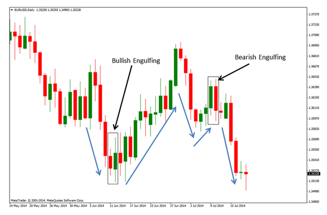
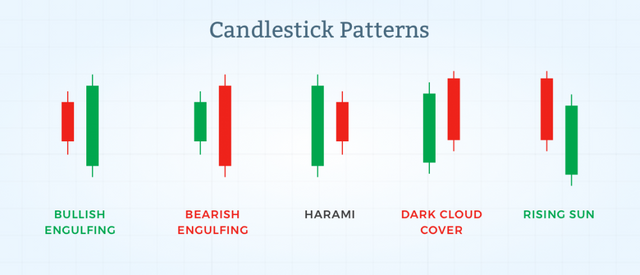
Bullish Candle
The bullish candle is a representation of an impulse sentiment in the market that is responsible for indicating the change of action of a bearish asset towards a bull market in price. Bullish candles are identified by their body color (green or white), which indicates that there is a buying pressure in the market. In other words, the bullish candles are patterns that appear when the value of the asset goes down and indicate that the asset value is at a point of a reversal of the current trend in the market. Candles are one of the most beneficial tools for the investor, as it provides information that the trend is gaining strength in the market.
The Opening price; It is the part where the structure of the candle begins where it indicates if the price is rising in a set period.
Minimum Achieved; It is the representation of the price that has reached a value in a certain time.
The Body of the candle; It is the trajectory of the value of the traded asset in a period of time that is manifested in the candle.
Closing Price; It is the point where a price close is generated in a set time frame.
Maximum Achieved; It is where the price has reached its highest bid of an asset in a specific time frame on the candle.
Shadows or highlights; It is nothing more than the price trajectory between a high or low point, as well as the opening and closing of a candle.
Keep in mind that Japanese candles tell us what has happened to the value of the asset in a given period. In other words, if we use an analysis of the graph in a period of 1 hour, this means that each candle on the graph is a reflection of 1 hour, which will provide us with information about what has happened in that time frame.
Bearish Candle
The Bearish Candles is the reflection that occurs when an uptrend in the market is culminating. It is usually the reflection of a drop in the market price, which involves a decrease in the value of the asset and a change in the current trend. Many traders use candles as a guide to understand when is the start of a downtrend in the market. With bearish candles we can identify when an asset is controlled by sellers, since these candles are identified in red or black which indicates that there is a decline in the trend.
The body; It is the thickest structure, which is identified with color, which indicates the fluctuations that occur between the opening of the price and the closing of the price of an asset traded in the market.
The Shadow or the wick; They are the lower and upper lines that stand out from the candles, which are responsible for showing the path that the price made in a given period, indicating the maximum and minimum points of an asset.
According to the length of the shadows or wicks of a candle, it can be identified if the market trend is gaining strength or losing strength
Candles set with long shadows is a signal that there is a possibility of a reversal in the current market, while a candle with short shadows signals a strong price trend.
The colors of the candles; They are responsible for showing if a trend is bullish, bearish or if the value of the asset is increasing or weakening.
The Opening price; They are reflected once the closing of a previous candle occurs, where then a new candle begins to build, it is the beginning and the closing point of a previous candle formed.
The closing price of a candle; It is the representation of the highest point of a candle, if we are talking about a bullish candle. While the bearish candle, it would be reflecting the lowest level of a candle. From this level in normal situations, it is the start of a new candle.
The maximum price of a candle; It is the representation of the maximum point that the asset value reaches in a given period. The value of the asset fluctuates and signals a maximum at the limits of highlights or shadows.
The minimum price reached; It is the representation of the lowest point that the value of an asset has reached in a specific time frame. The value of the asset fluctuates and indicates a minimum level at the limits of a wick or shadows.