Logo Design Proposal for PYSearch

Repository
https://github.com/ko1o/PYSearch
Linked Task Request
Details
PYSearch is a project which has function as an elegant search controller or tools which replaces the UISearchController for iOS platform like iPhone & iPad.

![]()
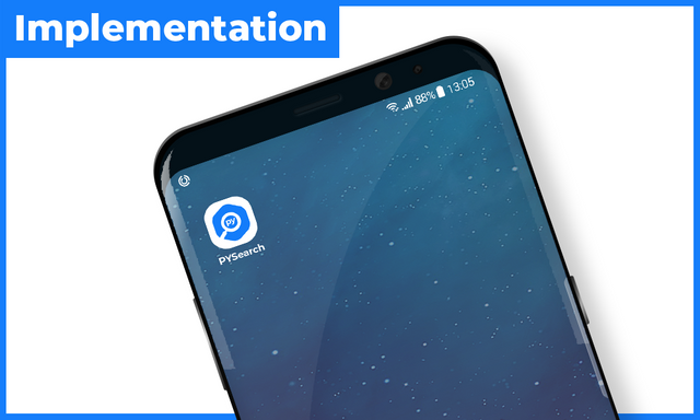
Alternative Version
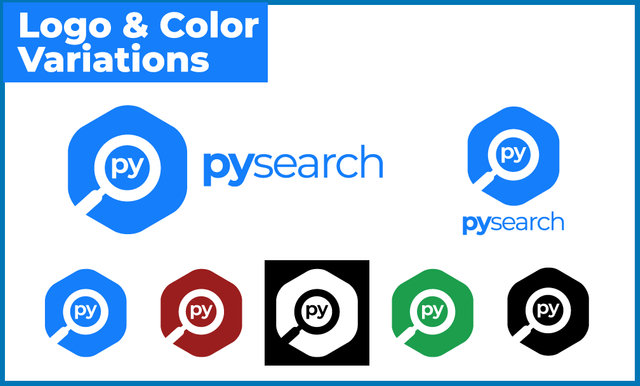
I proposed two logo designs for the project owner. So, the project owner can choose which one they prefer to use in their project between the two logos. This is the another logo proposal.

Benefits / Improvements
Using this new logo has many benefits, there are:
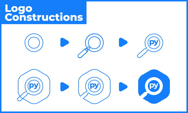
- This logo showing the 'PY' initial as identity of this project.
- This logo showing lup element as search idea and it's the main idea too
- This logo combining 'PY' initial and lup elements uniquely.
- This logo has flat, simple, and eye-catching design.
Proof of authorship
Tools
Using Adobe Illustrator CS6 to create the logo and presentation.
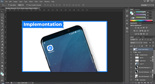
Using Adobe Photoshop CS6 to the mockup.
Original files
Proof of Work Done
https://github.com/anharismail
License

This work is licensed under a Creative Commons Attribution 4.0 International License.
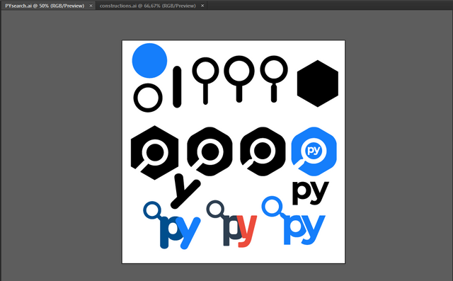
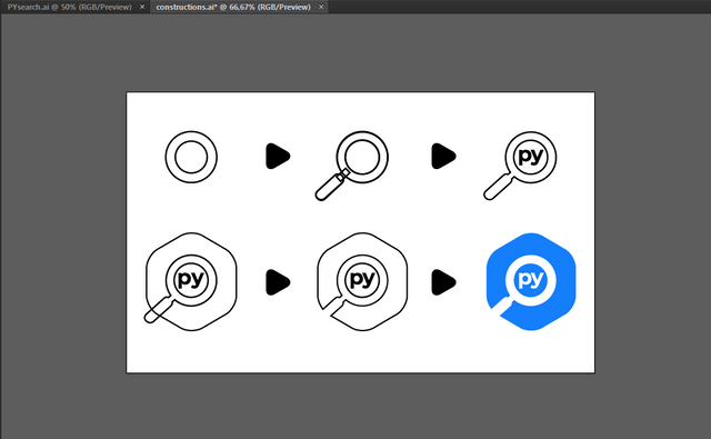
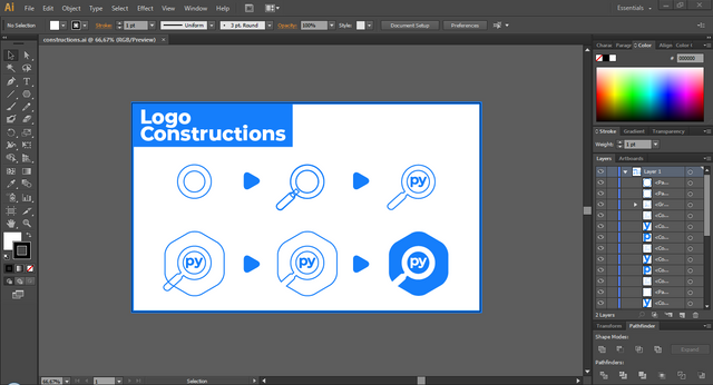
Hey @anharismail
Thanks for contributing on Utopian.
We’re already looking forward to your next contribution!
Want to chat? Join us on Discord https://discord.gg/h52nFrV.
Vote for Utopian Witness!
thank you for your contribution.
it seems like the magnifier is not perfectly centered, i don't know if it intentional or not but it make the logo unbalance.
Your contribution has been evaluated according to Utopian policies and guidelines, as well as a predefined set of questions pertaining to the category.
To view those questions and the relevant answers related to your post, click here.
Need help? Write a ticket on https://support.utopian.io/.
Chat with us on Discord.
[utopian-moderator]
I think when I designed it, I've adjusted on the centered. And in my opinion, I look you put the black line its not on center too, Mod.
Dont know what's wrong with it.
Brother, sorry for butting in but I think he's talking about the top and bottom spaces :)
Oh, I got the point. Thanks @tobaloidee
Thanks for the moderation, Mod @nilfanif.
@anharismail you were flagged by a worthless gang of trolls, so, I gave you an upvote to counteract it! Enjoy!!