Logo Design | TelePost
Hello my friends, this was my contribution to the TelePost App project.
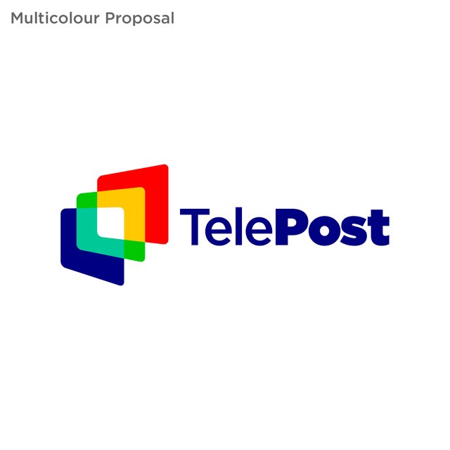
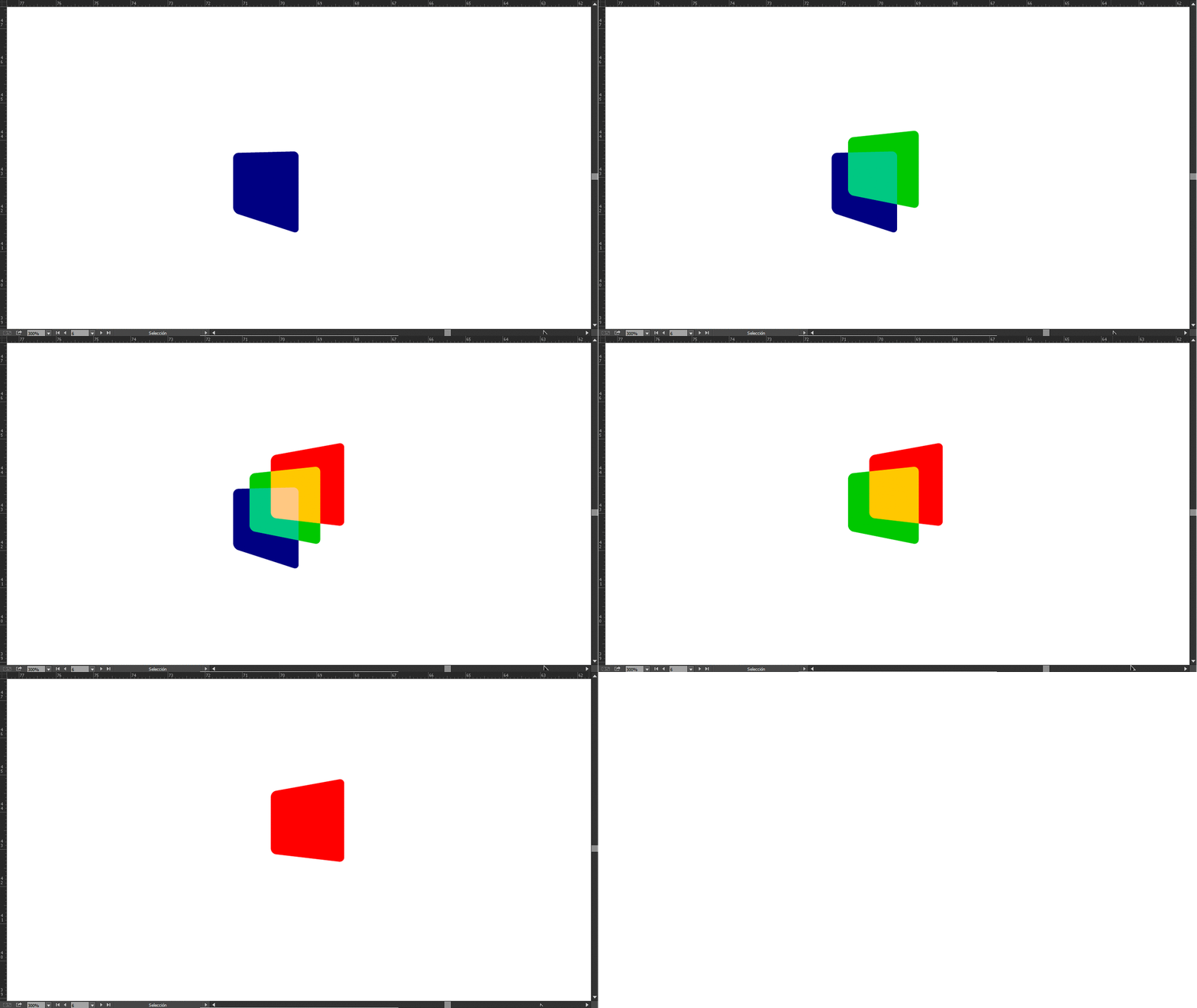
I presented different options of the same design changing elements such as color, overlapping colors and also a proposal of simple lines.
Although it was not selected by the project owner, I share it with you so you can give me your feedback and comments.
I must tell @hitenkmr that this design can be used in the future in his project if he wishes without any limitation on my part. Attached here is the original project file.
About the concept
- The layers are a representation of news (layers of information) in a digital form.
- Colours represent the thematic diversity of the news.
- The superimposed layers create an illusion of movement and dynamism, adding possibilities to generate animations and applications that improve the user experience. As an example, this icon can be easily animated in the app to signal the transition from one news item to another.

This work is licensed under a Creative Commons Attribution 4.0 International License.
Nice... I like the simplicity of the design...
Thank you very much for your comment @marlon241982 :) I'm always trying to make it clean and neat.