[UI/UX] Vote Button Design - Idea / Redefining / Reduction - inspired by @deepsynergy

UI Vote Button Redesign (playground)
I was playing with some ideas i got in mind after reading a user post here some days ago
I got inspired by an idea of another community member @deepsynergy
-.-.-.-.-.--.-.-.-.-.--.-.-.-.-.--.-.-.-.-.--.-.-.-.-.-
Introducing STEEM POWER & STEEM DOLLAR Symbols
-.-.-.--.-.-.-
thank you
draft by @deepsynergy
-.-.-.-
Source
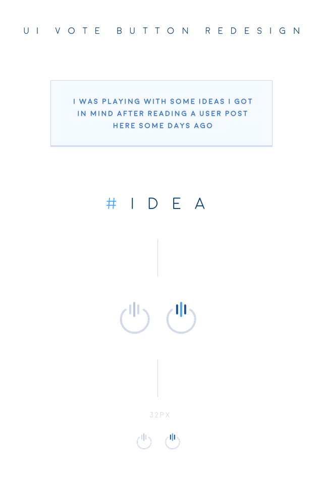
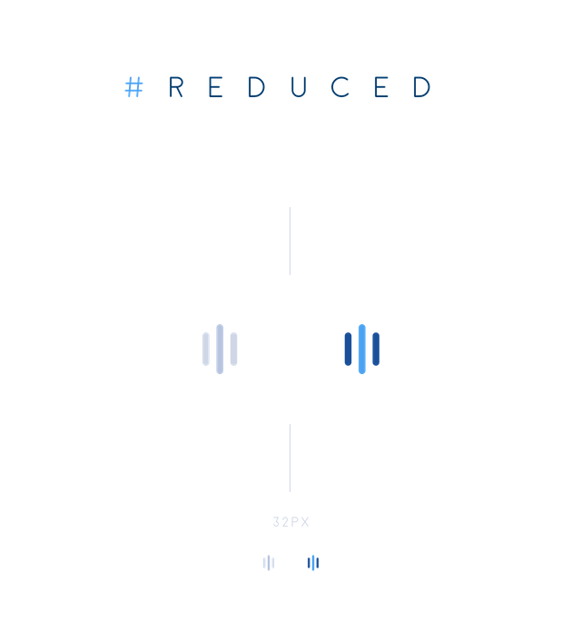
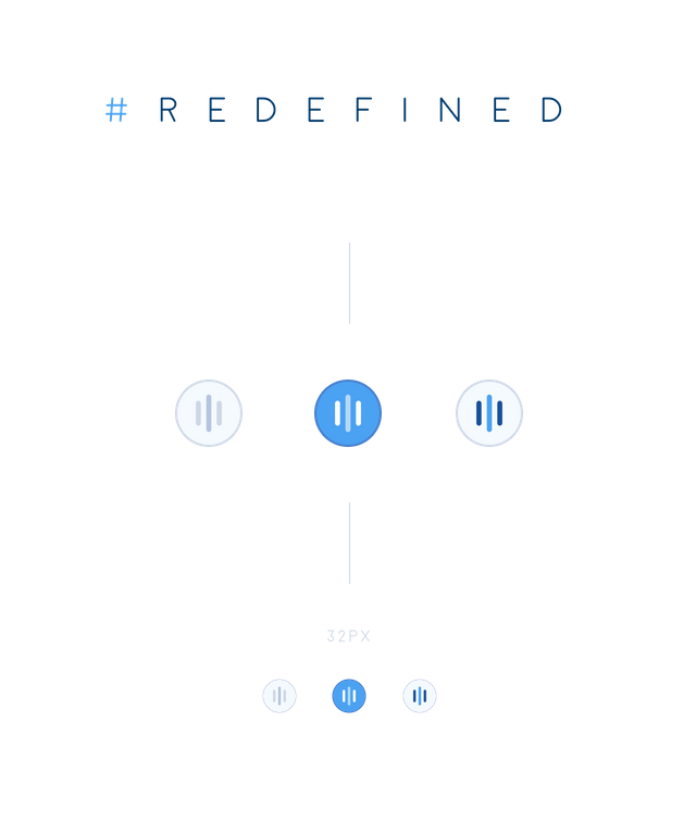
alternative presentation & examples
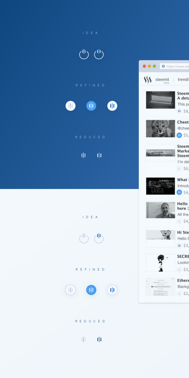
and in presentation format - standalone
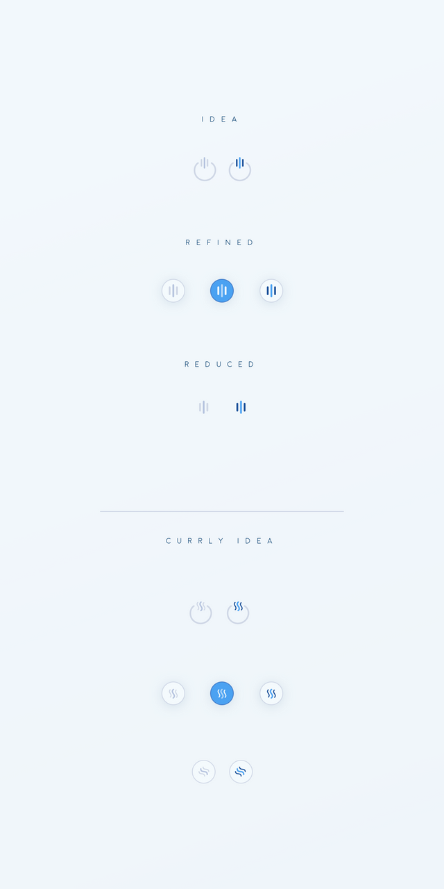
I would love to get feedback from U - the community about and maybe we can polish or tweak things together.
Also i'm happy to be able to have such a transparent way of talking about Ideas, Design approaches and much more.
Feedback well appreciated
I want to encourage everbody with some ideas and thoughts, feedback etc.
please use the comment section for your feedback.
Thanks in advance
Happy Steeming
(Please try to avoid cross posting your articles in comment section!
I won't vote for any NOT directly topic related posted link - Thanks for your understanding)
Hi @cass they are all great but I like the reduced option best, its just my style in general.
Simplicity :)
#takeiteasy
i'm with you ;)
Agreed.
This yes :)
I really like these, I feel the arrow is redundant and generic so this is a great alternative. I took the liberty and tried them in my mobile app UI mockup.
nice!
I love your reduced version most (the one with the original colors)! Its powerful. And thank you so much for the monetary support! It really helps!
Welcome!
I wanted to link to your post from my original one, but it seems I can't edit my post anymore. I had an impression that you can edit your poss for 30 days, but it seems its just few days ...
Honestly, they're all awesome, hope they add one asap. great job as usual :)
I really agree with what you're talking
Really nice work! I think the very first example is awesome and I love the last two reduced and refined, examples.
Absolutely fantastic! :-D
Cg
Love your posts @cass and think your work is great. Keep it up, the platform can only benefit from incorporate some of your designs.
Note for whales... I know you're just showing love and support however upvoting under 5 minutes of the post going up disincentivises the rational (smaller) curator from upvoting these posts.
I love the design, but I think I'm against using it as an 'upvote' button. I don't think it's intuitive enough for the new user to know that's the button they click when they like something.
Over time (once there are millions of users) this could be a viable change to the site, but as a new site, you really don't want to add confusion to the UI.
I've grown fond of the solid blue background of an upvote. I like the straight lines of refined more than the curly ones.
Very very cool ideas you got there , hopefully @ned and @dan approved it .
Maybe make a "lighter" website will help too , current website "slaughter" my internet data 1-2GB per day . that really crazy .
Sry, not sure if i get u right? Are we talking about Site loading speed,right? Ok, i'll happily forwarding your point! Thanks for you input.
I clear with everything you wrote above , but if that thing will cost more internet data to load this site up , people in asia mostly in my country malaysia , we got big internet bill to pay every day . i spend average myr10 for 500MB internet data everyday here . I hope you can help us to voice it up . you have bigger steem power people will see you more clearly than me . :) thank you .
i dont have idea anything for steemit