This is what Steemit Homepage Layout should roughly look like - rough draft!
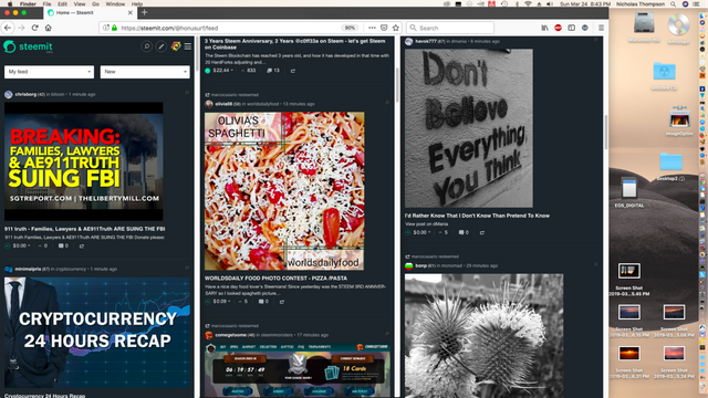
I was just cleaning my desktop and fiddling with some windows and noticed how the post thumbnails zoom so well when I shrank the browser size.(for mobile)
This got me thinking that this would be a better look with larger thumbnails! Even better if one day we could just click the image to upvote?
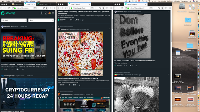
This is my desktop. Here is the current steemit layout below, expanded to the fullest it displays the same 6 posts, but lots of ugly wasted white space!!?
Big waste of precious homepage feed virtual real estate! lol no wonder steemit steem is only 40 something cents!
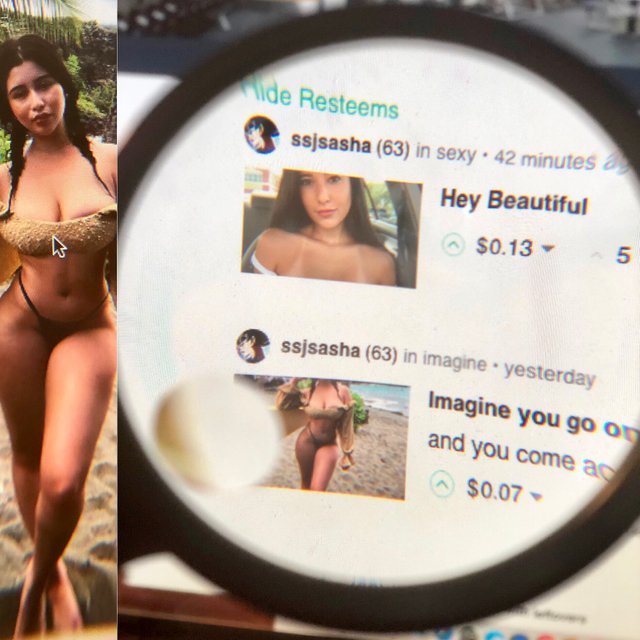
Hahaha, I'm waiting for you to clone
Uh oh. ssjsasha comes in the end looking fantastic