Logo Designs for NiftyNet
Details
NiftyNet is a TensorFlow-based open-source convolutional neural networks (CNN) platform for research in medical image analysis and image-guided therapy. NiftyNet's modular structure is designed for sharing networks and pre-trained models. Using this modular structure you can:
Get started with established pre-trained networks using built-in tools
Adapt existing networks to your imaging data
Quickly build new solutions to your own image analysis problems
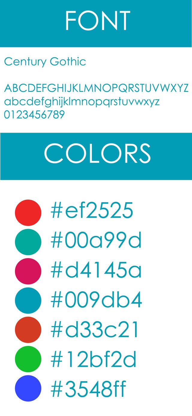
Font Download Here
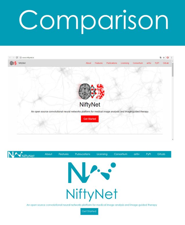
Benefits / Improvements
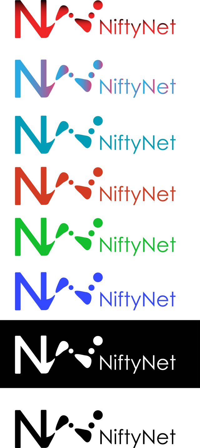
This is a totally original logo.
It is modern which helps its easy recognition and attracts in a friendly way compared to the old one in which the dea is overloaded. This gives great benefits to be much more current with more personality.
Tools
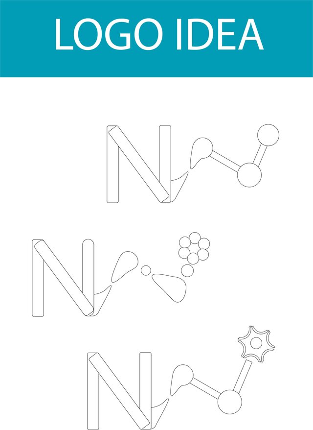
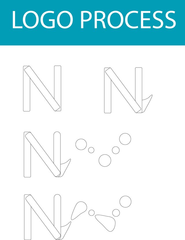
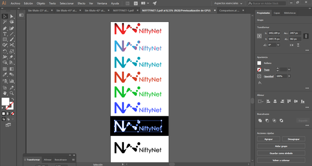
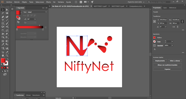
Using Adobe illustrator CC 2018 to made creation logo process. here is screenshoot to proof my work about this logo.
Original files
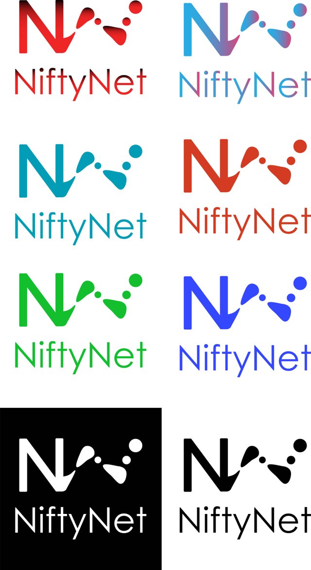
The following is a file about logos that can be used for projects. I enclose the logo in usable PNG, AI and PDF files.
Posted on Utopian.io - Rewarding Open Source Contributors
Your contribution cannot be approved because it does not follow the Utopian Rules.
you should stop copy/pasting link
I don't see any geometry behind those shapes, no clean or etc..
You can contact us on Discord.
[utopian-moderator]
I do not think this is a strong and valid reason for not approving a post friend if it is that you can say so, it is simply a minor correction and I appreciate reconsidering my approval.
I already modified it, and by the way there is another person that uses those tags for their design works that I admire and I do not see that they tell him something to place the benefits in that way. If you see the link that you placed correctly, not all of them are my works, should be more attentive to what you say sir.
And your presentation was misleading so I judged upon that. Your changes not going to change my desicion.
there are no benefits?
Did you really see the old logo?
Are you really objective?
deceptive in what way?
Then by your temporary whim you will not approve me?
Thank you for being such a considerate sir, I see that you at least have an education.
Happy day to you :)
Propose to project owner, get merged, then I'll approve.
Don't ever try to attack me again!
Glad you chose to stay with the cyan. It fits well
Thank you very much for your appreciation friend. If it is a much friendlier tone for the user in NiftyNet. Thank you.
Congratulations! This post has been upvoted from the communal account, @minnowsupport, by 7kalte from the Minnow Support Project. It's a witness project run by aggroed, ausbitbank, teamsteem, theprophet0, someguy123, neoxian, followbtcnews, and netuoso. The goal is to help Steemit grow by supporting Minnows. Please find us at the Peace, Abundance, and Liberty Network (PALnet) Discord Channel. It's a completely public and open space to all members of the Steemit community who voluntarily choose to be there.
If you would like to delegate to the Minnow Support Project you can do so by clicking on the following links: 50SP, 100SP, 250SP, 500SP, 1000SP, 5000SP.
Be sure to leave at least 50SP undelegated on your account.