Portrait studies 54
Hello everyone! I hope you are having a wonderful weekend. I'm stopping by to share with you another one of my finished illustrations. This time it's a portrait study, which I think is a very interesting subject and one that I would like to improve a lot more on.
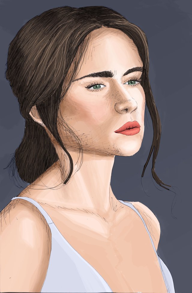
For this portrait I took a photo from Pinterest as a reference to create the base of the drawing but I didn't try to represent the image partially. The technique used is mixed media, I applied the line art with pen on paper and then scanned and colored it in Photoshop.
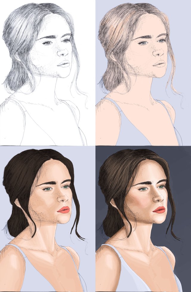
A little bit of the process.
I seek to develop my own rhythm and style of applying materials and techniques to obtain results that I feel comfortable with.
Well friends this has been all for this post. Soon I will be sharing with you once again. Thanks for your attention.
Beautiful work. In my opinion, the pen marks are not needed in this case, they look like she has a beard.
Hello yes you are right, it is one of those experimental things where you don't get a good result but you still learn, in this case what not to do XD. Greetings, Thanks for your opinion =)
Indeed. I had these experiences so many times, and I still do every now and then. It is better to try and fail, than not try at all.
Nice portrait. I agree with @ranartblog, hatchings are good for sketches and monochromic stuffs, but here, as you have paint your portrait in colors with shadows and volumes, the hatching is too much, you should have accentuated the shading with a darker colour instead.
This is a good work anyway!
I agree with @pipoune about agreeing with me :o)
Once again, good artwork.
:D
This is great work @essendi.