DESIGN COLOR TRENDS 2018 ACCORDING to IDS (International Design School)
Speaking of trends, color is one of the things that is constantly changing. Starting from techniques that are bold, bright colors, pastel and neutral colors assortment. Thus, in the year 2018, this color change whatever the hell are there? How color trends? Here's more!
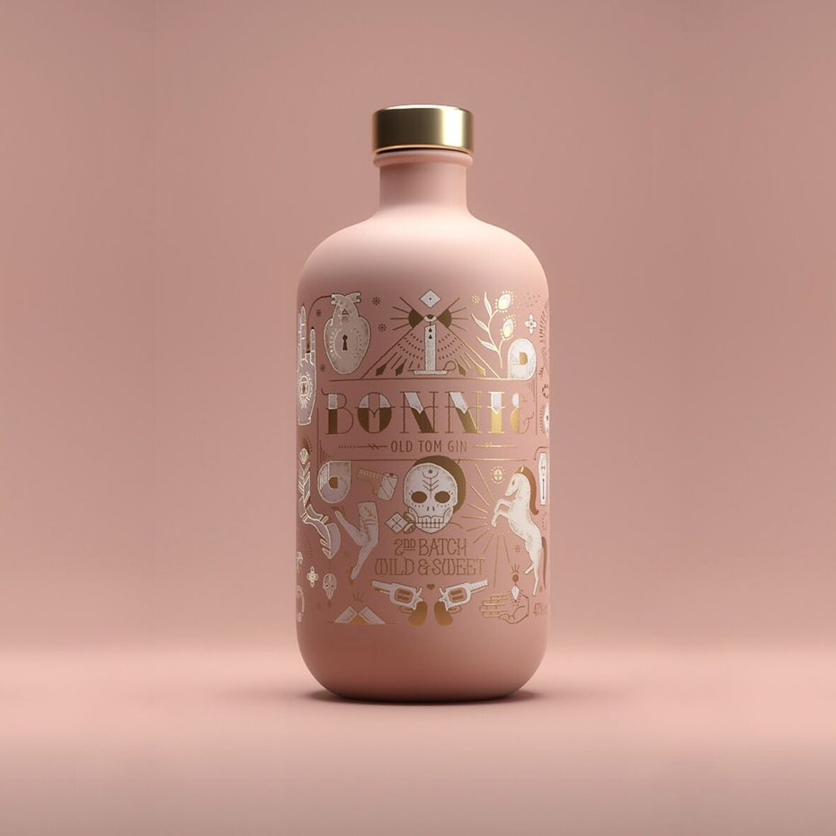
- Practical Pink
Pink has been one of the most common colors and often became an icon of women. The popularity of the color pink so quickly in the world of design, and so in 2016 is known the existence of the color "Pink millennial doctrines". Millennial doctrines Pink is pink color that evolved and developed into ashy rose color and a salmon color. However, when Pantone Color Institute (the Global Authority on Color) gives the pallete color called Rose Quartz color and Serenity, many observers claim the pink trends have peaked and will continue to evolve.
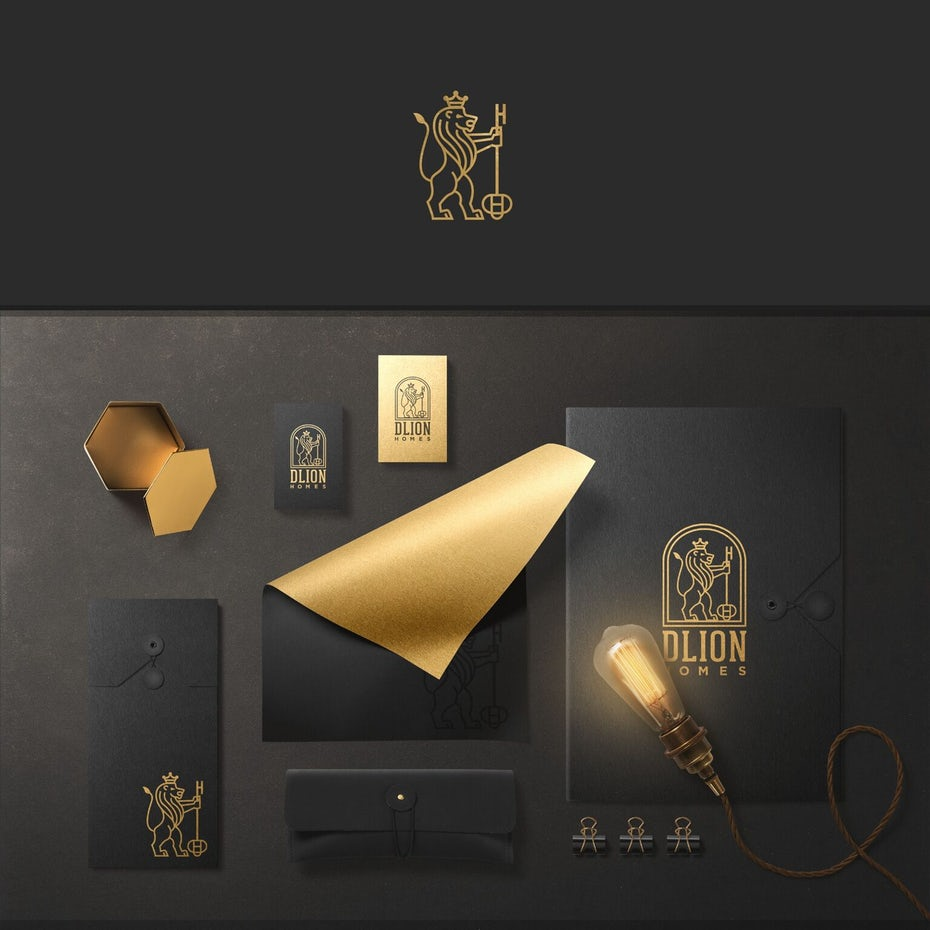
- Metalik
According to Leatrice Eiseman, Executive Director of the Pantone Color Institute, in the year 2018 metallic colors are classic Middle switch to neutral. Metallic colors are standard in fashion and interior design because it has the unique ability to combines with a wide palette of color and design trends. Metallic colors impressed gives an impression of opulence and has recently gained popularity in the design of visual brand, such as fashion, beauty, and lifestyle to evoke aesthetic trends as well as the identity.
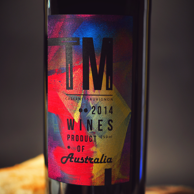
- Bright and Bold
Bold color has become the trend of web design and applications for many years and will continue to exist in 2018. As the movement from flat design, the introduction of a dynamic palette on google in the year 2014 is increasingly strengthened this trend and make it the standard in the new media. Because of the flat design changes, the use of bright colors and the introduction of modern gradient recently will update this trend.
While bold colors are also making appearances are more prominent in digital design. PANTONE announced a few choice views in the edition of the PANTONE ® Fashion Color Trends for spring of 2018 in New York Fashion Week showing bright colors like Meadowlark, Cherry Tomato, Ultra Violet, and Lime Punch.
- Pantone Colour
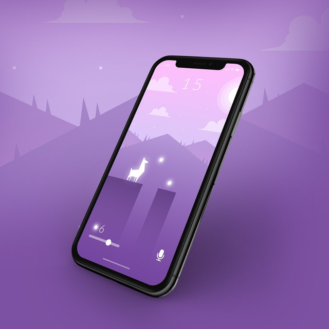
In 2018, Pantone selects color ultra-violet. The color was regarded as provocative and dramatic color. UV can communicate authenticity, and thinking ahead.
"Color that helps us think to the future," says Leatrice Eisman, Executive Director of the Pantone.
Pantone color choice may seem shocking to some, but the designer digital media watched color violet a life has become a popular choice in the last few years, especially in web and mobile application design. With the status of "color of the year", we can predict this trend will increase in the year 2018.
- Modern Gradients
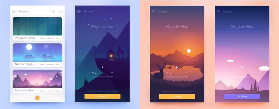
The current gradient techniques are popular again as the development of semi-flat design styles and predicted to be one of the largest graphic design trends this year. The design of the spring flat (a.k. a. "flat 2.0"), combines the best features of style flat design with some enhancements, such as gradients and shadows to enhance the functionality and user experience. Some examples that use this color trend, like Instagram, Spotify, and Stripe.
It's her color trends is still a few hits and used in the year 2018. If you think you, a trend the number how many of the most interesting? Or is there another color trends that have not been mentioned? The comment below !
Reference :
Dear friend, you do not appear to be following @artzone. Follow @artzone and get added to our voting list for valuable up-votes!
owh, I apologize. because I do not know about this, I now follow the artzone.