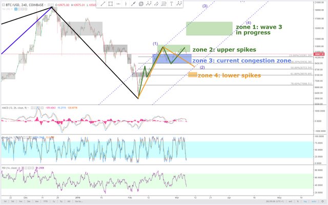
Bitcoin daily 6. mar preparation for the bull market
The orange trend sections have not been proven to be as drawn in the chart. Yet this is what it will pretty much look like when the bull run has begun.
The sinking price we see currently is just intermediate wave (2) comming to its completion.
The oversold stochastic of this 4-hour chart suggests that long positions should be taken this week.
The retracement levels mark where the price can still be falling to.
Zone 4 is at the 61.8% retracement line. It should be taken into consideration as a possibility before wave 3 begins.
Usual disclaimer ! This is what i see and do. This is no advice or suggestion to follow what i write.
Description of the drawing usage:
All boxes in diagrams are congestion zones.
Grey boxes are congestion zones from the past. They are the footprints of a market. They act like magnets, making the price prone to revisit them, even in a bull market.
Present and possible future congestion zones are drawm as colored boxes.
Colored slanted lines are trend sections of various time frames.
Colored horizontal lines show when an equally colored trend section is completed for sure, once the price touches such a horizontal line. They are support and resistance levels.
Colored vertical lines which range from top to bottom of the chart mark the end of time frames. Once the price reaches them, an equally colored trend section must have completed already.
Time frames are shown as a scale of vertical lines on daily charts usually.
