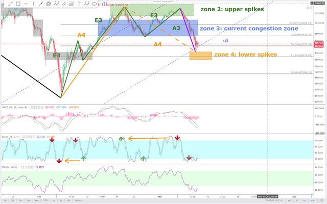
Bitcoin daily 9. mar the final dip ?
Into the 4-hour chart levels of evidence (E3) and levels of assumption ( A4 ) are drawn.
The stochastic shows when orange trend sections terminate. The oversold and overbought areas of the stochastic correlate with the green trend sections quite well.
Currently we need to wait for another overbought stochastic, followed by an oversold stochastic where a green trend section marks a higher low. This will end the currently regressing orange trend section. And it will also be the end of intermediate wave 2.

Usual disclaimer ! This is what i see and do. This is no advice or suggestion to follow what i write.
Description of the drawing usage:
All boxes in diagrams are congestion zones.
Grey boxes are congestion zones from the past. They are the footprints of a market. They act like magnets, making the price prone to revisit them, even in a bull market.
Present and possible future congestion zones are drawm as colored boxes.
Colored slanted lines are trend sections of various time frames.
Colored horizontal lines show when an equally colored trend section is completed for sure, once the price touches such a horizontal line. They are support and resistance levels.
Colored vertical lines which range from top to bottom of the chart mark the end of time frames. Once the price reaches them, an equally colored trend section must have completed already.
Time frames are shown as a scale of vertical lines on daily charts usually.