SEC S19W3 || Animation, Transition & Transform (HTML5+CSS3)
Today, I’m excited to share a fun project I worked on: creating a dynamic image gallery using HTML5 and CSS3. The goal was to design a gallery with a stylish Polaroid effect, where each image has its unique rotation. This not only enhances the visual appeal but also adds an interactive touch with smooth hover animations. So let’s dive into the details of how I built this.
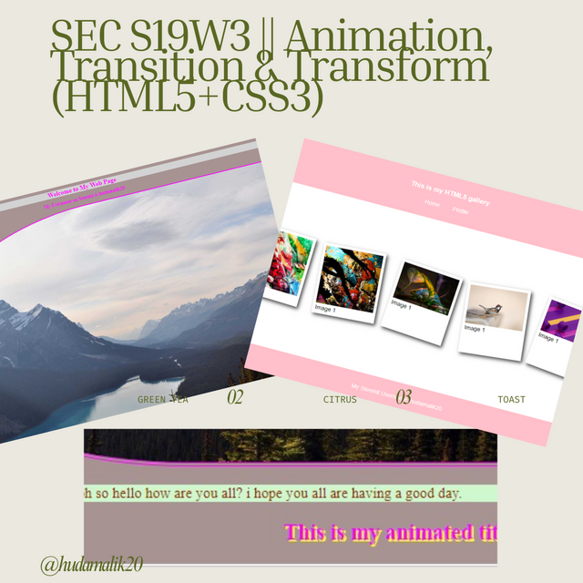

Homework (Exercise 1)
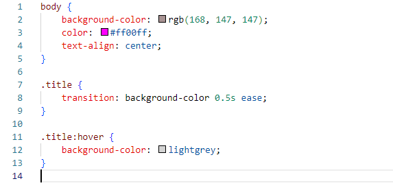
Apply a Dark Gray Background and Fuchsia Pink Text Color
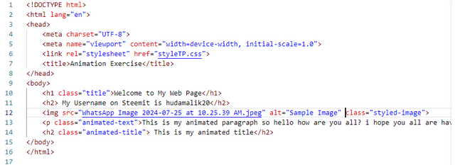
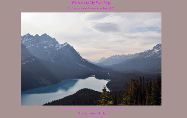
I started by setting a dark gray background for the entire document to create a neutral and stylish backdrop. The text color was set to fuchsia pink to provide a vibrant contrast, making the content stand out. To keep everything aligned and tidy, I centered all the headings.
Hover Effect for Page Title
To make the page title interactive, I added a hover effect that changes the background to light gray. This subtle transition draws attention to the title when the mouse moves over it, enhancing user interaction.
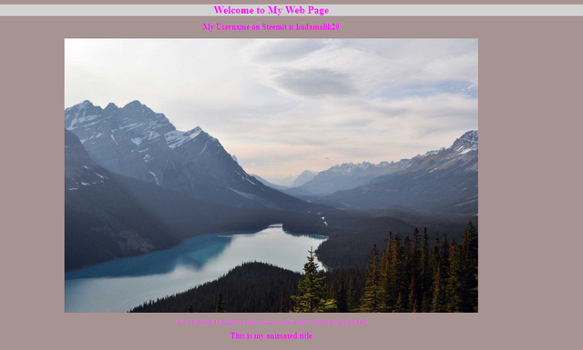
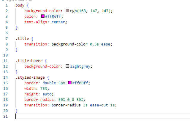
Image with Double Fuchsia Border and Rounded Corners
I added a decorative double fuchsia border around the image, setting its width to cover 75% of the available space. The image features uniquely rounded corners at the top left and bottom right, creating a visually appealing design.
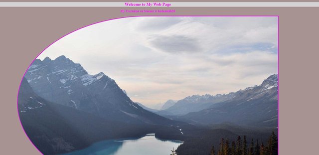
Image Corner Animation on Hover
To add more dynamic elements, I implemented an animation that changes the rounded corners when hovering over the image. This transition shifts the rounding to the top right and bottom left, providing an engaging effect.
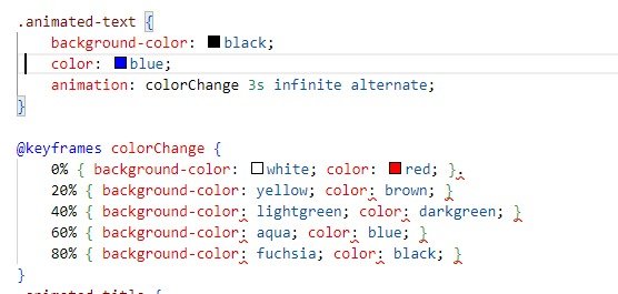
Text Color and Background Animation
For the paragraph text, I created an animation using keyframes to cycle through different background and font colors. This adds a lively, changing effect that makes the text visually interesting.

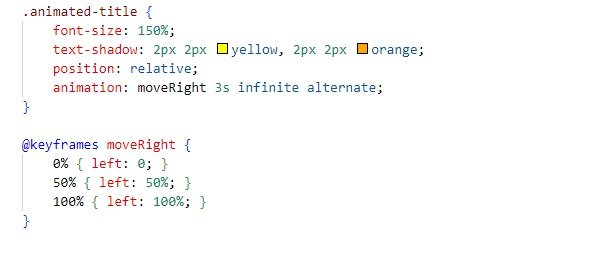
Title Alignment Animation
Finally, I applied an animation to the last title, making it shift alignment from right to center to left. This movement, combined with a shadow effect, gives the title a dynamic and stylish appearance.

Exercise 2
So let me shared how I accomplished Exercise 2 for creating an image gallery using HTML5 and CSS3:
My HTML Layout
Header and Footer: I set up a header and footer to organize the content and provide a clean structure.
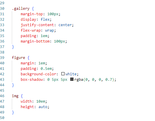
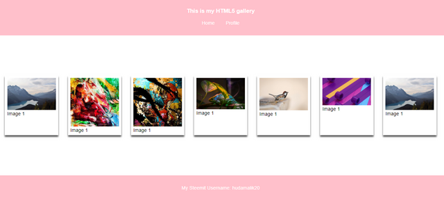
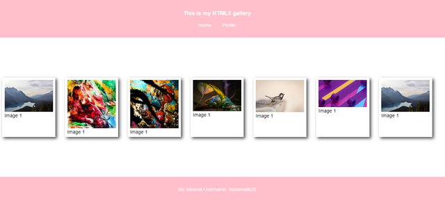
Image Gallery: Used a div container with the class gallery. Inside, each figure element holds an image. This setup allows for easy styling and manipulation.
Captions: As it was mentioned in the contest post, I used figure tags for potential future use of captions.
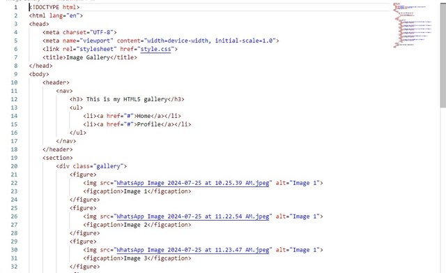
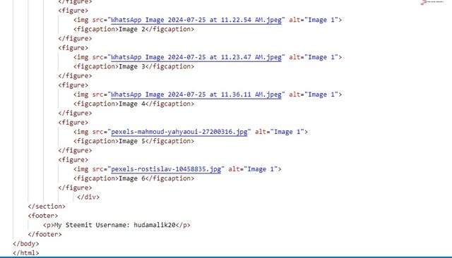
The gallery class will acts as a container for aligning and styling all images consistently.
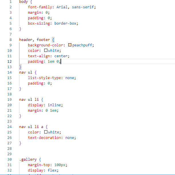
2. CSS Styling
I tried to set a consistent font and removed default margins and padding to ensure a clean layout.I used Flexbox for the gallery to align images in a row and center them, with wrapping enabled for narrow screens.
For Styling:
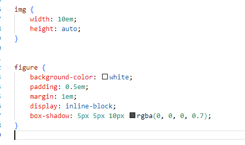
I added a white background and shadow for a Polaroid effect.
Then applied a transition for smooth changes when interacting with images.
3. CSS Shading
Background Color: I added a white background to make images stand out.
For Box Shadow: then I created depth with a shadow effect, giving images a floating appearance.
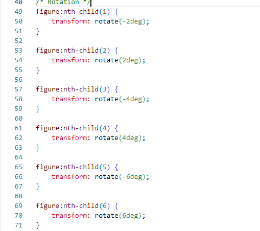
4. CSS Rotation
I used nth-child as I was mentioned in the post and used if them then to apply different rotation angles to each image, creating a playful staggered effect.
then I added a hover effect to reset rotation and enlarge the image interactively.
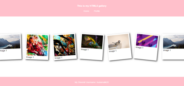
Each image appears uniquely tilted, adding visual interest. On hover, the image scales up and rotates to its original position for a dynamic feel.
5. CSS Animation
As it was mentioned I applied a transition for smooth enlargement on hover, making images more interactive so I applied this and in this the transition ensures that the enlargement effect is seamless, enhancing user interaction.
So these were the steps I took to create the image gallery, from setting up the basic structure to adding advanced CSS effects and final result is here.
That's it from today's blog I hope you will like it. With best wishes ❤️. Now I like to invite @steem4u, @abdullahw2 and @mateenfatima to participate in this amazing contest.
@kouba01 ,@starrchris respected teachers 🤗🌼🌸💖.
Thanks alot for reading ❤️🤗 .
My introduction post



Thank you, friend!


I'm @steem.history, who is steem witness.
Thank you for witnessvoting for me.
please click it!
(Go to https://steemit.com/~witnesses and type fbslo at the bottom of the page)
The weight is reduced because of the lack of Voting Power. If you vote for me as a witness, you can get my little vote.
Upvoted. Thank You for sending some of your rewards to @null. It will make Steem stronger.
Greetings dear friend. Your try to achieve this task Fabolous. In first task you change little bit animation and transformation. But it's look great too. Use of different combinations and animation make the layout perfect and is user friendly. They way of making videos and share on YouTube then embedded link here is the perfect way to show the output. I appreciate your hard working. This is the main part of website where we can design our layout in different ways. So i wish you more success. Keep growing up with steem.
Thank you so much for your kind words and encouragement. I'm glad you liked the animations and transformations. I appreciate your feedback on the video approach it's been a fun way to share my progress. Your support means a lot, and I’m excited to keep growing and learning on Steemit. Wishing you success as well🤗🌸💐🌺💖
It is a must that anyone who read your write up will definitely know how to develop a webpage because of how well you have presented your work for people to learn. I admired your writing skill. Good luck to you.
Thank you so much @josepha for going through my post and for your comment 🤗💞💐.
Wow, what a very beautiful work you have presented here on the topic Animation, Transition & Transform (HTML5+CSS3). You sure are very good in programming because your work is well structured. I wish you success in the contest.
Thank you so much for your kind words. I'm really glad you enjoyed my post on Animation, Transition & Transform. I put a lot of effort into structuring it, and your encouragement means a lot. Best of luck to you as well 😊.
Hello ma'am. Greetings to you
I'm some Happy to dissect every paragraph of your work and learn basics on CSS styling. Your work look spectacular and on point. Hopefully I get to be good as you.
Best wishes
Asalam Alikum @hudamalik20, Umeed ha ap khariyat sy hngi...
Ap ka code achy sy documented kia hoa ha jis sy samjhny me asani ho rhi ha... Exercise 1 me choti bt me btana chahon ga agr ap mind na kren jisy ap abi thk kr skti hain wo border corners hain jo dono opposite sides pe hngy aur hover krny pe dosry sides pe chaly jaen gy... mtlb top left bottom right shuro me aur hover pe top right bottom left ho jaen gy...me ne b assignment krty hoa galat read kr lia tha then dbra parha to pta chala dono aik side pe ni opposite side pe krny hain...
Exercise 2 me ap ne div use ki ha jis me figure aur figcaption ko div me put kia ha ta k code well structured lgy aur parhny me b asani ho rhi ha... Ap ne last me output share ki ha video k through jis me saaf pta chal rha ap ne homework complete kia ha aur mehnat ki ha. Mjhy ap ka code well structured lga aur output of exercise 2 homework k according bnai ha. Me umeed krta hn hm sb in lessons sy improve hoty jaen gy InShaAllah. JazakAllah :)