HardFork Series - VPN Final - 3D Model Design

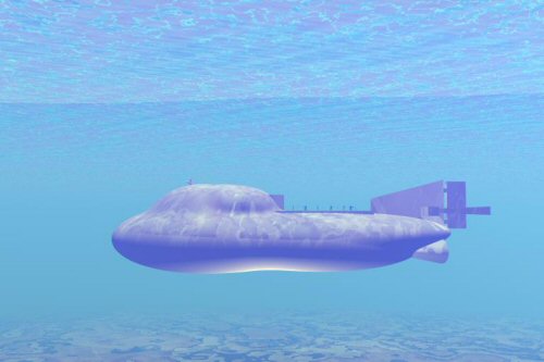
It has taken me about one week to get this together where I'm reasonably comfortable with the results. Moving forward if it needs anything it will just be tweaking of the base model. I'm relatively sure this is pretty close to what the series is looking for in terms of size and appearance.
.png)
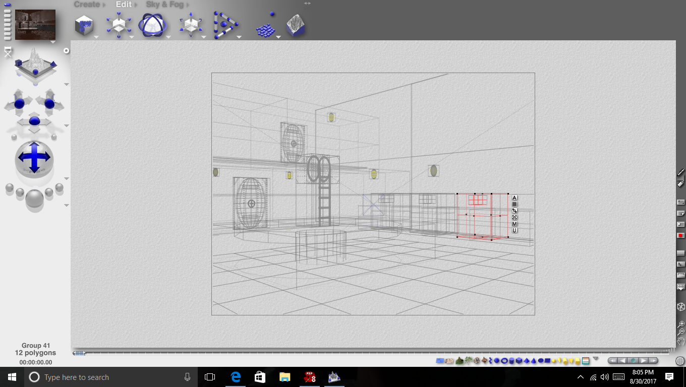
This is what the model looks like while I'm working
on it. I can move the camera about to see from
all angles including above and below. This helps
to keep the symmetry and diameters correct.
There are over 70 shapes in this model and about
20 groups with rails, rudders, etc. It is a very time
intensive process.
.png)
This is the shape of the sub rendered with no
materials or meshes. Rendering can take quite
a while depending how involved the model is.
A bare model only takes a few seconds. it is
necessary to render many times during production.
In my opinion It is best to save materials till the end.
.png)
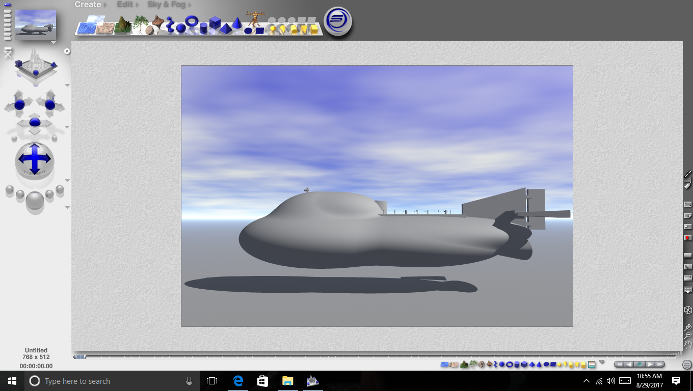
I create an underwater scene and add lights
to see how the sub will look in that environment.
Still no materials but adding the lights raises render
time to minutes instead of seconds. I decided at this
point that I was NOT going to add any materials to
the model and opted instead to 'hand' paint it in
Paint Shop.
.png)
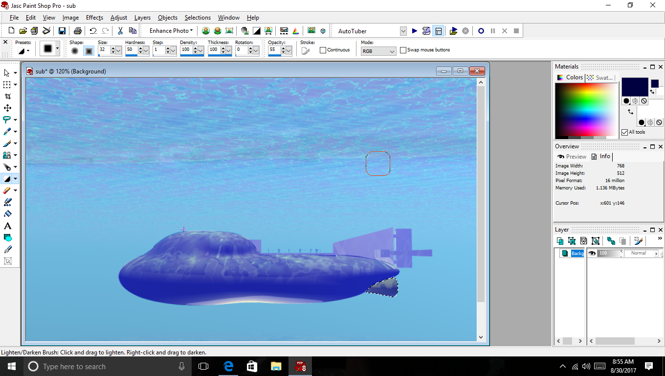
Paint Shop allows me to see the whole picture while
I'm painting it. I can focus on one specific area and
see how it relates to the whole. Materials in Bryce add
varying degrees of texture and depth which create a
more 'realistic' work but you must go into the wireframe
to add them then render to see the effect and adjust. It
can become a nightmare! I felt that Paint Shop would
work here. Look at the next photo and you be the judge.

.png)
I also attempted to do an interior model of the
common area in the sub. Interiors are their own
special brand of hell! The lighting alone is the stuff
nightmares are made of. Literally! I missed the mark a bit
and got a very eerie feeling picture. Still you get the gist.
See the picture below.

As I mentioned this is the common area of the sub.
I have neglected a lot of details here like chairs, rails
on the upper level, etc. I put the lights in wire 'cages'
which resulted in the excess shadows and I didn't
raise the intensity enough which give the picture
that slasher movie feel. About the area: The door
above goes to the bridge. I had every intention of
adding a window to view in but by the time I got the
floor in I was drained! The door below goes into
communication. I added the big round table at the
end as a kind of homage to The 12 and the Knights
of the Round Table graphic I seen in an earlier
HardFork post. From where we are with the camera
there is another door that would lead to the
private quarters, galley, engine room, sickbay, and
all other areas not mentioned.
Any comments, critiques, or opinions are always appreciated. I am still very intrigued with the HardFork Series and the scope of possibilities it inspires. I look forward to any/all updates.
You can check out the latest news and updates
on the Hard Fork Series at #hardforkseries

This post has received a 7.52 % upvote from @booster thanks to: @japhofin8or.
looks great @japhofinbor! great form, light and shadows...I like