Effective Trading Strategy using Line Charts ]-Steemit Crypto Academy | S6W1 | Homework Post for @dilchamo

Hello professor @dilchamo,
It’s another brand new season of steemit’s CryptoAcademy. And I want to you this opportunity to welcome all steamians both regular students and new students. For the first week of season 6, professor gave a lecture on Effective Trading Strategy using Line Charts. After reading the lecture notes and doing some research I will present my assignment post.

Q1 : Define Line charts in your own words and Identify the uses of Line charts.
The main reason why we trade in cryptocurrencies is because we want to make profit, and if care is not taking you will end up losing all your capital because of how volatile the crypto space is. Due to this, it is often advised we do a technical analysis on the chart of the asset. There are many techniques we can use to analyze and predict the price of assets some of them include the Japanese candle stick, Heikin Ashi charts, line chart and many more.
Our focus this week is on the line chart, The line chart as it’s name suggests, is the graphical representation of the price of the asset in a linear manner over a specific time. When you look at the Japanese candle stick, you will notice it displays the opening and closing price of asset at a particular time. The line chart doesn’t do that but rather it uses the closing price of the asset at a particular time and connect it to the closing price at another time creating a linear representation.
Because of the nature of the line chart, most traders prefer to use it as it’s more simple because a trader can easily tell the price direction of the asset whether it’s going bullish or bearish depending on how the line behaves for a bullish season it will be noticed that the line will be in an upward motion and for a bearish season, the line is seen to be in a downward movement. Making it very simple to use.
Another factor That makes the line chart, widely used by many traders is its ability to cancel the noise in the market. This is because it links the closing price of the asset in other to creat a clear linear picture thereby clearing the noise in the market. Making it safe for any trader with little knowledge to begin using it.
ETH/tether showing the line chart.

Uses of line charts
1 - The line chart can be at a glance to identify bullish and bearish seasons. And once you have done that, you can be able to setup good entry points for both your buy and sell order.
2 - The line chart can be also used to clearly show us the resistance points as well as the support points of the chart.
3 - The line chart functions very well with almost all technical indicators line EMMA, vortex indicator, RSI, MA and many more.
4 - The line chart can be used to analysis a chart whether on a short time frame or a longer time frame.
Q2 : How to Identify Support and Resistance levels using Line Charts (Demonstrate with screenshots)
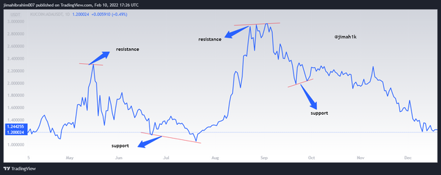
Support and resistance are very key aspect of trading as they show where the traders are actively buying or the area traders and investors are selling their assets. From my above uses of line chart I made mention it’s ability to identify support and resistance very simple. Yes that’s true it’s all because unlike certain techniques, they the line chart is very smooth and visible with little or no noise in the chart Making it very simple to spot these levels. Let’s talk about these levels (support and resistance level) and how to identify them.
Support, when we talk about supper level this is the level or a point at which we see the price of the asset being in a continuous fall possible case scenarios is because of the reduction in volume of the asset due to hardcore sales of the asset by a lot of traders. And at a certain point the decline stops and quickly reverses. This simple means it changes direction from a downtrend to an uptrend
The moment it reverses, that is when smart traders place their buy oder in anticipation of a upward trend. Mind you sometimes these reversals tend out to be fake to be safe add certain indicators to support your decision. Let’s look at the chart below
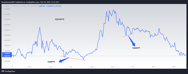
From the chart above the support level is highlighted you can see that the price of the asset was falling and stopped at that point and began to change direction (reversed). For traders that place a buy order at the reversed point would have made profit.
Now let’s talk about Resistance, I believe this is quite the opposite of the support level. At this level, we notice the price of the asset rising (continuously) as a result of high increase in the volume of the asset because again there is a hard purchase of the asset by many investors and traders mostly whales(people who have lots of assets). Causing the price of the asset to rise until it reaches some point and begins to reverse (change direction) from the uptrend to a downtrend. Probably many traders or investors feel like they have made profits and want to jump out of the trade ideally this is the right time to sell your asset before the make further loss.
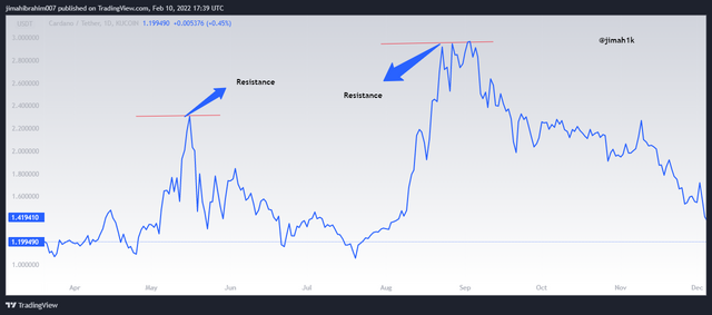
Let’s look at the chart above, it clearly shows the price of the asset rising to a particular point and quickly reversing it direction to a downtrend.
Q3 : Differentiate between line charts and Candlestick charts.( Demonstrate with screenshots)
The Japanese candle stick and the line chart are undoubtedly both effective tools a lot trades and investors use other to do a proper analysis on an asset before they make decisions. However they have some differences between them and in this section I will shed some light to them. Let’s begin
One clear difference I want to talk about is the Japanese candle stick uses or displays the opening price of the asset and the closing price of the asset. It is also depicted with colors to make it easy for investors to be able to differentiate a bull from a bear. For a bullish season, a green color is used likewise for a bearish season, a red color is used. Making the chart pictorial identifiable to the investors. See chart below
From the screenshot above it is seen that the bullish candles (green) signifies a rise in the price of the asset. Whiles the color Red signifies a decrease in the price of the asset.
For the line chart, it is not possible to see the red candles that signifies a reduction in the price of the asset or green. Because it only uses the closing price of the asset over a period and connect it with another closing price creating a linear pattern instead of using the candles to create unnecessary noice, the line chart eliminates those noice making it more simple to read even to an amateur.
See screenshot below.
Again we can see that it’s only one single line representing the closing price of the asset over a period.
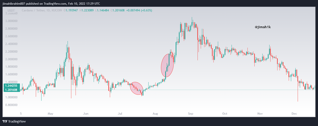
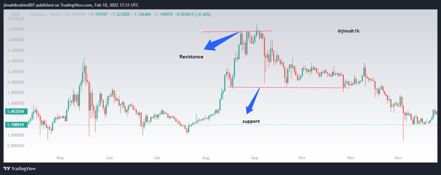
Again, when we talk about the Support and resistance in both techniques, it is ver easy to spot them in the line chart than in the Japanese candle stick. Let’s look at the chart below,
This chart shows a line chart showing the support and resistance. This is easily spotted because of the unnecessary noise the line chart has filtered out.
Now if you look at the Japanese candle stick technique, from the chart below it also displays the support and resistance, but it’s not as visible as the line chart because it doesn’t filter out the unnecessary noise in the market.
Last but not least. A trader with little knowledge in trading can effectively read and understand the line chart due to its user friendly nature. And you can. Also spot support and resistance levels at a glance. Unlike the Japanese candle stick, you will need to be careful as it’s very complicated and requires some knowledge before you can use it to analyze any chart.
Q4 : Explain the other Suitable indicators that can be used with Line charts.(Demonstrate with screenshots)
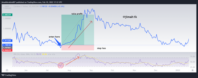
Experts advise us not to use only techniques alone to make trading decisions as most of them are not capable of filtering all the noise in the market or produce fake signals so it is very good to add indicators to help increase the success rate of the your trading decisions. I will be using the Relative Strength index, I believe this is the best indicator to use with the line chart because it determines the strength of the market using the closing price of the asset over a period.
Let me quickly explain the parameters for f the RSI indicator, it has configuration from 0-100. Such that the oversold region (support ) is calibrated 0-30. Whiles the overbought region (resistance) is over 70. (70 - 100). With this we are able to determine the price reversal of the asset and place good entry and exit points. Let’s look at the chart below.
From the chart Above showing the line chart, I added the RSI indicator with length of 14 it confirmed the overbought and over sold areas as shown by the line chart. From there we can actually take a decision.(to either buy or sell)
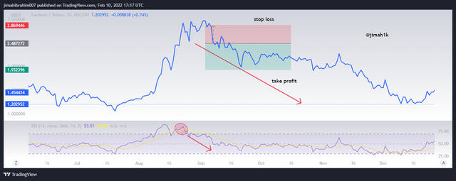
Q5 : Prove your Understanding of Bullish and Bearish Trading opportunities using Line charts. (Demonstrate with screenshots)
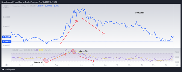
In other to make sure that I have properly seen a bullish trend or a bearish trend using the line chart, I will again be adding the RSI indicator. Let me tell you what to expect. Now for a bullish season or a bullish trend to occur, the price of the asset usually falls below 30 signaling a oversold zone from which it then reverses to a bullish state. So right after an oversold zone there is an anticipation of a uptrend.
Likewise for a bearish season, the assets is usually above the 70 on the RSI indicator which also signals a overbought zone, right after it begins to decline (going bearish). so ideally right after an overbought zone is a bearish season.
Let’s look at the chart for a bullish season, from the screenshot below, you can clearly see the oversold region which has been highlighted because it falls below 30. Right after the oversold zone, is a bullish season or an uptrend. The same movement can be confirmed with the line chart.
Let’s take another look at a bearish season for the same asset., again form the RSI indicator I have highlighted the overbought zone which is located above the 70. Like I said earlier on after the overbought zone the price will reverse changing direction to a bearish season or a downtrend.
Q6 : Investigate the Advantages and Disadvantages of Line charts according to your Knowledge.
Advantages of line chart
I have come to understand that everything has its advantages and disadvantages. So does this indicator I will be talking about the good aspects of this indicator and also talk about its negative aspects.
1 - The first advantage I believe is, it’s very simple to use traders with little knowledge can easily use the line chart vey well it doesn’t have any complex rules or complex reading.
2 - The line chart makes the spotting of the support and resistance very simple unlike other techniques. You can easily spot them at a glance.
3 - False signals that may be shown with the Japanese candle stick are filtered away by the line chart.
4 - The line chart is suitable for longer time frames like a day.
5 - If you look at the line chart once you add it into your chart you don’t have to do anything like twigging the parameters or so.
Disadvantages of line chart
1 - I believe that since it uses only the closing price, it might effective when you want to make a trading decision because certain details are not taking into consideration.
2 - When you set the timeframe to a shorter period like 1 mins you will not get the best results.
3 - Because it doesn’t use colors to depict the bullish and bearish Trends you can’t tell at a glance.
Conclusion
The line chart I would say if added to a suitable indicator like the RSI, the investor will be able to confirm and determine the oversold and overbought regions or zones and once you do you are now sure of where to set your buy or sell trade.
Also because the line chart makes use of the closing prices of the asset, it is able to filter the noise that the Japanese candle stick couldn’t giving the investor a clear picture of the market
Thank you professor for this wonderful lecture I hope I continue to participate in your upcoming lectures.
please note all unsourced images are screenshots from TradingView
Upvoted! Thank you for supporting witness @jswit.