Rock Paper Scissors - MY 1st LOGO CONTEST!
Taking the challenge of @peerplays' post, I would like to try designing the logo of Rock Paper Scissors (aka RPS) . The completed product is shown below.

As a civil engineer, I choose a daily tool of my work to design the logo - that is Autocad. But not the tool, the most important thing in design logo is a good idea. I think the logo should be simple enough to sketch by hand. "Sometimes, the things we think are so simple but not so easy to grasp are the things that work the best." says Howard Graham Buffett. My idea of RPS logo has came from the existing peerplays' logo, it seems that the first element of Rubik was missing. That is the reason to create the RPS logo as the missing element of peerplays' logo.
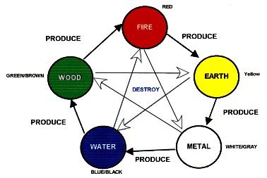
In many Asia countries, the feng shui aspects affect every aspect of your life, from the small thing to the big one. The basic principle of feng shui is the principle of five elements, which are Wood, Fire, Earth, Metal and Water. These feng shui elements effect to each other in certain ways, generally defined as the Produce and Destroy cycles as same as Rock Paper Scissors game. Therefore, the color of logo is chosen based on the 5 feng shui colors, there are White ~ Metal, Green ~ Wood, Blue ~ Water, Red ~ Fire, Yellow ~ Earth. Moreover, the colors of Wood and Earth are put under the color of Fire , which means that Earth supplies nutrition to Wood and Wood is the material for Fire. Therefore, the fire will burn forever! They connect together to build a perfect logo. :D

If you have any comments or suggestions please feel free to let me know. Thank you
( ͡° ͜ʖ ͡°) => .....magicstone1412.....
the design is simple but your idea is quite good. it is connected both to @Peerplays logo and Asian culture, which makes the logo more meaningful.
Have you thought about using images representing Rock, Paper and Scissors instead of capital letters on the Rubik?
Good luck to you :)
Thanks. This is the logo not the banner. I wanna make it simple as I can. I have thought your idea before designing, but as I explained in my post, it is difficult to sketch by hand if I put it into the logo.
Your logo was designed following feng shui aspects , so that I strongly beleive that you will become winner due to luckily LOL
Thanks hope so. Haha
Did you like this logo? Check mine https://steemit.com/rps-logo/@rosevard/rps-new-logo-contest
Congratulations! This post has been upvoted from the communal account, @minnowsupport, by songha from the Minnow Support Project. It's a witness project run by aggroed, ausbitbank, teamsteem, theprophet0, someguy123, neoxian, followbtcnews/crimsonclad, and netuoso. The goal is to help Steemit grow by supporting Minnows and creating a social network. Please find us in the Peace, Abundance, and Liberty Network (PALnet) Discord Channel. It's a completely public and open space to all members of the Steemit community who voluntarily choose to be there.