How to make a lettering design
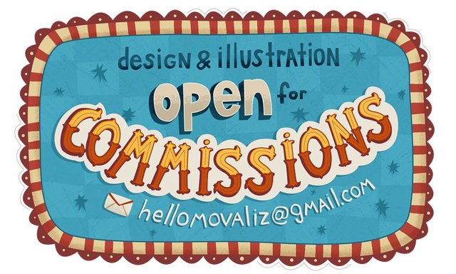
Hello Steemians! This weekend I've updated a bit my website and Behance portfolio.
Now I'm looking for the new clients for me as an illustrator so I decided to make a small label to add at the bottom of my behance project. Plus it is a good practice of making lettering design!
My process
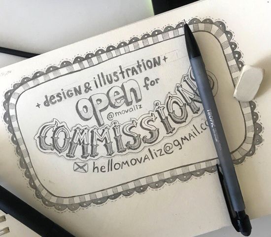
Every time I'm start from the simple pencil sketch. It is good way to think, don't try to make it perfect, just find the good composition and the idea. This sketch is number 5, not the first (even if you are professional, usually the first sketches are the worst, don't hesitate to put them into the trash bin).
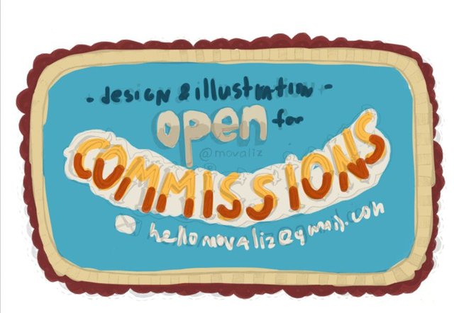
After putting my sketch to the Adobe Photoshop and editing brightness/contrast by Levels (ctrl+L/cmnd+L), on the new layer I'm trying to find the color scheme. It is fun, you don't have to make it perfect from the first trying, just play with colors!
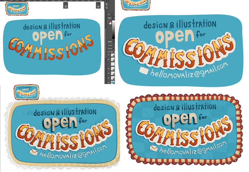
Some steps of my process. It is very simple: new solid layer shape by Pen tool (ctrl+p/cmnd+p) and details by different brushes on the new layers above. That's it, no magic.
The result

I like the result, and it looks nice on the dark background of my new Behance project
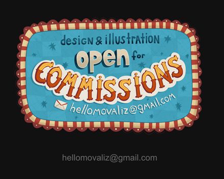
Elizaveta Akimova aka movalizOpen for commissions
Nice to meet you, Elizaveta. Great work
Check your email!