Branding Proposal for @steemcommunity


As always, when I trust about a community that benefits its members, I will always help. Yesterday, I got a message from hatta about a running task looking for a design.
I was thinking, if I could be a part of this community. But, maybe not too much help is wanted in the design field, so the project owner does not respond.
Then, I tried to find out what the community planned to do. And I got it. Once I know, if this will bring benefits to everyone. I started looking for a concept for branding.
And of course, it must still be linked to Steem's. After I read and made a concept. The concept that I think of this, to create a visual that resembles the Steem Logo, with the visual of a ring encircling it.
By the way, here is a short briefing:
- Clean
- Elegant
- Uncluttered
- Trim, but stylish
- Clear color scheme
- The right size!


So, I immediately made a sketch. Here are some sketches and models that I made. From some concept of the model. I found that 1 concept that is really suitable to visualize this community.
Here is a sketch I made.
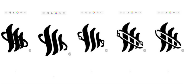


Of the 5 sketches I drafted, I chose the 5th concept to serve as the Steemcommunity logo.
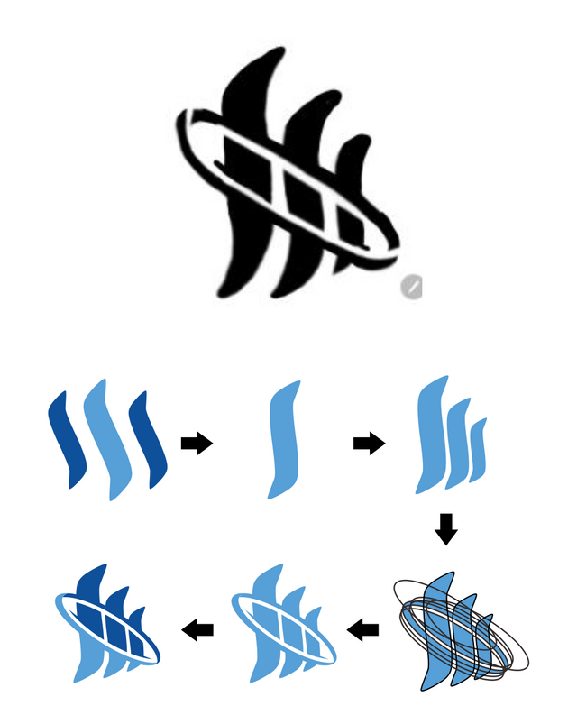
In this design, I use the Steem Logo, then I re-tracing without changing the shape.
At a later stage, I set the initially oblique object so that it straightens it upright. Then, the stage duplicates the object into 3 sections like the Steem Logo. Then here's the difficult stage to keep the balance of a design, I use the same 7 circles for the cut process.

And finally i get the result. above is Logomark for steemcommunity.


Basically, this request is about banners and thumbnails. However, I do not think it's enough to make assets without a brands. So, my initiative also created a brand, maybe this brand can give a meaning to the project.

1. Logo
Primary logo. Color, black and white.
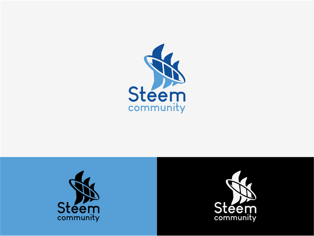
Secondary logo. color, black and white.


2. This is the thumbnail design.



3. Banner design.


4. Profile icon for use in social media. (steemit, discord and other profile.)


5. This is for divider article.
Example.
Welcome to the 4th post from the @steemcommunity witness.
If you are visiting our page for the first time and would like to find out more about our project, please take a look at our initial contribution:
Introducing @steemcommunity - A Witness Project by @abh12345 and @paulag
We would like to begin by sincerely thanking everyone for the early support that we have had via comments and votes for our witness.
Thank you!

An apology for the 'Exclusion/Blacklist checker'
Dear all
Please accept our sincere apology for the production of an 'Exclusion list/Blacklist as detailed in the previous update.
Our approach to this lacked thought and input from the community, and for this we are sorry. In hindsight, we can appreciate how angry and frustrated you are given the consequences of our actions and take full responsibility for this.

6. Implementation
Check this https://steemit.com/@reppla for preview profile and banner.
thanks, let me know if this is what you are looking for.

7. Font used in logotype
The logo use Louis George Café font for typhography. this font is design by Chen Yining , and These fonts are 100% FREE for both personal and business usages.

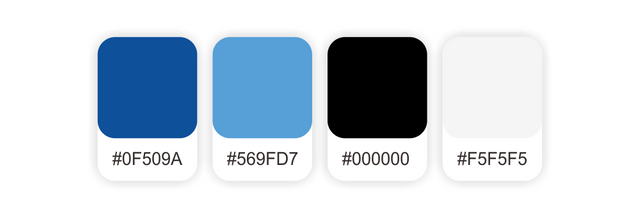
8. Colour palette.
The logo is use only 4 colour palette.


As mentioned in the briefing, some concepts and designs have the perfect benefit.
Logo created with gridline, this is the goal of keeping the quality of the real size, so that the logo has a balance size.
The logo was also created very clean, in accordance with the existing briefing.
And also, the logo is a stylized and elegant concept.


Download file in .PNG | .SVG | .PDF.
Logo Primary : DOWNLOAD
Logo Secondary : DOWNLOAD
Banner, thumbnail, icon and line : DOWNLOAD

| File Name | Branding proposal for @ steemcommunity |
| File Type | PNG - SVG - PDF |
| Artist | @podanrj |
| Copyright |


It looks great, Podan! I wish you good luck and to be a winner!