[ Effective Trading Strategy using Line Charts ]- Steemit Crypto Academy | S6W1 | Homework Post for @dilchamo
Hello there, Steemians. I'd like to welcome everyone to the first week of Season 6 of the Steemit Crypto Academy. I'm excited to be a part of Professor @dilchamo class on Effective Trading Strategy using Line Charts.

QUESTION 1
Define Line charts in your own words and Identify the uses of Line charts.
Charles Dow established line charts, which are as ancient as technical analysis itself, in the 1800s.
This trading chart trend focuses solely on the assets price's closure which has nothing to do with other aspects such as its high, low, and starting, as shown on the candlestick chart.
These equity prices highs, lows, and openings are viewed as disturbance and hence of little help in determining the true motion of an asset. As a result, removing these disturbances provides traders with a clearer picture of where the asset price has changed over time.
Line charts make it easier to observe market dynamics, support and resistance levels, particularly for newcomers who find the understanding of other types of trading charting, such as candlestick charts, hard owing to their various aspects such as high, low, and opening.
A line chart works only by linking an asset's current value. This straightforward structure makes it simple for traders and analysts to analyse the market using the more accessible price graph.
The line chart provides traders with a clearer picture of where the asset price has moved over time. It accomplishes this by focusing just on an asset's closing price.
The line chart is fairly easy to explain, particularly for newcomers, since it eliminates additional complexity such as high, low, and opening prices of an asset, which are viewed as noises generally created by fluctuation.
- Due to their clarity, line charts make identifying support and resistance levels simple. As a result, traders can make more informed trading selections in certain sectors.
QUESTION 2
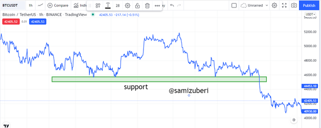
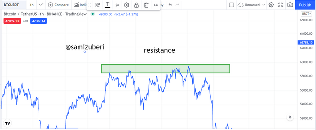
How to Identify Support and Resistance levels using Line Charts (Demonstrate with screenshots)
Whenever it comes to trading, the support and resistance levels are crucial. These tiers serve as the foundation for all technical analysis even though they are used to focus on areas where there is significant buying or selling pressure in order to reverse a nature of the market.
Support
The support level is the area where buying pressure is strong enough even to counter a declining asset's price.
In some cases, the price of the asset usually breaks through the support level if the selling pressure exceeds the buying pressure at a certain spot. When this occurs, the badly bruised support level becomes a resistance level for the bearish price.
Resistance.
The RESISTANCE level is the area where selling pressure is large enough to resist the up trending price from moving further.
The zone is really quite recognizable on the line chart, but occasionally the market moves above the recognized resistance zone, but when that occurs, the severely bruised resistance zone serves as a support for a new price.
QUESTION 3
Differentiate between line charts and Candlestick charts.( Demonstrate with screenshots)
Line charts and candlestick graphs both are charts that depict marketplace asset price changes.
There are a few similarities graphs, one of which is that that both display price closure levels at different periods.
Despite having some commonalities, they also have notable distinctions, which are as follows;
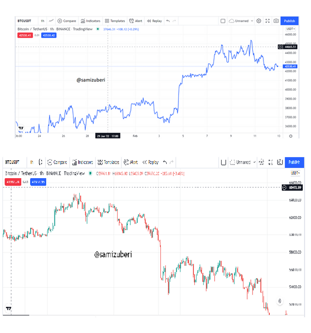
Line charts link just the asset price's closing, but Candlestick charts provide a variety of market prices, including the close, open, and the lowest and highest points achieved by the price, known as the wicks
Line charts are very simple to comprehend because they contain few details about the price action but only a traditionally defined of the close, whereas Candlestick charts are more complicated, particularly for newcomers, as they provide more information abthe price including its opening point, closing point, and shadows.
- The Candlestick Charts provide further data on the buyer's behaviour at various times. The data is displayed by different coloured candles, with bearish candles suggesting that sellers are in power and a bullish candle showing that purchasers are in command at any particular time. Line charts, but on the other hand, do not provide such data since there is nothing to discriminate among buyers and sellers at any particular position.
QUESTION 4
Explain the other Suitable indicators that can be used with Line charts.(Demonstrate with screenshots)
Then we will look at the use of indicators suited for line charts, and one of the indicators I will discuss here is the EMA.
The EMA is a trend-based indicator that is used to correctly detect the overall price trend. It accomplishes this by filtering out tiny movements, revealing an asset's true price trend.
The foregoing explanation of the EMA qualifies it for usage on a Line chart to spot price trends.
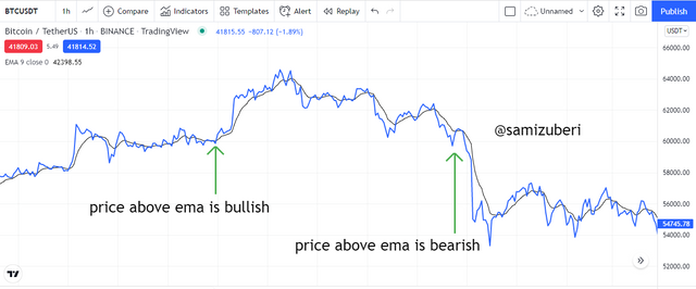
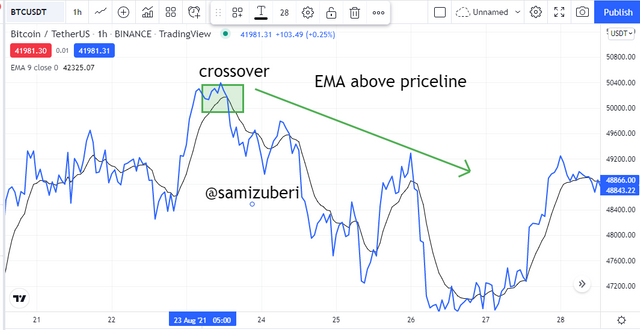
When the EMA falls below the Line Charts, it indicates a bullish motion, while when it rises above the chart, it indicates a bearish movement.
The EMA is often used to spot price reversals on the Marketplace. When a bearish price breaks above the EMA, it indicates that the trend may be shifting from bearish to bullish. Likewise, when the bull price falls below the EMA, it signals a price reversal from bullish to bearish.
These price reversal indicators, which are often supplied by the EMA, are typically used as entry or exit points for traders, albeit they are better validated by using additional indicators including such RSI for convergence purpose.
The RELATIVE STRENGTH INDEX is also another indicator that works well on a line chart.
The RSI indicator is a volatility-based indicator that identifies when an asset is overbought or oversold, signalling a traders to join or quit the marketplace.
The RSI indicator is divided into three parts: the top area, the mid point, and the lower region. The top zone ranges from 70-100, the lower region ranges from 30-0, and the midway remains at 50.
When the RSI rises over 70, it shows that the asset has been overbought, and a trader should prepare for a probable downturn in the asset values.
QUESTION 5
Prove your Understanding of Bullish and Bearish Trading opportunities using Line charts. (Demonstrate with screenshots)
We have previously explored some of the applications of line charts, particularly the fact that they make trend detection easier when compared to candlestick charts.
In this lesson, we will use Line charts to find bullish and bearish trend possibilities.
In order to accomplish this, I will begin by using the moving average indicator, which will give an entry point for both bullish and bearish trading opportunities.
Buying Entry.
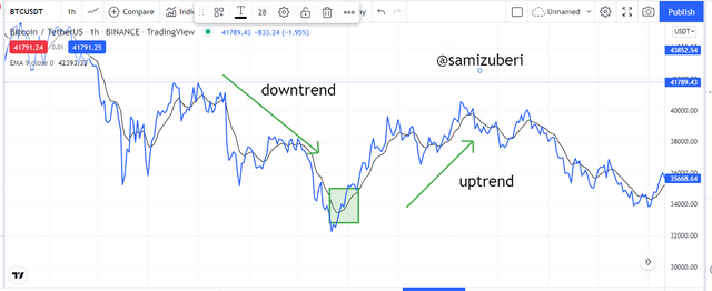
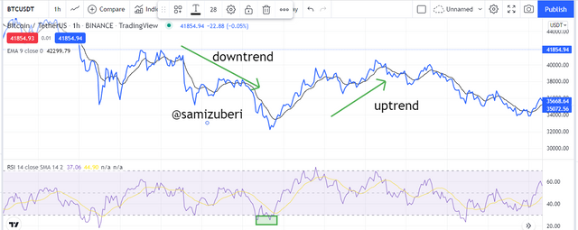
To find a bullish entry using the moving average indication on a line chart, I will first detect the direction of the trend that use the same moving average indicator.
To determine the direction of the market, I will first look at the position of the moving average indicator and whether it is trending just above price chart, indicating a negative trend.
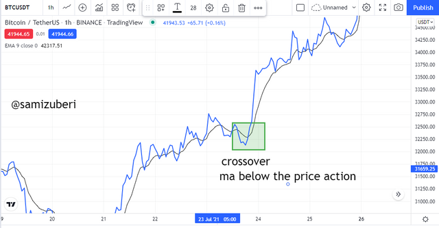
Following the identification of a negative trend, I will wait for the line chart to break above the moving average, indicating a probable bearish-to-bullish trend reversal. After that, I'll wait for the price to retest the recently developed support on the moving average indicator before entering.
Selling Entry.
To find a bearish trading opportunity utilising the line chart, I will begin while using my moving average indicator, exactly as I did previously.
This indicator will primarily be used to identify price patterns. A bullish trend is indicated when the indicator is well below the price chart.
After correctly identifying the trend direction with the moving average indicator, I will look for a breakthrough underneath the moving average as an entry signal for a likely bullish-to-bearish trend reversal. When the breakthrough occurs, I will wait patiently for the price to retest the freshly created resistance and draw back until entering. This is done to prevent false signals and fake-outs.
QUESTION 6
Investigate the Advantages and Disadvantages of Line charts according to your Knowledge.
ADVANTAGES.
Line charts are relatively basic and easy to read, particularly for newcomers to cryptocurrency trading, because they do not provide intricate price action characteristics such as high, low, and open. However, it is simply a near line link.
Line charts make trend detection simple since they concentrate just on the close of the price, keeping the trend highly clear.
Line charts also make it simple to observe and quantify slight price fluctuations that are harder to see on other line charts, such as candlestick charts, due to the production of price shadow.
Line charts also help identify significant support and resistance zones easier owing to their minimalism and noise removal, which are factors that make identifying these regions considerably more difficult on candlestick charts.
DISADVANTAGES
.
Line charts also provide the closing price of the share, which is insufficient for a broker to make an informed trading choice. Information such as the highs, lows, and open are also crucial.
Line charts do not account for price fluctuations since they do not display price highs and lows.
Using Line Charts on a shorter timeframe generates several indications, making trading decisions difficult.
On a price chart, some key financial data, such as the min and max levels a price achieved before closing at a given position, is disregarded. This data is relevant because it allows traders to recognise the present market's purchasing and selling pressure.
Conclusion.
Line charts are one of several market charts that are used to understand price behaviour, movement, and direction.
Line charts are a basic and easily understandable chart for beginners who find other chart patterns confusing. Because it eliminates all market clutter, Line Charts make it simple to identify support and resistance levels.
Nonetheless, Line Charts are best utilised in conjunction with technical indicators such as moving averages and RSI for a more accurate analysis that will help to optimise trading gains and reduce trading losses.