Color Or Black & White? Two Photos From Yesterday's Anne Brigman Art Hike
Yesterday I was hired to capture color and black & white photos for the Trails and Vistas - Nevada Museum of Art collaboration. The museum is currently having an Anne Brigman photography exhibit, I wrote a bit about Anne in my last post. The Trails and Vistas organizers collaborated with the museum to create an art hike that was a tribute to Anne Brigman and her art.
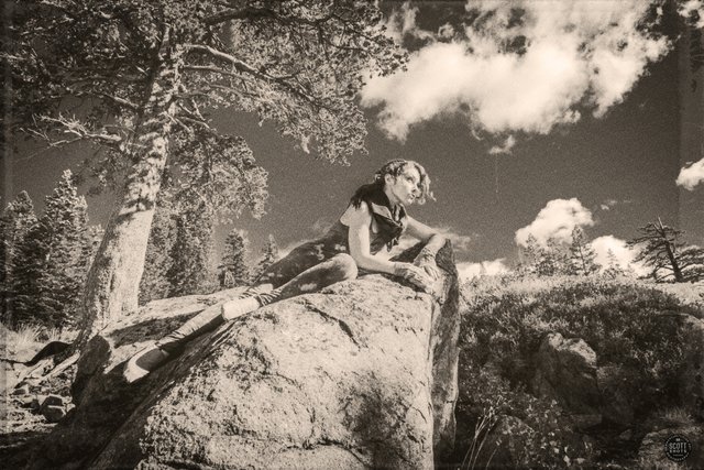
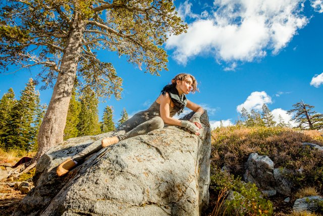
Here's one of the photos from yesterday's event. I tried to antique up the photo and create a bit of an Anne Brigman style to it. I like it a lot but I also like the color version. I'm curious:
Do you like the Black & White version or the color version better?
This photo was shot on a Canon 5DS R and the black and white version was edited similarly to the photo in my last post. I converted it to black and white in Photoshop's Camera RAW feature. It was softened up with Photoshop's "Field Blur" tool. I then brought it into ON1's Effects 10 program where I added a heavy amount of film grain, a bit of vignetting, a touch of "tattered paper" texture, and a light "Dano" border. I then brought it back into Photoshop where I added the sepia tone.
Thank you for looking and reading!
Scott Thompson
Scott Shots Photography

 |  |
|---|


Both are great but if I had to pick one it would be the color version
Nice, thank you @tattoodjay! I tend to prefer color photos and rarely produce black and whites. Producing the black and whites has been a fun challenge by the client though. Cheers!
Before coming onto steemit I also seldom did B&W edits also now I find I do them more often for a couple of posts a week
Interesting, haha! I hadn't really done much black and white here but we'll see now that I've been back at it again with this job.
I do it mostly with shots around NYC, some of the buildings for me just call for a B&W edit
I like them both, tho I do like the way the shadows
pop on the top photo. The older look is cool, but also
love blue sky, anyway to combine that?
I often wonder how a color spot in a black and
white photo is done :-)
Interesting idea @shasta... I'm sure there is a way to combine them. Thank you!
good take
Both great, but color is better methinks.
Thanks @brandt!
I prefer the colour version. The black and white does have a bit of a sepia feel to it. Kind of looks straight out of the 40’s or 50’s!
Thank you @daveks. Cool, I'm glad that the black and white looks old to you, mission accomplished.
I like the black and white. More of a film vibe
Cool, thank you @chaseburnett! Glad it looks like film.