What's in a Name PART 2: The Leaf in SW/Eden
Sometimes you demonstrate who you are by your actions, sometimes with your words (hopefully they support your actions) and sometimes with images.
In a recent post I discussed our name change. https://steemit.com/eos/@seanxa/what-s-in-a-name-eossweden-to-sw-eden
At the suggestion of Kevin from EOSgo, I'm following that up with some of the story behind the design of our logo.
Normally, when I do a rebrand with an organization, that rebrand is kept secret until we are ready for the big reveal. It can take 2 or 3 months to get everything right. With SW/Eden it has been different. With the limited time until launch, this has been a more organic approach. In a way, that seems fitting. Our name name changed right away and the visuals have been following along. Actually, before the name changed, there were no visuals, so everything we have is new.
As we moved from being EOSSweden to SW/Eden, a host of visual ideas came to the surface. At the name Eden, many people picture a paradise filled with trees, plants and water. Which is where the leaf came to life in our logo. We knew we wanted something to represent this paradise that had an organic element. Within plants we see life, growth, opportunity and even generosity. Generosity? Well ---- OK, plants are not cognisant of the oxygen and food they give. On the flip side, those who steward and manage a garden can be generous with what they grow.
After a few preliminary drawings, Vahid asked me if there was a way to make it look like a chestahedron.
What a brilliant idea.
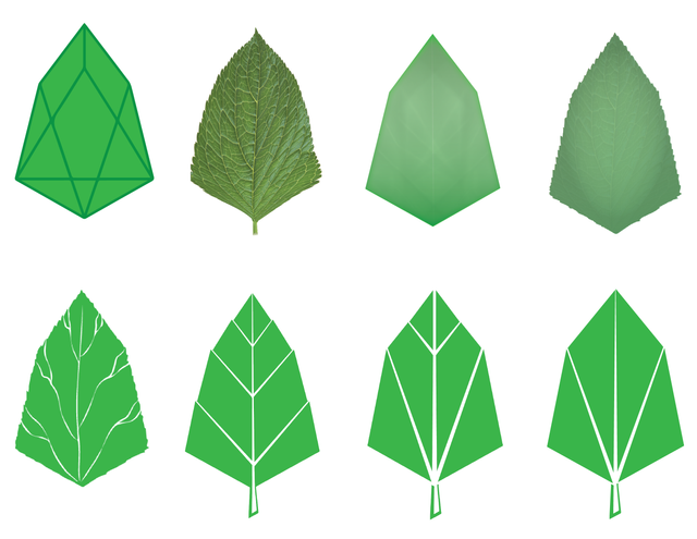
Below is an image with our transition process.

An organic journey
We are still trying to decide on that final image. The last three on the bottom row are the front runners. Though we might utilize a couple different versions depending on the situation. If we do, we are in good company.


Technotopia is Coming
EOS has the potential to bring that to life. At the same time, it will only thrive if those who are the stewards of that technotopia, continue to strive toward the higher ideals that they have articulated on their profiles and in their posts over the past several months.
For SW/Eden, the picture is represented visually in that leaf... Life, Growth, Opportunity, Generosity. a technotopia that has the potential to bring massive change to the world technologically as it comes to life.
I love the new logo choices. Thank you for letting us in on the design process; very cool.