SLC21/WK3: Logo Design - Part 2 (Home Work)
 |
|---|
In this session I've learned seven kinds of logo design that helped me acknowledging more about logo design. Before starting I would like to thank our teacher cum friend @lhorgic for making each category crystal clear to we students. I'm going to discuss briefly whatever I've learned and understand from this graphic design session. Let's get started..!!
• Discuss about each of the logo types we have and then talk about conditions when such logo should be used and when not to be used for a brand. You can do a little research to aid you.
WordMark Logo: Typography focused logos that also known as logotypes is actually wordmark logos. Typeface or font styling is the most important part of this kind of logos. There are many famous brands that we know use wordmark logo for their identification and here styling with upper case and lowercase also does matter. It highlight the brand name that mostly found short, simple and expressive. Brands that focus on simplicity, class, fashion, elegance and clean typeface.
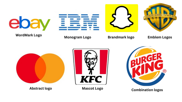
Monogram Logo: Monogram Logo is another form of wordmark logo as it also focused on typography and lettermark. This type of logos are based on short form of brand name that can can be mostly caps lock to express the full brand name in short. This kind of logos prefer to shrink the full name of brand into few letters or alphabets. A single letter can be a monogram logo, for example we can see the sing N for Netflix and the logo N is the face of Netflix.
Brandmark logo: This is absolutely different from the types of logos above I explained. It is a simple picture that will be the face of the brand. It doesn't need any kind of explanation about the brand and pictorial logo will be the identity of the brand. For example we can see the logo of snapchat, facebook, social media X and many we can find as the famous brand.
Abstract logo: Abstract logo give a perfect shape of the brand that has deep meaning. It doesn't use typeface or typography and not even absolutely similar to pictorial logo. This kind of logos are not generic and it has ability to represent the brand with perfection and sometimes indicate a kind of sign. For example we can see the logos of pepsi or mastercard that indicate to be an abstract logo.
Mascot Logo: Mascot logos looks like drawing or sketches of an artist. Adobe Illustrator can be the best software to create this kind of logos for brands that allow fun, art and anythings that connected an entertainment. There are many food brands prefer mascot logo and we know the famous food brand KFC that is a mascot logo. This logo also can be found with or without text.
Emblem Logo: This logo based on geometric shapes and also use modified texts in it. We can see this kind of logos in classic creations and it mostly found as monogram, coins, badges, crests, stamps and many more. It looks like a sign and artists can create emblem logos in a extraordinary way.
Combination logo: Combination logos are basically combine the picture or image with the typography. When a brand express more about it, it definitely combine both pictorial and typography to create a perfect combination. This give audiences clear concept about a brand and the name of brand can be recall quickly when the name of it also added with a pictorial logo. The logo should be meaningful and expressive for the brand. Examples are many you can see, I would like to mention the brand name Burger king and the logo is a combination logo with an image and text into it.
• Pick any two (2) of the Logo types discussed and then practically demonstrate how to make them, showing your detailed process.
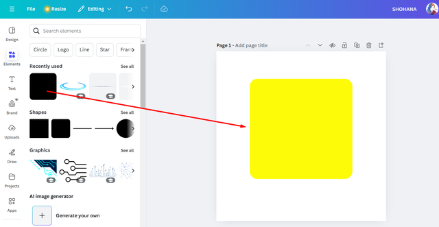
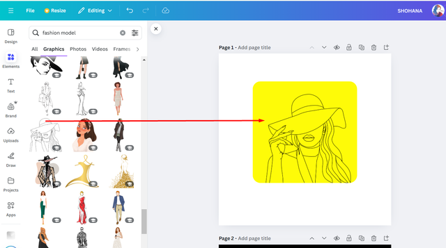
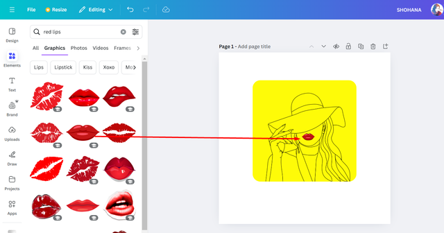
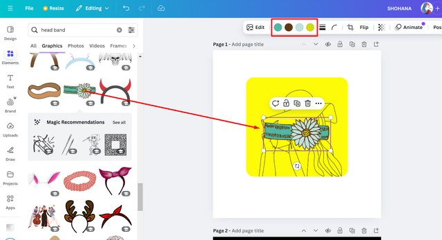
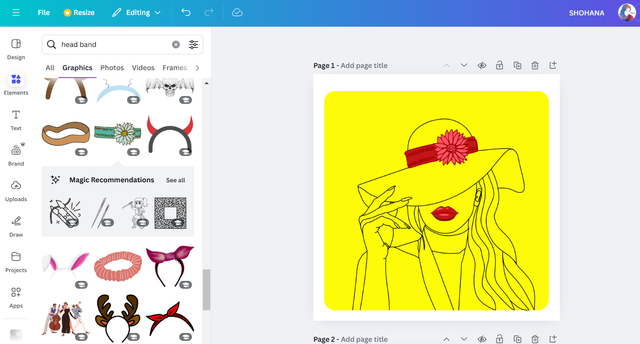
In this section I'm picking two types of logos and those are WordMark Logo and Brandmark logo I'm inspired by the logo design of ebay and Google for wordmark logo and inspired by snapchat logo for brandmark logo. Each screenshots are explaining the details so have a look,
WordMark Logo:
 |  |
|---|
 |  |
|---|
 |  |
|---|
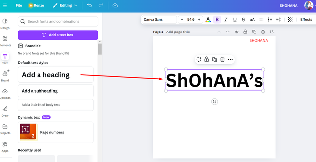
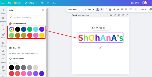
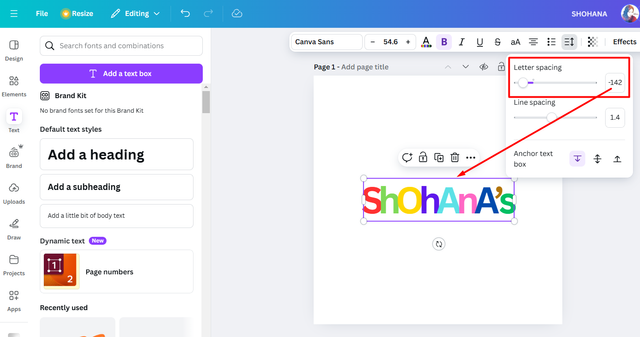
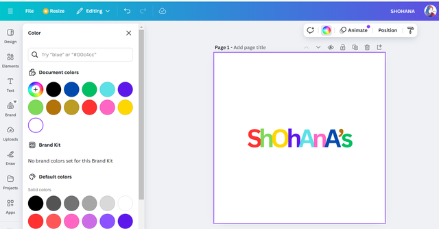
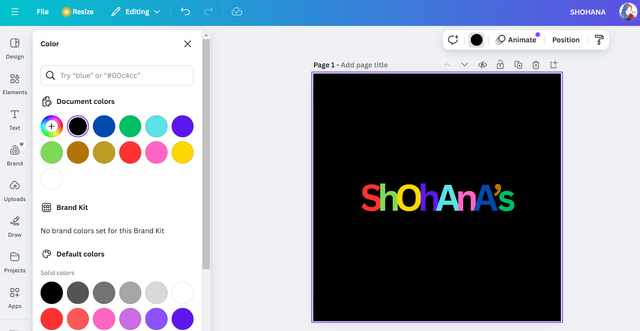
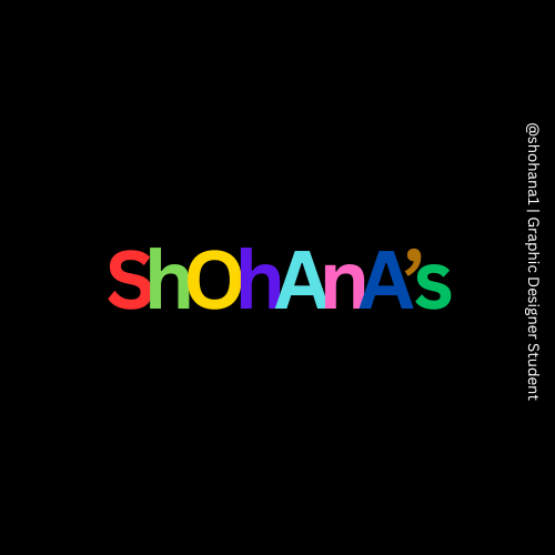
This was created using simple Canva sans font and I picked random colors from the color wheel. I was inspired by ebay logo when created this. Shohana's is a clothing brand that provide fashionable wears for ladies and this is my imagination for this design. I reduce the space amongst letters of logo Shohana's. It was easy and simple to create. You can do it too by seeing screenshots above.
Brandmark logo:
 |  |
|---|
 |  |
|---|
 |  |
|---|
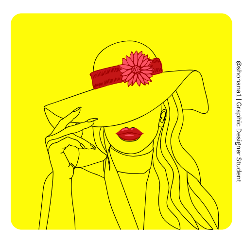
The concept were not pre-planned so I design the logo after having logos in this category. The woman face with a hat is a line art for my logo design. I've added red lips and also headband on hat and changed the color of it. The finale result you can see above with the process as screenshots.
• Design a simple flier for your brand and then strategically place one of the logo you made in the flier.
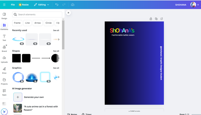
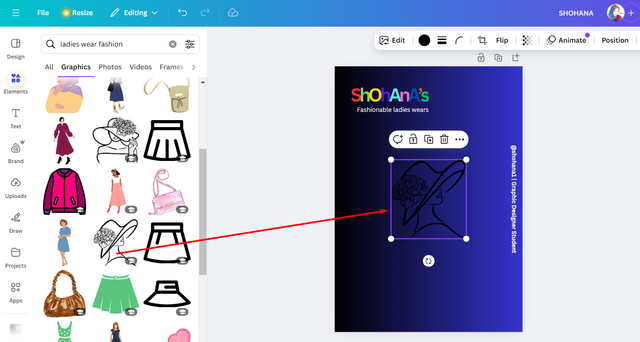
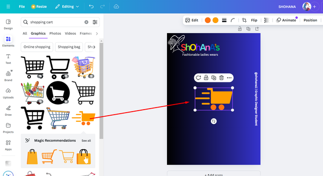
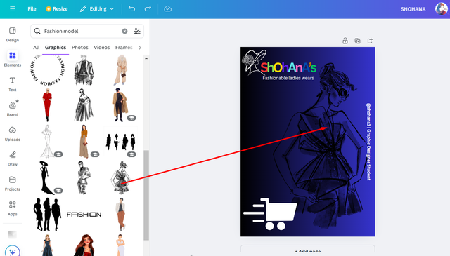
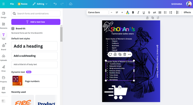
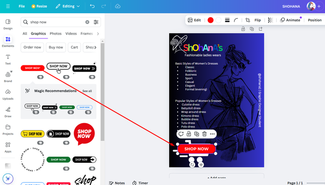
Here is my simple flyer design using my own designed logo. Have a look on the process below, finale result at the botto, of this homework post.
 |  |  |
|---|
 |  |  |
|---|
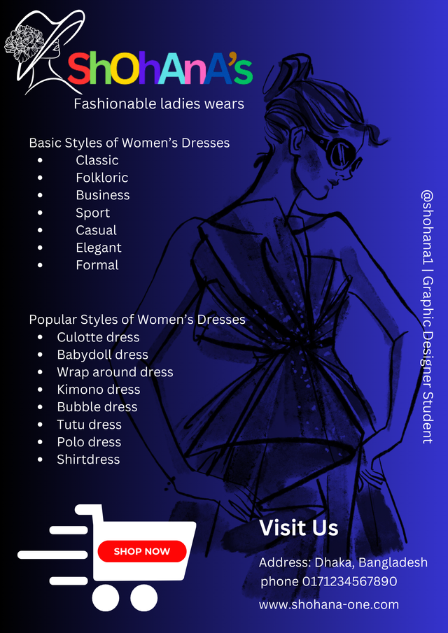
So this was my understanding and result of practice. Logo design these days are more professional and perfect as clients expect to make a world famous brand and a logo is the identity of a brand for all the time. Anyway, this was my presentation as home work. Last few days I was planning to attend my homework on it, finally I made it and I'm done with it for this week.
Thanks For Stopping By
Inviting to join the CONTEST friend @saikat01 @sisol @azit1980 we are closer to deadline so perform it faster!
Love & Peace ❤️😇

Upvoted! Thank you for supporting witness @jswit.
https://x.com/SHOHANA_ONE/status/1857867227799892099