How to create and Modify Panels Using Bootstrap
What Will I Learn?
- You will learn how to create panels using bootstrap class
- You will learn how to create panel component such as panel heading, panel content and panel footer
- You will learn how to create panel group
- You will learn how to modify panel with contextual
Requirements
- You have basic about HTML
- You have basic about CSS
- You have basic about JavaScript
- You should Install or host the bootstrap file. If you don't want do that, you can add the bootstrap CDN.
- Text Editor and a Browser
Difficulty
- Basic
Tutorial Contents
A panel is a bordered box with some padding around its content. In web design panels is lots of use. Therefore, Bootstrap has provided some class to build a panel and panel component. For more detail lets follow steps bellow :
Open your Text Editor Software [in this tutorial I use visual studio code]
Create new file and save as html extention. For ex
panel.htmlAs we know for using bootstrap we should use HTML5 Doctype. Add the HTML5 element on your file.
<!DOCTYPE html>
<html lang="en">
<head>
    <meta charset="UTF-8">
    <meta name="viewport" content="width=device-width, initial-scale=1.0">
    <meta http-equiv="X-UA-Compatible" content="ie=edge">
    <title>Panel</title>
</head>
<body>
</body>
</html>
- For using bootstrap framework we should install or host bootstrap file first. If we don't want to do that, you can also add Bootstrap CDN as a replacement. You can visit bootstrap official website to get it. add and put it in
<head>element
    <link rel="stylesheet" href="https://maxcdn.bootstrapcdn.com/bootstrap/3.3.7/css/bootstrap.min.css">
    <script src="https://ajax.googleapis.com/ajax/libs/jquery/3.2.1/jquery.min.js"></script>
    <script src="https://maxcdn.bootstrapcdn.com/bootstrap/3.3.7/js/bootstrap.min.js"></script>
After adding all element above, Now we can start to code bootstrap.
To create the panel using bootstrap we can use
tag like this.panelclass. Open
  <div class="panel">
  </div>
- add
.panel-defaultclass to color the panel with default color
<div class="panel panel-default">
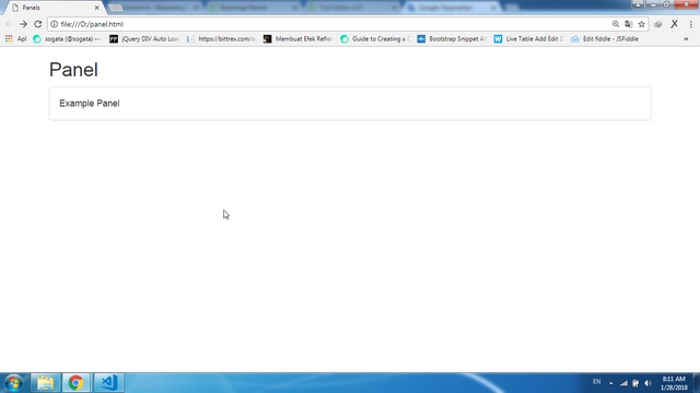
- Create panel body with open new div in previous div. then add
.panel-bodyclass.
<div class="panel-body">Example Panel</div>
Save and run the file, you have created a panel easily without need to create more css
To add the heading of panel, we can use
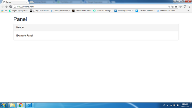
.panel-headingclass. Open new div in<div class="panel panel-default">with class.panel-heading.
<div class="panel-heading">Header</div>
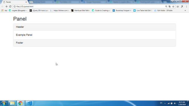
- Our panel now already has header and body, how to add the footer ? open new div under body with
.panel-footerclass
<div class="panel-footer">Footer</div>
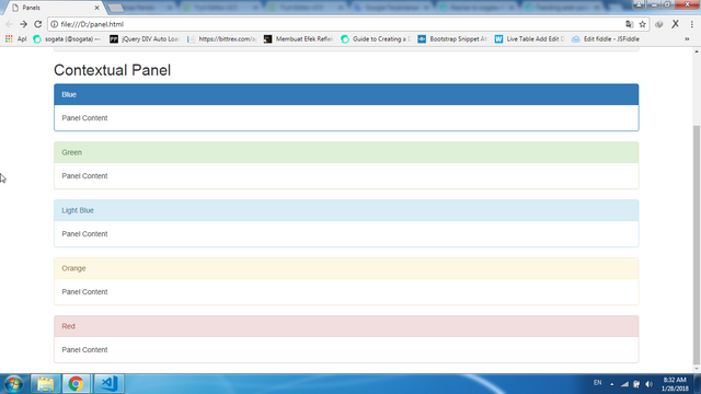
- We already created a default panel. now how to create a panel with other color. Bootstrap has provided some to create panel in more colors.
.panel-primaryfor blue color,.panel-successfor green color,.panel-infofor light blue color,.panel-warningfor orange color and.panel-dangerfor red color. now we try one by one
<div class="panel panel-primary">
        <div class="panel-heading">Blue</div>
        <div class="panel-body">Panel Content</div>
      </div>
      <div class="panel panel-success">
        <div class="panel-heading">Green</div>
        <div class="panel-body">Panel Content</div>
      </div>
      <div class="panel panel-info">
        <div class="panel-heading">Light Blue</div>
        <div class="panel-body">Panel Content</div>
      </div>
      <div class="panel panel-warning">
        <div class="panel-heading">Orange</div>
        <div class="panel-body">Panel Content</div>
      </div>
      <div class="panel panel-danger">
        <div class="panel-heading">Red</div>
        <div class="panel-body">Panel Content</div>
      </div>
- How if we create more panel and wil group it in a
<div>. Bootstrap has provided.panel-group. To group many panels together, wrap a<div>with.panel-groupclass..panel-groupclass clears the bottom-margin of each panel.
<h2>Panels Group</h2>
    <div class="panel-group">
        <div class="panel panel-primary">
        <div class="panel-heading">Blue</div>
        <div class="panel-body">Panel Content</div>
      </div>
      <div class="panel panel-success">
        <div class="panel-heading">Green</div>
        <div class="panel-body">Panel Content</div>
      </div>
      <div class="panel panel-info">
        <div class="panel-heading">Light Blue</div>
        <div class="panel-body">Panel Content</div>
      </div>
    </div>
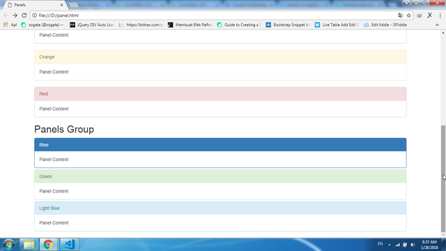
You can see the different before and after using
.panel-groupclass. After using it, all panels looks like a group not separate.Finish, For full code of this tutorial you can copy bellow :
<!DOCTYPE html>
<html lang="en">
<head>
  <title>Panels</title>
  <meta charset="utf-8">
  <meta name="viewport" content="width=device-width, initial-scale=1">
  <link rel="stylesheet" href="https://maxcdn.bootstrapcdn.com/bootstrap/3.3.7/css/bootstrap.min.css">
  <script src="https://ajax.googleapis.com/ajax/libs/jquery/3.2.1/jquery.min.js"></script>
  <script src="https://maxcdn.bootstrapcdn.com/bootstrap/3.3.7/js/bootstrap.min.js"></script>
</head>
<body>
<div class="container">
  <h2>Panel</h2>
  <div class="panel panel-default">
    <div class="panel-heading">Header</div>
    <div class="panel-body">Example Panel</div>
    <div class="panel-footer">Footer</div>
  </div>
  <h2>Contextual Panel</h2>
  <div class="panel panel-primary">
        <div class="panel-heading">Blue</div>
        <div class="panel-body">Panel Content</div>
      </div>
      <div class="panel panel-success">
        <div class="panel-heading">Green</div>
        <div class="panel-body">Panel Content</div>
      </div>
      <div class="panel panel-info">
        <div class="panel-heading">Light Blue</div>
        <div class="panel-body">Panel Content</div>
      </div>
      <div class="panel panel-warning">
        <div class="panel-heading">Orange</div>
        <div class="panel-body">Panel Content</div>
      </div>
      <div class="panel panel-danger">
        <div class="panel-heading">Red</div>
        <div class="panel-body">Panel Content</div>
      </div>
    <h2>Panels Group</h2>
    <div class="panel-group">
        <div class="panel panel-primary">
        <div class="panel-heading">Blue</div>
        <div class="panel-body">Panel Content</div>
      </div>
      <div class="panel panel-success">
        <div class="panel-heading">Green</div>
        <div class="panel-body">Panel Content</div>
      </div>
      <div class="panel panel-info">
        <div class="panel-heading">Light Blue</div>
        <div class="panel-body">Panel Content</div>
      </div>
    </div>
</div>
</body>
</html>
FULL CODE AND LIVE DEMO
Curriculum
- How to create Forms [Vertical, Horizontal and Inline Form] using bootstrap
- How to create alert message [success, info, warning, danger] using bootstrap
- How to create Fixed Navigation Bar (top and bottom) using bootstrap
- How to create a badge using Bootstrap framework
- How to create Dynamic Tabs (Tabs Toggleable) Using Bootstrap
- How to create SlideShow (carousel) using bootstrap
- How to create Progress Bars Using Bootstrap [colored, striped and animated Progress Bars]
- How to create login Form on Modal using Bootstrap Framework
- How to Create Toggle Night / Day mode on the your website page Using Bootstrap
Posted on Utopian.io - Rewarding Open Source Contributors
Thank you for the contribution. It has been approved.
You can contact us on Discord.
[utopian-moderator]
Follow back me please
Hey @sogata I am @utopian-io. I have just upvoted you!
Achievements
Suggestions
Get Noticed!
Community-Driven Witness!
I am the first and only Steem Community-Driven Witness. Participate on Discord. Lets GROW TOGETHER!
Up-vote this comment to grow my power and help Open Source contributions like this one. Want to chat? Join me on Discord https://discord.gg/Pc8HG9x