Today, I Feel Honoured. Today, I Feel Like A Steemian.
For months, I have awaited this day with no guarantee of its arrival. But when I checked my Steemit this morning to find a comment from @timcliff advising me to go and check the "Welcome to Steemit" page, I knew before even looking, that day had finally come.
It started quite some time ago, when @timcliff hosted a competition that allowed Steemit's artists and designers the opportunity to have their work become a part of the Steemit website. @officialfuzzy also sweetened the bounty to entice more entries.
In truth, I would have entered the competition even if there had been no bounty available. At the time, I was fairly new to Steemit myself and still in awe of the concept of the platform. Like many of us, I had become accustomed to the repugnant system we are born into, and the recurring models of profit and power that sprout up within it.
Steemit was different though. It was decentralized, with the power being intended for the very users themselves. It was free from censorship, giving people the chance to find their voices after a lifetime of suppression on all other social media outlets. More than that, I was being introduced to a community who I shared a lot in common with. I really felt at the time, that for the most part, the community consisted of the wiser, more attuned to reality, and more generous of the human population. It was inspiring.
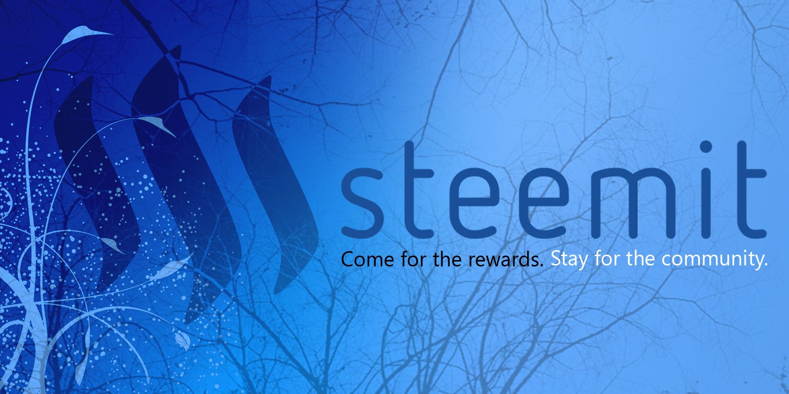
So when presented with the opportunity to have my own work serve as a welcome to every new user to arrive at the platform(which will be an awful lot before long), I leaped at the chance. I made a fair few entries, with the following two being my favourites.


The community voted, and although it was very close between @rigaronib and I, I somehow managed to win, and was ecstatic. But then I realised that the image being implemented onto the homepage was not a guarantee-- something that I had overlooked in my excitement when reading the first post about the competition.
Well, after all that time, today I found out that my entry has finally been added to the welcome page. I have learned a lot more about Steemit since I entered the competition, way back then. So, how do I feel about my work being a part of the very website itself?
Honoured
Yes. I have learned a lot more about Steemit since my entry to @timcliff's competition, and much of that was not ideal. I learned of how, just like everywhere else in life, there are those who cannot pass up on an opportunity to exploit any potential weaknesses in a system for short term profits, even at the expense of their own long term benefits. But, this was not enough to change my mind about Steemit, because for every one person I can find on here who seems to be in it entirely for themself, I can find twenty others who feel passionately about Steemit and want to see the whole community thrive, and who are actively working to resolve our problems. This is why, whilst I was always skeptical of Steemit's success, I am now feeling incredibly optimistic about the platform's future. There are simply too many people fighting for Steemit for it not to succeed. So, I feel truly honoured to be a part of this community, and to have my artwork displayed for the millions whom I expect to come to this platform before too long.
Humbled
It has been quite some time since I entered this competition, and I have watched a number of amazing artists come to this platform since. I feel that had it happened only last week, I would have stood no chance at all of winning. But I realise that it matters not how great or how shitty the content itself is, what is truly encouraging about this, is that a member of the community can be given the opportunity to have their art featured on the welcome page, and that the community could have been allowed the chance to vote on it. What other site does this happen on? Typically, the decision would be made by one or two people and the community of users would have no say in it, even if they all hated it, they'd simply have to deal with it. But, not on here. This platform was designed to accommodate a community, and upon those foundations, a community is building and refining the platform together. It is no wonder so many people feel passionately about this place. For unlike facebook, Youtube, Twitter or the likes, we are actually sharing the driver seat in this one, rather than sitting in the back having no say in what direction we will be going next. This is why the final thing I feel on this day is;
Excited
Big things are happening right now. We have the recent spike in STEEM price which has held steadily above 15 cents after far too long hovering around 7 cents. We have a record amount of trade volume over the past couple of weeks. Also, although I still do not agree with the spontaneous and uninvited nature of "the experiment," it is clear to see that it has done wonders to boost moral around here. I have noticed a difference myself in all honesty, and it certainly makes me wonder what this experiment would have been like under strict conditions. We also have the new VP of marketing for Steemit, @zurvanic, appear on the scene sounding awfully enthusiastic about exciting new announcements to arriving this week. So, yes. It is very exciting times for Steemit, and I for one feel privileged to be a part of it.
A big thank you to @timcliff, @bitcoiner and @officialfuzzy for making this possible. When I think about how unbelievably fucking huge this platform is likely to be, it's hard not to feel disbelief towards my work actually being on that welcome page. Thank you once again. Truly.

https://steemit.com/welcome
On Google Chrome, the "Welcome caption" starts correctly just below the initial 's' of steemit, and I see the full line:
Come for the Rewards. Stay for the community.
But, on Firefox (Ubuntu 16.04), the line starts further right (between the 't' and the first 'e') and the line is truncated:
Come for the Rewards. Stay for
"the community." is gone!
This sounds like an issue for @timcliff. I only designed the image, I don't know much about the web development side of things or why the text and image had to be implemented separately.
I will say though, I just checked it on waterfox, which is a firefox clone, and it looked completely fine to me. Perhaps there is a problem specific to your computer. Maybe your resolution is zoomed in or something?
Yes, I agree, the issue if for @timcliff.
I checked different zooming, and the complete two sentences appear only withe 200% zoom, but in two lines:
Come for the rewards. Stay for the
community.
Below 200%, it is not good.
Mine is on 100% and looks fine but, I have rather large monitors. I will get in contact with him and notify him of the problem. Thanks for sharing it.
Winner, winner!!
Awesome!
Looks very welcoming and message received...
Congratulations @son-of-satire
I have been following you a month since I started and already noticed some of your talents. Look at your at your spinning logo for heavens sake, it's the BOMB! And don't take this personal, but as I was reading this well written and crafted post of yours, you saved the F-Bomb for the end!
Nice!
:D
That's very nice of you to say. Thanks a ton, and as for the F-bomb, definitely sounds like me. Lol. I mean no offence in my words. I just do not see why one should suppress their vocabulary in order to appease the sensitive natures of those who might be offended by said words. Taking offence is a choice, and I respect you for choosing not to be offended by something that was not intended to offend.
Not mad at you mate!
I notice your style from day one!
I like it!
The design looks wonderful! Very very nice. Congratulations, sincerely. And good job by @rigaronib as well!
Cheers, mate. Most of the entries were top notch, so I was pretty lucky to win it.
Yay congratulations :D I love the lighter blue plant swirly one, it's gorgeous. And doesn't help I'm a bit of a sucker for swirls :) Glad it's somewhere everyone will see it XD
Yes that's the one that won! It had to be changed a tiny bit during the process, but for the most part it's pretty identical. Certainly still has your swirls lol.
Thanks for the congrats-
Very nice! Congrats!
Gracias, Señor Pepper.
Congratulations! I think it´s a beautiful addition to the Steemit welcome page :)
Thank you very much.
Great news my friend, congratulations to this well-deserved promotion - you are a star @son-of-satire
That's some very nice words. Thanks !
Congratulations ! You deserved that, your picture have deep meaning when I look it in silenceness at the moment. Yeah... blue and tree has meaning large as ocean and growth together. Nice ! :)
That's a nice interpretation, though it is not what I was going for. I used the tree branches to symbolize the decentralized nature of Steemit, and the colours were really just about matching about the logo. But, if anyone asks, I'll go with your reasoning. I like that better. Lol.
.
Cheers, Scritchy.
Well done!
Thank you very much, my friend.
I'm lucky you did not join with some of your photography and the text overlaid, or perhaps it would have been you making this post today and not I.