Keep the Circus Going Inside You! A Circus Poster Step-by-Step
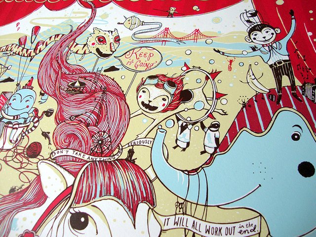
"Keep the circus going inside you, keep it going, don't take anything too seriously, it'll all work out in the end." -David Niven
The quote above is indeed a good one to live by, though often too easily forgotten.
At the time of its creation, this screen print was in itself a vacation from my more "serious" work. Drawing in a simplified flat style is a great way for me to loosen up and worry less about shading and realism. Creative people (and I suspect all people) occasionally find themselves taking their work too seriously, not to mention life's little setbacks and frustrations. The concept is universal.
This piece was originally created for Bazaar Bizarre San Francisco - a show and sale featuring indie goods and artists. I created the show's mascot - A bear with a mustache and monocle (that I realize looks a bit more like some sort of blue badger). We knew we wanted the bear in a prominent position with the circus and quote around him. We also wanted to include some details that subtly reference specific artisans and companies involved. As usual, I started with a pencil drawing.
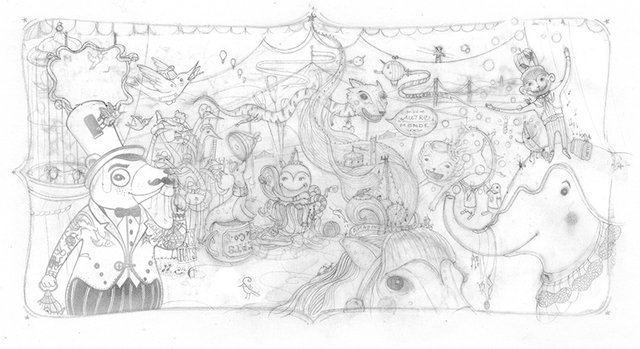
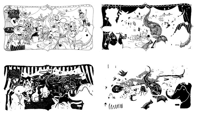
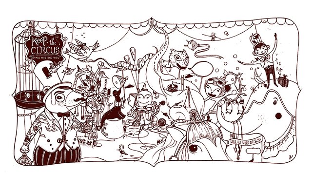
From there, I blew up this small drawing to full size (about 11"x 17") and traced my sketch with ink to make a clean drawing. Because my scanner only scans up to 9"x 12", I made my drawing in many parts and reunited them in Photoshop. I first created the outline, which would become my dark brown layer in the final print. I like using Micron Pens in sizes 01 and 005 for detail.
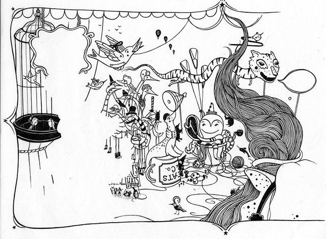
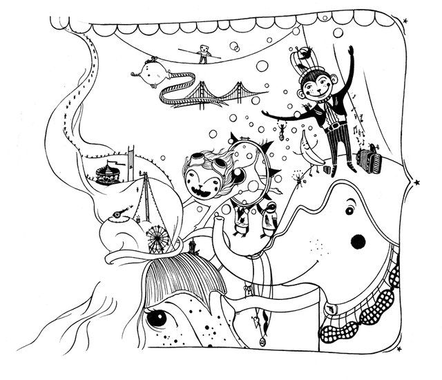 In this first pass, I left room for parts of the drawing that would be printed in other colors. At this point I didn't worry too much about little mistakes or smudges because I can clean those up digitally. I then used this line drawing as my base and made the other drawings on vellum paper on top of it. There will be one drawing for each color of ink that will be screened. In this case four colors = four drawings.
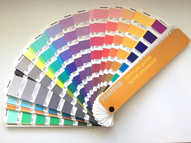
Once the four drawings were finished, I considered colors for the print. This is fun and the possibilities are vast. I knew I wanted a vintage circus palette. Because this particular print would be printed professionally, I consulted my uncoated Pantone swatches and picked by number. You definitely don't need this tool to pick colors - it just gives you an accurate physical example of what to expect.
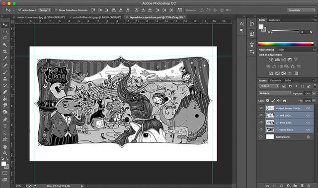
There are many ways to draw and submit a piece for screen printing. I submit a layered Photoshop file with each layer labeled by Pantone number. This leaves little room for error. Below is a black-and-white version of the file so I can see the overall value of the piece (which helps me pick how light or dark my chosen colors should be). But before I sent this to the printer, I switched each layer to 100% black. The file looks like nonsense when in black layers, but once each is printed in color, the piece will appear!
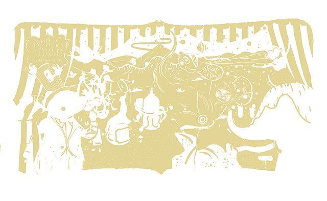
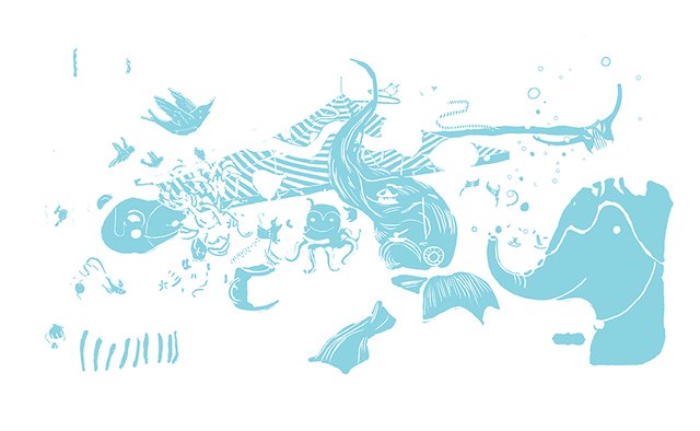
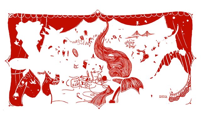
Below are the ink colors one by one. I print the lightest color first and finish with the outline.
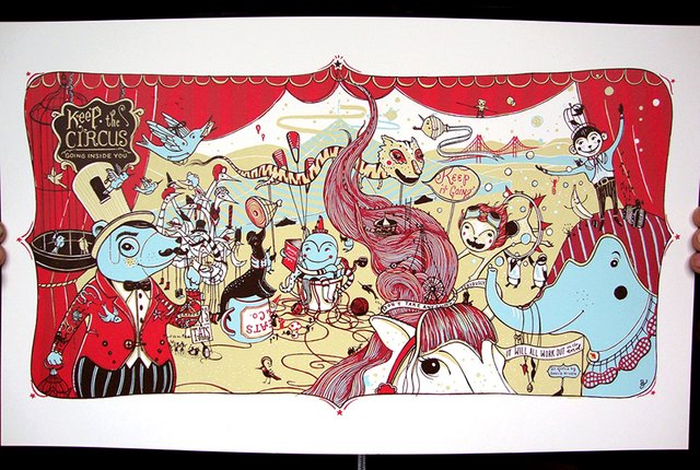
 And here is a picture of my fingers holding the final print! This is one of my favorites to date because it reminds me to lighten up every once in awhile and to remember why I make art. It can hopefully serve as a reminder to all to continue to learn and do things that excite you, and not to get stuck in predictable patterns. Here's wishing everyone a day of spontaneous possibility!
Images © Jaime Zollars 2016
You are pure joy, my dear Jaime! This writer is out of words :)
Well @andreeagarden that's so nice of you to write! I just checked out your previous posts - I turn 40 in a few short months myself ;)
Beutiful style. I follow you ;)
Thanks! your paintings are beautiful! I'm following back ;)
Great illustration!
Thanks @comealong !
Fantastic! And what a fascinating process. I've been looking forward to seeing this, it's wonderful!
Thanks! Lots of circus fun today ;)
but no creepy clowns! ;)
I love circus style illustrations! This is great!
And your progress images are so helpful for other designers.
Thanks @bianca-dupree ! I do hope some of the process helps others!
So fascinating to see this process laid out by color - this is like screen printing, isn't it? Wonderful work.
Yes! This is a screen print. I got into screen printing after I graduated as a new way to feel like art was still a hobby. It was so different than my other techniques that it really felt like play again, and I still turn to it for the right assignments! I printed my own prints for years and then started having small print shops do the printing for larger runs.