SEC S19W4 || Organization using CSS (box-model Display, Position, Flex)
Hey everyone, this is @suboohi, I am taking part in the contest how you can organize your content with CSS using box-sizing display, flex, position properties, I thoroughly read the lesson and learned about the basics of web page development.
lets start the answers to the asked questions.
Theoretical Answers

There are two basic properties of display those are, inline and block, both are fundamentals of webpage design. As name implies in inline does not require a new line to start, you can not set width and height properties, it takes width as required. we can avoid wasting horizontal space, It efficiently using available space and reduces gaps between elements.
When an element is given display block, it takes up the full width of its container, causing subsequent block elements to be placed below it. they automatically stretch from the left edge to the right edge of the container, regardless of the content's width. This ensures that the entire horizontal space is used, but any remaining space on the sides remains empty if the content does not fill it.

Margins in CSS are part of the box model and are used to create space outside the borders of an element. They help position and space elements relative to each other, and understanding how to use them can greatly enhance layout control. margin:10px this means a 10 pixels of margin on all four sides. If we want to set different margin on left, right, top or bottom so we can use margin :5px, 12px, 5px, 12px ; that means; top of 5pixel margin , right of 12 pixels, bottom of 5 pixels and left of margin 12 pixels.
Border as name implies it creates border between the two different containers. they can be dotted borders, dashed borders, inset borders, outset borders, hidden borders, thick borders, double borders, and solid borders. The syntax for these can be;
border: 2px dotted red;
border: 5px dashed blue;
border: 3px inset green;
border: 4px outset purple;
border: 1px hidden gray;
border: thick solid orange;
border: 5px double black;
Padding is used to create space between the content inside images or text. for uniform padding the syntax would be padding:10px: this means 10 pixels on all four sides. For vertical and horizontal padding the syntax would be; padding: 10px 20px; 10 pixel padding vertically means top and bottom and 20 pixels padding horizontally, left and right. and for all four sides's different padding we will use syntax padding: 10px 20px, 10px, 20px;

As name implies position property help in positioning the elements and how they interact with other elements. There are five major positioning types; static, relative, fixed, absolute, sticky.
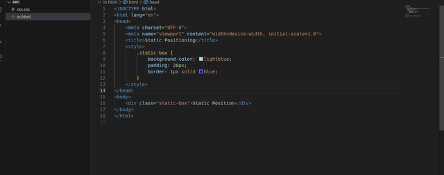
Static Positioning: HTML elements are positioned static by default. if it is static then no left, right, bottom or top positioning will affect it.
 |  |
|---|
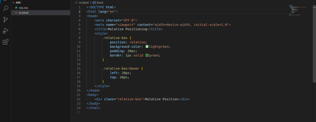
Relative Positioning: It is positioned relative to its normal position.
 |  |  |
|---|
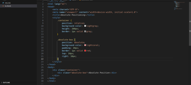
Absolute Positioning: It is positioned relative to the nearest positioned ancestor or moves with scrolling.
 |  |
|---|
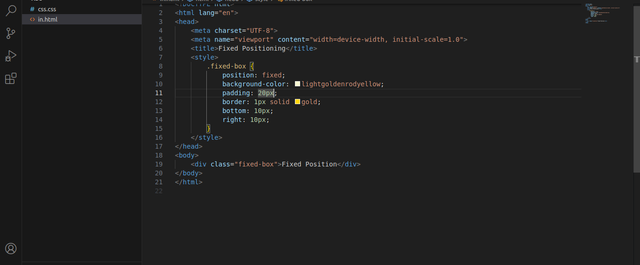
Fixed Positioning: Always remain inn the same place even when the page is scrolled down.
 |  |
|---|
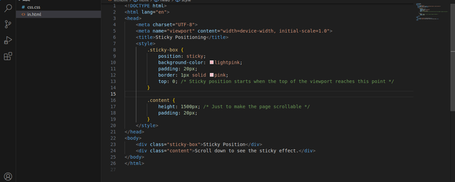
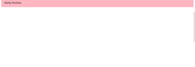
Sticky Positioning: It is positioned based on the user's scroll position.
 |  |  |
|---|

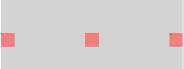
The display flex property makes it easy to create flexible layouts. It arranges child elements in a row or column and allows you to control their alignment and spacing. It works in two dimensions that are horizontal and vertical but focuses on distributing space along one axis is row or column.
The display grid property allows you to create a grid-based layout, which is ideal for two-dimensional layouts (rows and columns). It gives you control over both dimensions and lets you place items precisely within a grid structure.
| Flex | Grid |
|---|---|
 |  |
Practical Answer
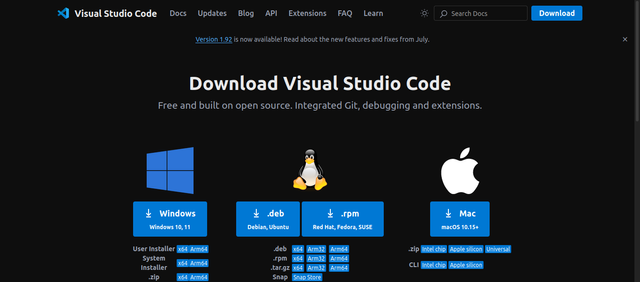
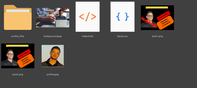
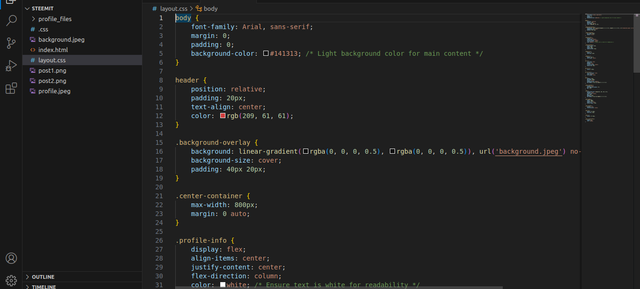
First I downloaded the VS code in my laptop. Install it and then created a folder named steemit. In which I created index.html file and layout.css file, added pictures needed like kouba01 profile picture, and other post images. So we can include it in our web page.
 |  |
|---|
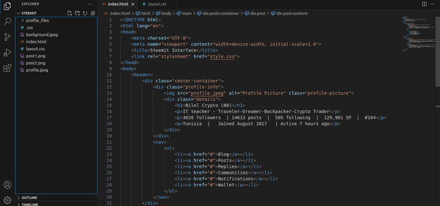
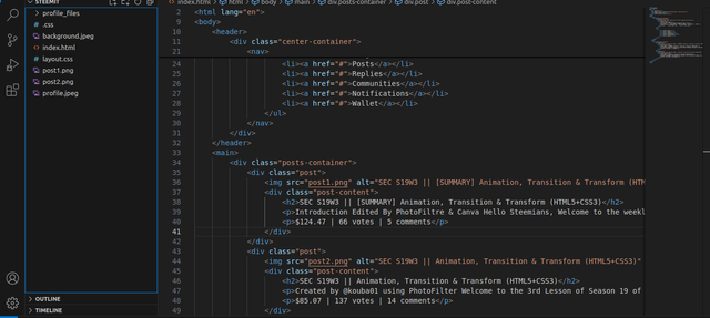
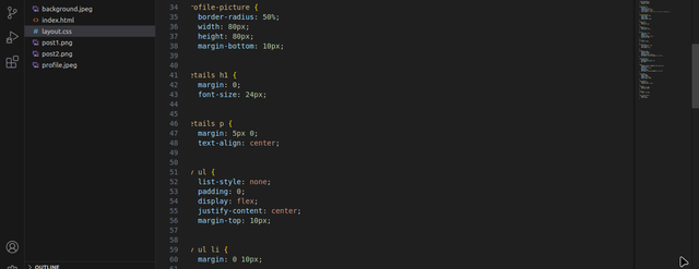
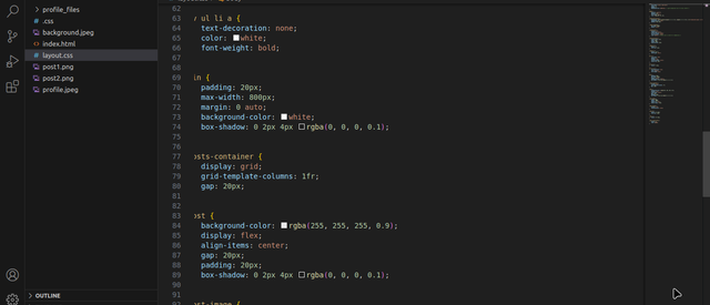
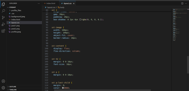
In HTML file I wrote the code for the structure of the web page. The header displays the profile information such as a profile picture, name, description, followers, posts, following, location, join date, and last active time. And also there is a navigation menu with links to different sections like Blog, Posts, Replies, Communities, Notifications, and Wallet. Each post is represented with an image, a title, a brief summary or introduction, and it's earnings, votes, and comments. CSS styles enhanced the HTML structure of the web page.
 |  |
|---|
 |  |
|---|
 |  |
|---|
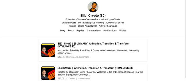
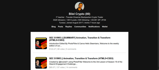
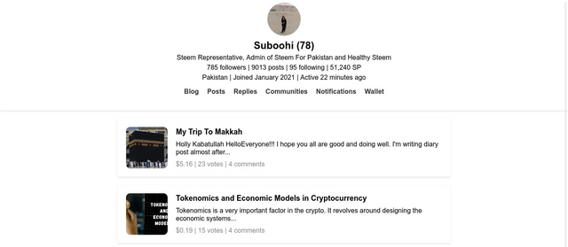
I also tried it with my profile.
Thank you for reading,
All images used in the post is my own
inviting @sualeha, @roohiasif99 and @drhira to take part in this contest
Thank you, friend!


I'm @steem.history, who is steem witness.
Thank you for witnessvoting for me.
please click it!
(Go to https://steemit.com/~witnesses and type fbslo at the bottom of the page)
The weight is reduced because of the lack of Voting Power. If you vote for me as a witness, you can get my little vote.
Upvoted. Thank You for sending some of your rewards to @null. It will make Steem stronger.
THE QUEST TEAM has supported your post. We support quality posts, good comments anywhere, and any tags
Thanks @sduttaskitchen for the support
Aww 🥰, you have done a nice job here mam, I never knew you were this good at programming. I wish you success in the contest.
Greetings to you
happy to find you here. I like your presentation where you explain with examples. This way everyone can understand it well. Practical work is also great. I wish you the best of luck.
You have shown your understanding of the challenge by perfectly answering the questions in well well-presented way. Your explanations and design a proof of how good you are. I like it when females are programming. I enjoyed reading your post. Success to you.