A Day at the Beach No.2 - Pseudo Abstract Minimalist Digital Painting
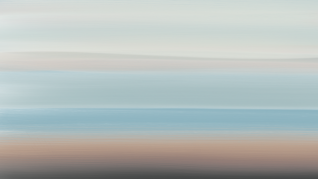
A Day at the Beach No.2
Here's another piece I created on Corel Painter 18.

The Inspiration For This
This is continuing on the theme of the beach and the ocean using oil brushes.
What I'm trying to do is invoke a sense of the ocean through colours and textures whilst keeping it as minimal as possible.
Alternative Version
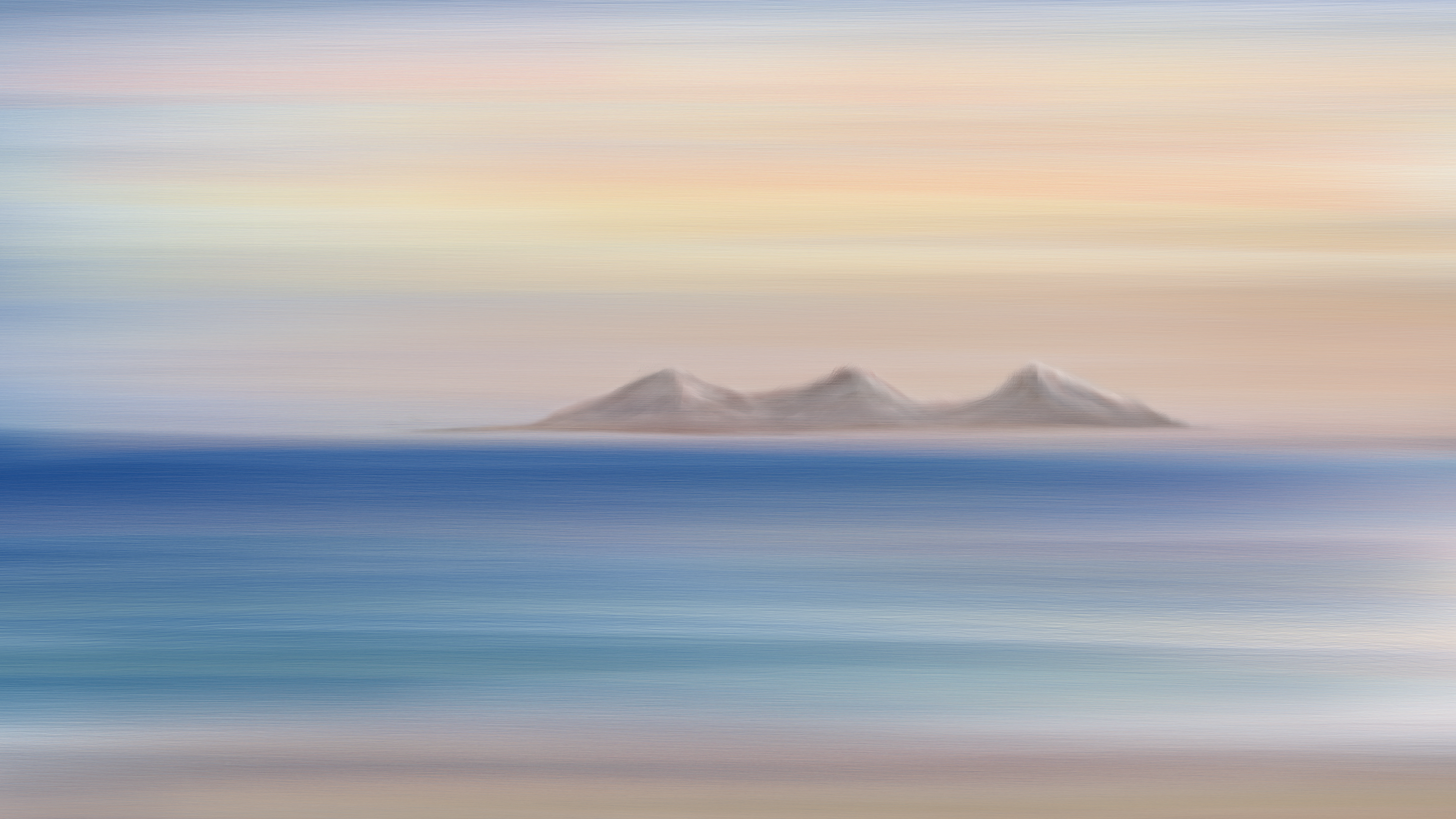
I also experimented with creating a landmass in the distance which I have included below.
Personally I think it looks better without it:

The rocky island (which was meant to resemble volcanic peaks) just makes it look too cartoony in my opinion
It detracts from the simplicity and minimalism of what was meant to be a study in texture and colour rather than detail.
Perhaps you think differently - let me know.
Also (as I usually say) feel free to use it in your own posts if you can find a use for it.
The Original - A Day at the Beach:
In case you missed it this is how the original "A Day at the Beach no. 1" looked:


Looks good
This post received a 2.5% upvote from @randowhale thanks to @maxsteem! For more information, click here!
Both look nice. But without looks better ;). The mountains don't fit in that style though. Keep it up. Really like watching these :)
This post received a 1.5% upvote from @randowhale thanks to @rkrijgsman! For more information, click here!
Yes I think it is a clash of style. The mountains were done after I finished the rest and it just doesn't work.
yes, without is much better!
really very great collors, very atmosphere painting!
upvote and follow!
I also invite you to see my blog. there is a lot of post about my art, this is I just posted also I found very nice!
Thank you:)
All of your work is always absolutely amazing but unequivocally I think this is my favourite. It looks so beautiful that I just want it framed on my wall.
This redesign of it looks way better than the original one. I guess this one may be better because you have a wider dynamic of colours with a light and airy blue contrasted with a deeper darker indigo.
I seriously can't express how much I love the look at it and it is amazing to see how with a minimal amount of textures you can make something so detailed and intricate.
Great Job @thecryptofiend on making this masterpiece! :)
Thank you. This is not a redesign more a part 2 from the same kind of idea.
Amazing!..

This is interesting, I enjoyed watching your natural views with these nice colors :) keep sharing please, and waiting for more.
I just followed you.
wow, solid painting and choice of colors ..makes me wanna go to the beach and swim with the sharks , upped as always...keep it up and have a blessed weekend.
Thank you:)
welcome, feel free to see my latest post on steem price issue . I wish you a blessed weekend.
the original painting was not as defined, and had a misty ethereal quality to it. The darker hues in the water help define the boundary between sea and sky, but the same evocative sense of haunting is there, reminiscent of the hollow echo of a sea shell.
I have noticed that cartoon-like element in digital paintings other steemians have posted but have never seen it in yours -- but I do agree that less is more, and in this case, the island had to go simply because it drew the eye away from the tension between sea and sky. Lovely work.
Yes the original painting was supposed to be more soft :)
wow looks so beautiful there, you painted or the pictures are in this quality. Good job keep going. Thank you @thecryptofiend
Thank you.
It is a good digital painting @thecryptofiend putting those mountain peaks gave it more depth.
Now you can compound your painting by putting more landscapes and other items to make it far more better.
Thanks - yes I will keep working on it.
Ha! I was looking at the picture, and imagined that an AI started to express it's originality :)
Lol - there are some images like that they are more psychedelic though:)