The Hive. Using Steempeak.
The Hive Steempeak.
Hearing about this site from @TheKittyGirl I went and had a look. Kitty Girl does share some good links. or posts. She is possibly if not already published a post about Steempeak.
On logging in, you will see your feed table. Straight away here you have option for the display. Let's take a look at this first page you see and the options available. I highlight three parts of this screen shot. The first highlight is in orange and only highlights the page we are on. Second highlighted is in red and two option are available there. The third highlight is in green, this is an option for what you will see on your feed.
From the feed page, The first icon highlighted in Red will reveal a third option highlighted in Green. Clicking on this option will remove any resteems from your feed, allowing you to only see posts from those you do follow and dismissing any resteems done by members you follow.
The second icon in the Red highlighted section is for your display and how it appears on your .screen. For the next screen shot, (still on the feed page). I have now clicked to not show resteems by clicking the box highlighted in green. The Queen will not be the first post I see on my feed now. I have also click the second icon in the red highlighted section. This changes the feed post preview format. Your feed now has a grid display like below.
The difference between the settings is a personal preference, I am sure there would be an equal value to having any combination of setting here.
The profile page is pretty much a standard page and does not offer much for preference other than the display option. The display options along with that of viewing posts which have been resteemed.
Highlighted in red you can see again the option to change the view of filter out resteems.
The section highlighted light Blue will not be looked at, I think those will be known about and the function they have. I have tried clicking on the portfolio tab, though I have not got it to load anything as yet.
Moving on, The comments tab let's you view previous comments you have made. The replies tab is a bit more exciting. In this tab you can reply straight to comments left on your post. No need to open a new tab or change page. All your replies to others can be made from here without having to go to the post the comment was made in. For those who fall behind on comments, this could prove to be a great asset.
Three sections are highlighted in the screen shot above. These are marked in orange and all relate to replying to a comment to you. Writing your replies like this could be a real time saver for many. I found it also make it much easier keeping track of where you have replied. Highlighted also in this screen shot in red is an Information Icon. Scrolling your mouse over this icon will display your voting power with both the maximum and current level of reward. I like that maximum and current myself.
The topic tab to me looks pretty much like a trending page. It does offer an option on how to view this trending by the reward level or time created. This is not a tab I will make much use of myself.
Moving over to the right of the tabs bar we see a few icons. Recognizable is the write a post icon. To the right is a schedule icon followed by an alerts icon.
Your write a post tab, has a great addition. Two options are available here to see the preview to your post before posting.
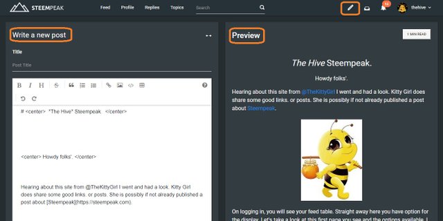
Three orange highlights here, all related to writing your post. Your preview can be seen on the right side of the screen as you write. this is beneficial to viewing how you post progresses as you write, without the need to scroll up and down the page.
When it comes to publishing your post, there is also a schedule option, a save as draft option and the post option.
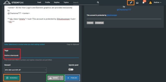
In red I have highlighted the tag section where you select which groups will see your post. The orange at the top showing that we are still in the "write a post" tab. At the base of the screen shot you can see highlighted in **orange too an option to schedule a post for publication. In green is a save option and cyan the publish.

Under the personal tab, in this instance The Hive there is a list of other tabs. The bookmarks tab I have not made use of yet. The activities tab takes a look at

The four remaining tabs, I will take a look at in the following screen shots. Starting with the activities tab. This lets you view recent activity such as votes, comments and rewards.
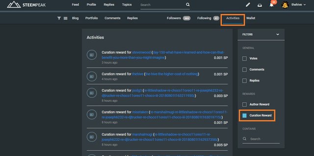
A neat little gadget in this one letting you filter through the activities. Selected in this screen shot is curating rewards, which filters out all other activity associated with the account. There is also a cool search feature, to assist in finding that post you want fast.
The wallet is standard when you open it first. However, if you want to check a recent transaction with another user, the search option is available here too.
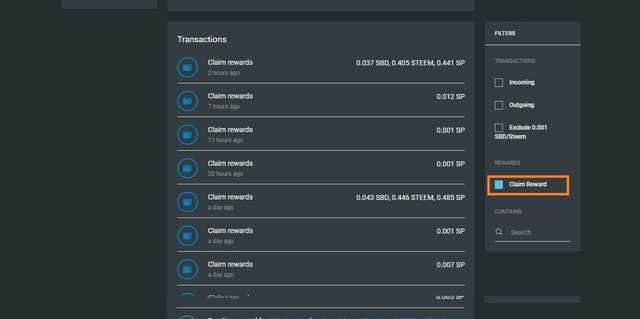
The wallet also has a cool filter, letting you select what you want to see for faster viewing. Selected here is the curating rewards, excluding all other transactions for quicker reference.
Your setting tab has a cool feature, You do not have a slider for your vote level, there is an option to set the level you want to vote with to both posts and comments.
For those who do not use Ginabot, there is an option available to choose to receive or not receive a variation of notification types.
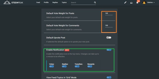
This entry point seems to be full of wonders. each section has improved in a positive way advancing on the Steemit entry point with no negative effects that I can see.
The dashboard is the best by far for novelty, You have to get a look at this, if you like to check your history at all this is a must for you.
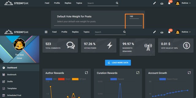
General stuff across the top, than bam!, you are hit with charts that can help you judge your progress. Combining the information held in these charts, can help you better your Steemit game. Right now for The Hive we will be making the best use of these charts that we can.
I think I got everything covered there, I did not go too much into the charts that are there, I expect you will greater enjoyment exploring through those yourself.
https://discord.gg/SQ3zSsp
Some other groups I invite you to take a look at are:
The @IFC Discord group: https://discord.gg/uSGDtKR
The @cryptoempire Discord Server: https://discord.gg/9JhyHXg
The @asapers Discord Server: https://discord.gg/2gJD7PW
The @buddyup Discord Server: https://discord.gg/3d5H3K8
The @steemitramble Discord Server: https://discord.gg/QJzP2zm
@danielsaori @yehey @pharesim @yabapmatt @steemcommunity @enginewitty @jackmiller
All these witness have come at the recommendation of
Jan23com to the The Hive.
They do not reflect the opinions of individual members of the group or the group as a whole.
by
@Charisma777
It looks like an interesting front end, I think i will wait a bit before delving further into it. I know a lot of people like busy, and a few other front ends, but I started with the steemit front end, so will continue for now.
i like it for the charts and graphs
They do look nice, and change is inevitable, all the systems/front ends have something for someone. What I would really like is a bit more HTML available for making post, but that is down the road I guess.
You got a 25.00% upvote from @automation courtesy of @thehive! This is a service sponsored by @yehey. Please consider voting @yehey for Witnes. Use this short URL link https://on.king.net/witness simply click and vote, this will redirect to Steem Connect for secure connection.
Interested to earn daily? Delegate Steem Power to receive 90% payout rewards. Use this link https://on.king.net/automation to delegate SP to @Automation.
If you need an extra upvote, join us at https://SteemChat.com discord server.
Have a lovely day.
@Automation - Keep Steeming for a better future.
Congratulations @thehive! You have completed the following achievement on Steemit and have been rewarded with new badge(s) :
Click on the badge to view your Board of Honor.
If you no longer want to receive notifications, reply to this comment with the word
STOPTo support your work, I also upvoted your post!
This post has received a 20.01% UpGoat from @shares. Send at least 0.1 SBD to @shares with a post link in the memo field.
Interested to earn daily? Delegate Steem Power to receive 95% payout rewards. Use this link https://on.king.net/shares to delegate SP to @Shares. Join us at https://steemchat.com/ discord chat.
Support my owner. Please vote @Yehey as Witness - simply click and vote.
It looks pretty good to me. I'll give it a try. Thank you!
I like the extra features it has :) and that it has so much in the same place a bit like Steemworld Using a combination of different things from various places helped me build up a map of what I do in my mind.
Awesome review! You covered some things I did not, so it's great that you did one, too! 😊