Steemit Crypto Academy Season 5 Beginner's Course - Task 10: Candlestick Patterns
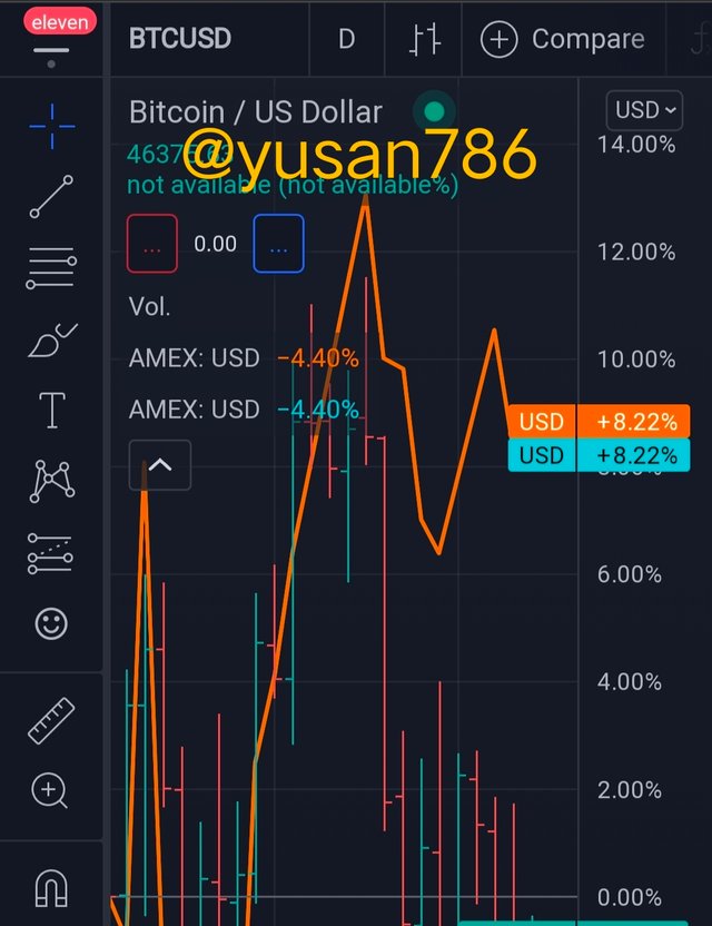
1a) Explain the Japanese candlestick chart? (Original screenshot required).
b) In your own words, explain why the Japanese Candlestick chart is the most used in the financial market.
c) Describe a bullish and a bearish candle. Also, explain its anatomy. (Original screenshot required)
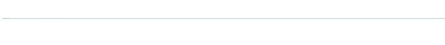
Explain the Japanese candlestick chart? (Original screenshot required).
We can get more information from a Japanese candlestick chart than we can from a line graph or any other style of graph. It may be used to forecast future prices and is considered the finest for trading because it tells us when to enter and exit the market. It is technical analysis of price behaviour with the addition of a forex chart.
If we want to create a candlestick pattern for optimal conditions, we should do it for a full day. The candlestick patterns can be set for 5, 10, or 20 minutes. When we establish the candlestick patterns for the entire day, we get information on the entire day's closing, opening, high, and low prices, as well as a prediction.
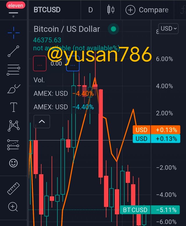
Technical analysis offers us an indication of what traders and investors are doing, such as if there is strong buyer momentum or strong selling momentum.
- If there is a significant buyer's momentum, the price will rise.
- If there is a significant seller's movement, the price will fall.
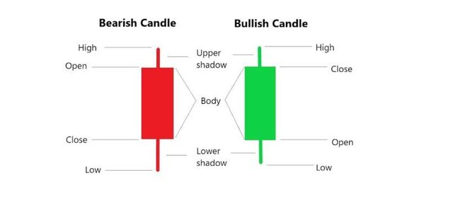
Candlestick Chart Anatomy 📉📈
The different body components of a candlestick pattern reflect the price movement and potential moment in the market. Below are some of the components of a candlestick pattern.
- Opening When you create a chart for a day for a few minutes, the starting price of that chart represents the market's opening price.
- Closing price It is the price at which the chart ends at a certain point in time.
- Shadow The lowest and greatest price levels during the specified time range are represented by the shadow.
- High There are the highest price that was reached in the market at the time when we set up our chart for the day or a few minutes.
- Low This line represents the market's lowest price over the specified time period.
.png)
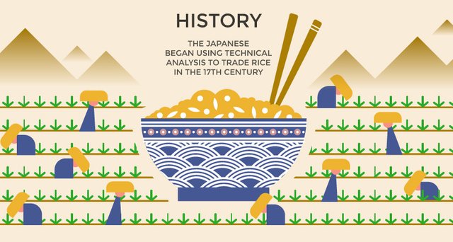
History of candlestick chart
A centralised market for trading was developed in Japan by the beginning of the 17th century. Its headquarters are in Osaka, Japan's capital. Munehisb Homma, a rice trader in Japan, invented the Japanese candlestick chart. To chart and track rice contracts in the 18th century, he employed candlesticks. He charted the opening and closing prices of the rice, as well as the high and low of the day. After a while, he notices that the majority of the pattern repeats itself after a few days. Because certain of their prices have repeated over time, he can use the past graph to anticipate future prices.
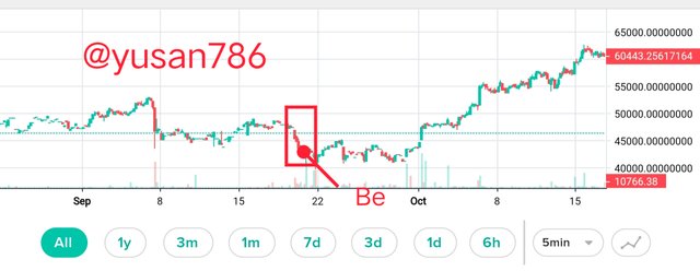
- Alert the spotter
- At high levels, a spot sell signal is issued
- At low levels, a spot purchase signal is issued.
Source
These are some of the reasons why Japanese candlestick charts are so popular in the market.
- The candlestick pattern is utilised because it is the most extensively used in the market and is the simplest approach to understand market trends.
- The candlestick design is made up of two colours, one red and the other green. These two hues assist investors and traders in analysing the market and determining whether they should enter or quit the market.
- The candlestick chart can be used to forecast future prices as well as provide insight into what is going on in the minds of traders and investors.
- There are four points in the candlestick chart: opening, closing, high, and low. These four points provide the reader with the most straightforward understanding.
- We can comprehend the market demand and supply trend by presenting the chart.
- When comparing a candlestick chart to a bar chart, the candlestick chart is more visual and provides us with clear information about demand, supply, and price movement.
| Bullish pattern | Bearish pattern |
|---|---|
| When the close of a candlestick is higher than the beginning, it is called a bullish candlestick pattern. | When the closing is lower than the opening, a bearish candlestick pattern is formed. |
| Green or white is the colour of the body of the bullish candlestick pattern. | The red or black body of a bearish candlestick formation. |
| Bullish is related with goodness and the belief that positive things will happen in the future and that market prices will rise. | Bearish implies that the market is declining or decreasing, and that things will not improve in the future. |
| The market is in a bullish pattern, and the economy is stable. | In a bearish pattern, the stock's value falls and the market falls. |
| A bullish pattern indicates that we should invest in the market and that we expect the price to rise. | A bearish pattern is one in which prices fall in the future from where they are now. |
Anatomy of bullish and a bearish candle
Source
The red colour of the bearish candle is represented by the presence of two wicks above and below the body. The upper one depicts a high-priced opening, while the bottom one depicts a low-priced closure. There is a body present in the centre. A bearish pattern indicates that the market's initial price is higher than its closing price, indicating that the market is downtrending.
The body of a Bullish candle pattern is green, and the body represents closed and open positions. The top wick is closed at high while the bottom wick is open at low. It signifies that the market began at a low price and ended at a high price, indicating that the market is rising.
Conclusion
In this lecture, we learned a lot about candlestick patterns, which may help us enter the market and determine if we should invest our assets or exit the market. Compared to other patterns or charts, candlestick patterns provide more detail and accessible information. The Japanese candlestick pattern is often employed in the market since it is simple to comprehend for the majority of individuals.
There are various candlestick patterns that can help us anticipate the market, such as bullish and bearish candlestick patterns, which can help us determine whether the market price will rise or fall in the future. It is a highly extensive and informative lecture, as shown in the screenshot.
All of the screenshots were grabbed from Canva, with the exception of the picture and its Trading View

Thanks you Prof . @dilchamo
Mention
Prof . @dilchamo