Pastel Pencil Painting - Bruynzeel
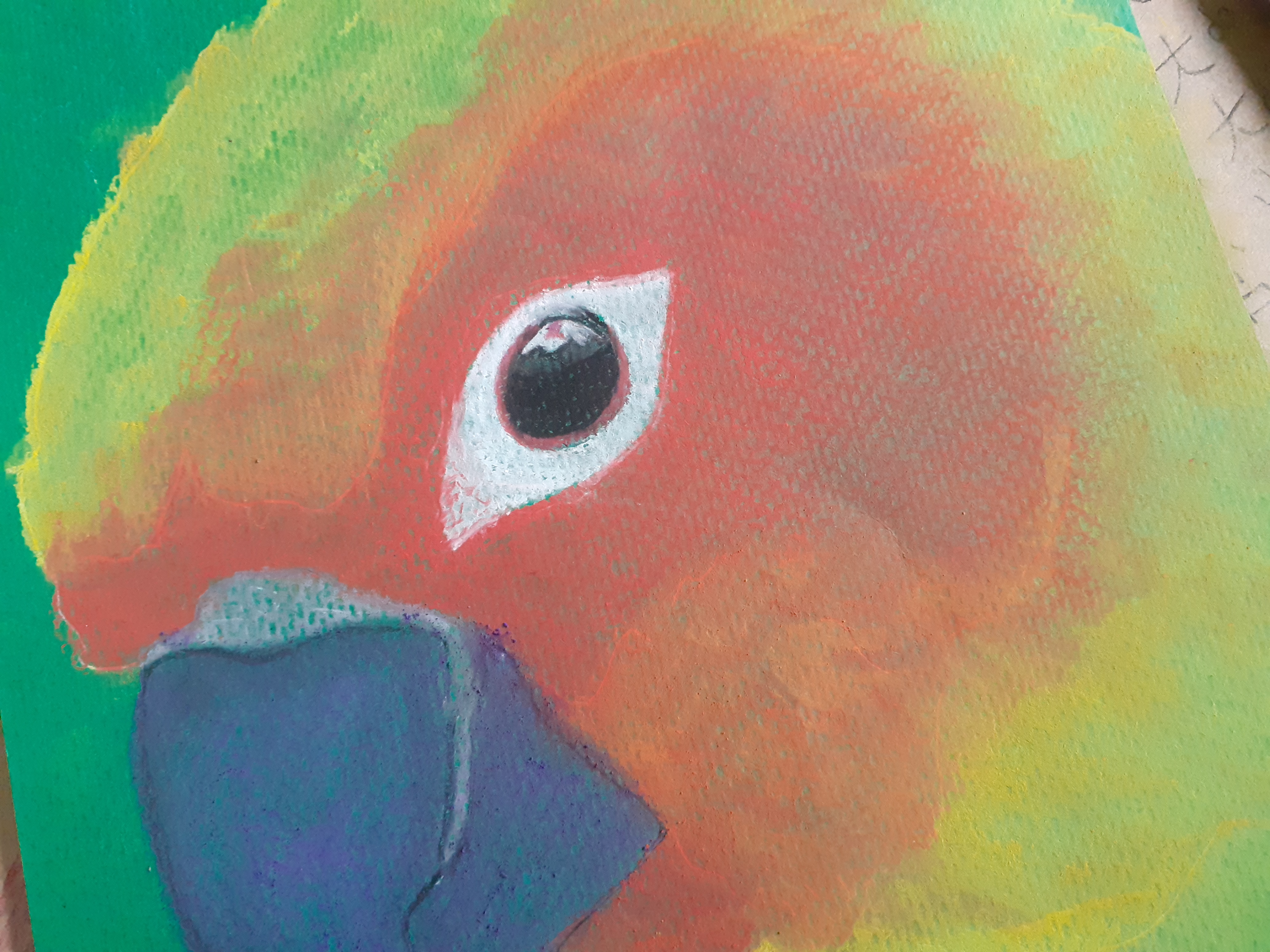
As I mentioned earlier, I’ve got loads of green paper left over, so I’m just going to use it all up. The idea you can see in the photo isn’t mine, but you can probably find it on YouTube. It’s a free video explaining how to make this bird, and it’s done using carbon paper. You use white carbon paper to trace a photo onto the pastel paper. I’m still stuck with that green stuff with a bit of texture, but pastel mat is recommended. I have this paper too. It’s quite pricey, and I have the light blue colour, which just looks like grey. However, I don’t want to use it for this, as this is nothing more than a test – in this case, testing the Bruynzeel brand pastel pencils.
I’d used these pencils during the painting group and eventually I just decided to buy them myself. The pencils are a lot cheaper than anything else recommended, but I actually thought they worked quite well and, all in all, they cost quite a bit, so it would be a shame to leave them unused. I suspect that the Bruynzeel pencil is a lot harder on one end than many others; I wonder whether the colour is actually deeper or lighter, though I didn’t really notice it on the bamboo paper at the time.
What is a fact, however, is that pastel pencils contain considerably less pigment than soft pastel chalks of any brand – in my case, Rembrandt. I had to restrain myself from reaching for these chalks, because the pencils really don’t produce much colour, and as soon as I try to rub them into the paper, the colour only fades further.
As for the result, there’s little difference from soft pastels or chalks. I can’t get the paper to take the colour properly; perhaps that’s not too bad in this case, as a bit of green on a bird doesn’t hurt.
In any case, this piece isn’t finished yet; let’s say there are now about two to three layers on it, and these are a lot less thick (and colourful) once you rub the pastel in. In the end, instead of rubbing, I just gently tapped the pigment in.
I still need to add some details to the colour gradients, and as for the background, I’m still deciding whether it’s worth painting it.
What went wrong?
Of course, I pressed too hard on the carbon paper. As a result, I could see not only the white outlines (drawing details is pointless for this sort of painting because you’re always working in layers), but also the indentations in the paper, which is far from attractive (and I’ve traced more in the same rubbish way. Tracing isn’t really my thing, by the way. I can’t really do that either, just like I can’t colour within the lines).
Did I learn anything from this free lesson?
Not really. To be honest, I think my owl is much nicer, and I made that without any instructions, just by getting on with it using bRbrandt soft pastels
Note
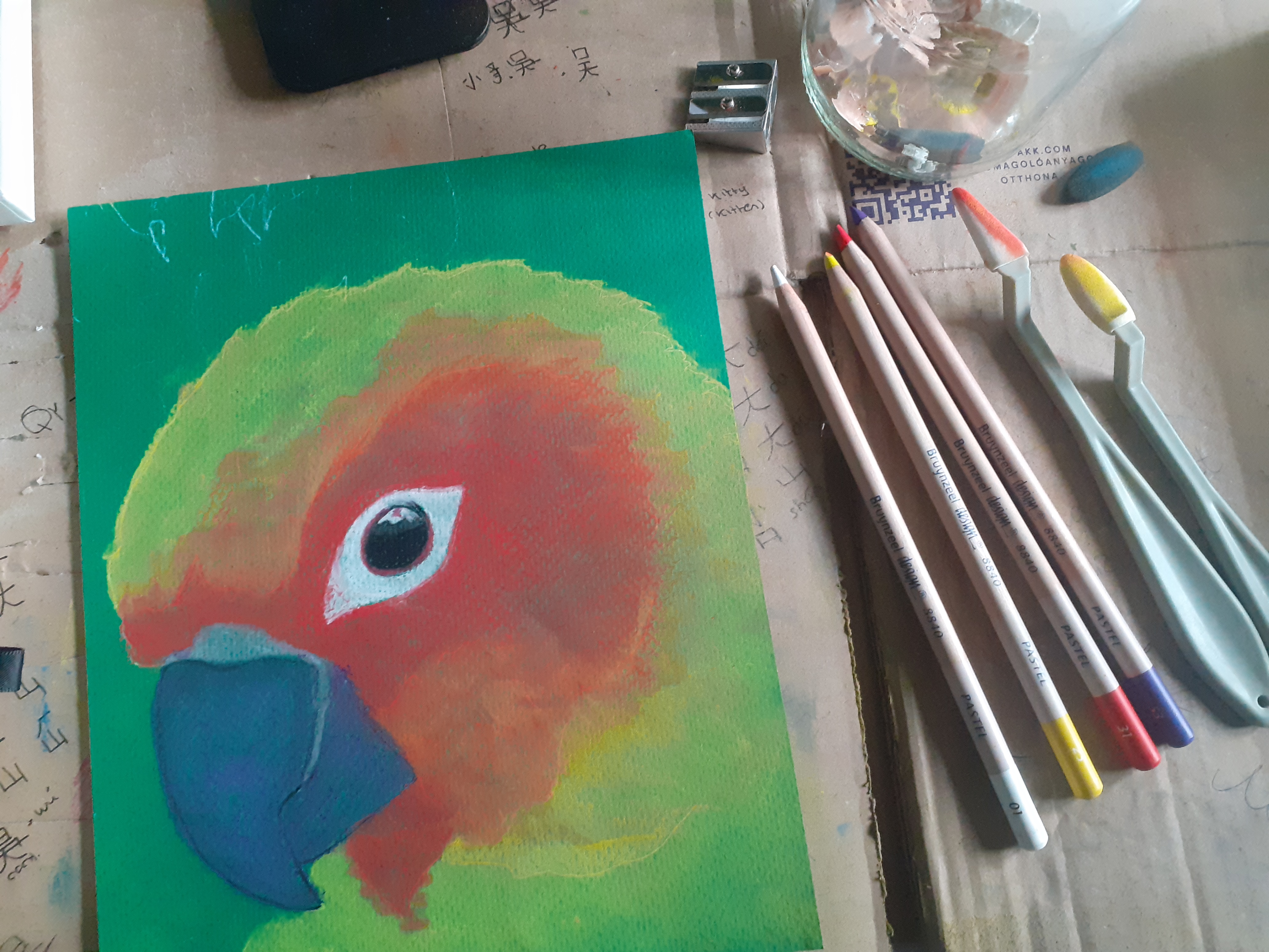
In average it is hard to sharpen pastel pencils simply because they are too soft. For the Bruynzeel pencil I used an average sharpener and it worked great. Since the sharpener is cheap I don't see any point in buying something expensive or use a Stanley knife.
Materials
- Bruynzeel pastel pencils: red, yellow, white, black, purple.
- FABRIANO® - Tiziano pastel paper - kleur: Prato
- pencil sharpener- sponges, vinger, tissue
12-5-2026
The green tone looks great.
That parrot is nice. Good job.
Thank you
♥️🍀
I have a feeling you’re having some difficulty blending on this paper. By the way, if you have extra green paper, feel free to send some my way! ;-) My current papers are of such poor quality that the ink just bleeds/spreads whenever I try to do calligraphy on them.
I’m actually on the lookout for glossy paper; it’s my favorite for calligraphy. The quality of your colors looks quite good, too. Over here, we usually have Deer brand colors, but they don't blend very well either they’re mostly just good for kids' drawings
Indeed I cannot blend no matter how hard I try. For some reason more layers also don't work. It feels as if the paper should remain this way. See at the picture underneath.
By the way, My pencils are pastel pencils so not colouring pencils.
I am not sure what glossy paper looks like.
I could check and see if it is possible to send you some. I assume you also need a thicker paper than 60nor 80 mg
In average paper, printing paper + for school is affordable just not if it comes to art, tools included.
Hi, @wakeupkitty,
Thank you for your contribution. Your post has been manually curated.
- Delegate to @ecosynthesizer and vote @symbionts as a witness to support us.
- Explore Steem using our Steem Blockchain Explorer
- Easily create accounts on Steem using JoinSteem
To be honest, you don't need to worry at all. Blending oil pastels is a really tough task in itself. I’ve used them before, so I know how tricky they can be. I’m actually looking forward to trying soft pastels myself.I’ve heard they blend much more smoothly.
Your hard work really shows in this portrait. You’ve handled the features and the blending with a lot of detail.
Also, please don't worry about sending the paper. I was just joking. :-) I'll pick some up myself next time I'm at the market
I wonder if Aliexpress delivers to you.
These aren't oil pastels but soft pastels the pencils and I also have an old box of Rembrandt soft pastels of at least 25 years old. I also found a box for portraits but I am not skilled when it comes to faces I am rather blind.
There are soft pastels and soft pastels in all ranges and it mainly depends on the paper how good you can blend them but also if you can cover the paper. I believe I had way better results with the simple bamboo paper than with this. But I refuse to not use it after I spent money on it who knows I may find a different approach or the idea is to see the texture, like we can see the texture of canvas?
It looks great! I wonder if, after this exercise, you'll try it out freely, even if it's a different drawing. I'd love to see one of your betta fish made with these materials. Let's create; art calls us!
I am not sure if I will use these pencils to create complete drawings. They have fewer pigments, plus it will cost me an entire pencil for bigger surfaces and for that, a pencil is too expensive (over 2 euros a piece). I just use it now to try them out, finish the paper, and for that, I need to win some time. I am slow when it comes to sketching and my time is limited. Not that I in an average sketch of I use the soft pastel sticks. I don't see any point in it.
I'm not sure if I should make the colors more saturated and bright.
The image has a calm and balanced appearance. However, it's up to you to decide, as the photo may not accurately capture the colors.
What are those Chinese characters? Are you learning this language or using it in your drawings?
===========
Я не уверен, стоит ли делать краски более насыщенными и яркими.
Получился спокойный характер изображения, всё уравновешено. Но тебе виднее, конечно, может быть фотография не очень точна в передаче цвета.
А что там за китайские иероглифы? Ты изучаешь этот язык или используешь в рисунках?
I learn the language and I signed my drawing.
It's cool))
Это круто ))