Color and Light : Green Tomatoes
I was deciding which color to move on to next and fortunately got the opportunity to give some feedback to @ezunjoshy before moving on from the banana. He did an excellent painting after going through the Banana Series: Banana 1, Banana 2 and Banana 3 and if you haven't had a chance I recommend taking a look!
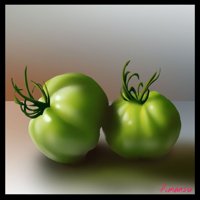
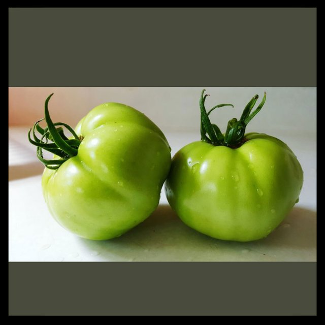
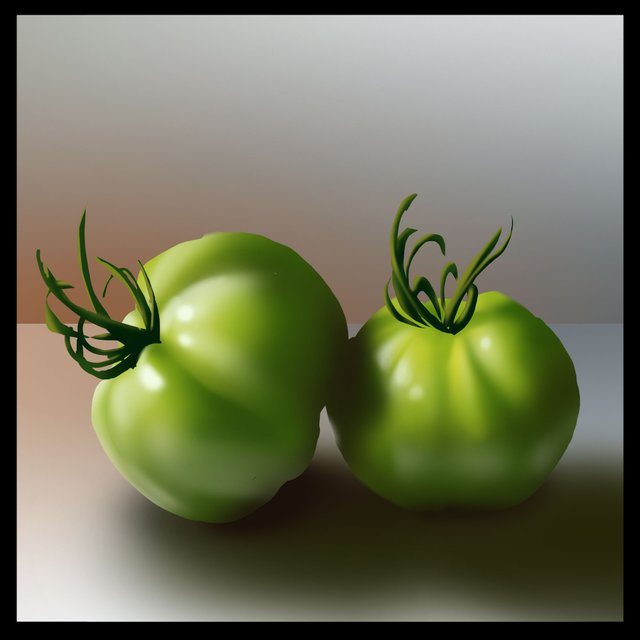
From yellow we are going to move along to green! I scoured the internets and found this image that has pretty good lighting to show off the color and even has some nice red and blue nuance in the background. It's super important to start off with a reference when studying a new subject and I didn't want to skip this step for you guys.
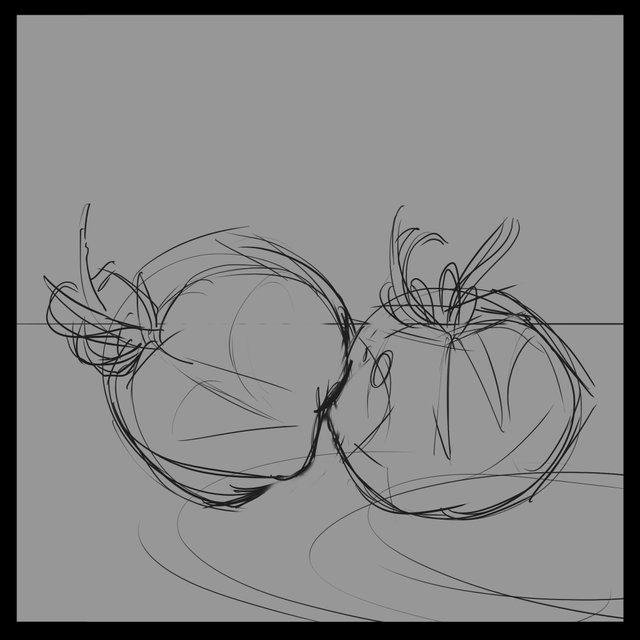
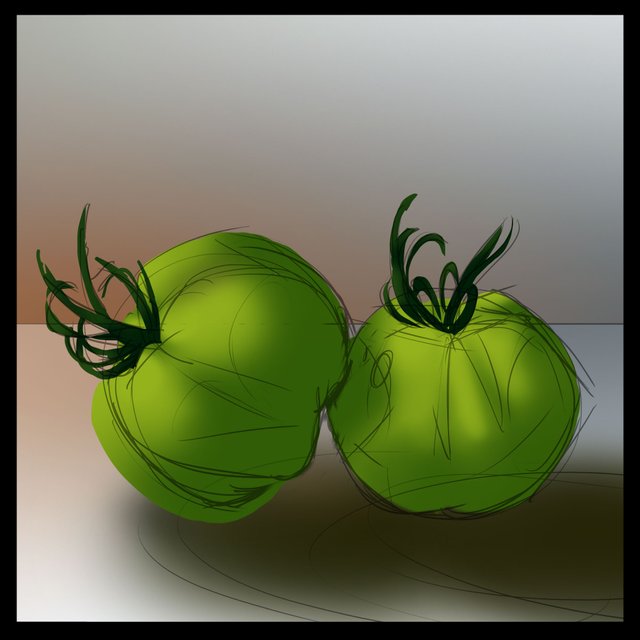
As usual we start out with a sketch. It's not important to be super precise here, we're just trying to find the overall shapes and build a little guide for the painting stages. I've marked out roughly where the shadows are and where some of the highlights are going to end up as well as the background horizon line.
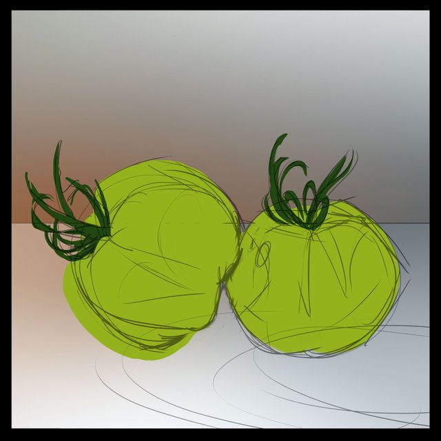
Here I've just laid in the flat colors of the tomato and it's stems and filled in the background with those nice nuance colors. I'm aiming for the warm grey reds and cool grey blues. One of the neat things about color is that by using neutral greys you are able to lean toward colors, like red, that might usually clash with green but when muted enough they kind of act like a supporting color instead of competing against the green. I'll definitely exaggerate this when we do the tomato from memory.
Next up for me comes laying in the shadows. I've gone about halfway to black and a little toward the blues.
For the light side I go not quite halfway to white but a little bit brighter and toward the yellows to make the color warmer.
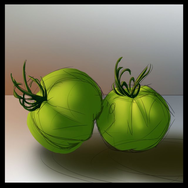
As I study my reference I'm noticing that there are areas where the tomatoes are touching each other and the ground and the light has a really hard time getting there. This is called occlusion and it's important to include if we want our object to have gravity. If the light can't get in there we shouldn't see much color at all so I'm going to go pretty close to black for those areas. Its subtle but hard to miss when you're looking at the reference.
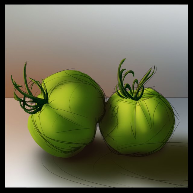
We're getting really close to the end so I think it's time for highlights! This is one of my favorite parts because it really shows off the material of the object. In this case, unlike the banana, which is more matte, tomatoes are very waxy and therefore shiny! So we get to put very round and bright highlights. I'm going pretty close to white and hitting the edges on the light side as well as the little rounded tops on the tomatoes.

Now for something we didn't really talk about last time, bounced light. As the light bounces all around the room it is going to pick up whatever color it is bouncing off of and carry some of that color onto the object on the undersides of what you are painting. In this case, because we have a nice reference, you can see that the white of the table is visible on the underside of the tomatoes in the shadow. It's very subtle, but along the bottom quarter to half of the tomato we've got to lay in a very soft warm white along the bottom side.
The same is true for bounced light FROM the object! So we've got to lay in some of that green bounce back onto the surface. After a little bit of gentle blending I'm call this one complete.
I know, it gets overwhelming at times, this is why I try to break everything down into steps. Eventually, it will be second nature after going through the process a few times. I have to say that after doing my banana studies I was paying especially close attention to some of the things I missed like the bounced lights and highlights. We are once again going to be doing this study over again from memory and then doing a silly one to really explore what we can do with our knowledge. I hope you'll join me!
I you want to go over how I made some of these color choices in this study you'll find a basic primer here.
If you need help getting started drawing, I highly recommend you head over to @jorgevandeperre's blog and start following along his lesson plans. @jorgevandeperre has over 20+ exercises to get started and is even giving out rewards to students who complete homework!
I almost don't understand where the photo is and where your drawing is)))
Very impressive result )
The power of having reference! I was totally impressed with @ezunjoshy's result as well.
Yes, I also like his drawings, a keen eye)
You post is nominated for „Visual Art“ Support Program, @booming account upvote. Only the posts that are not cross posted, original and posted from Xpilar community page If your post gets approval, then you get upvote within few days. Good luck!
looks beautiful
nice one
Thanks @sammy00!
Green tomatoes.
I live in the land of evergreen tomatoes.
But in fact, now we can get ripe red tomatoes in the greenhouse, but still the main part turns red after the tomatoes are picked and put to ripen in a warm sunny place.
Love green tomatoes, I like that they are a bit more tart than a red one.
I remember how in Soviet times there were many cans of salted green tomatoes on store shelves. Winter preparations of green tomatoes ... :)