On this edition of #Branding...
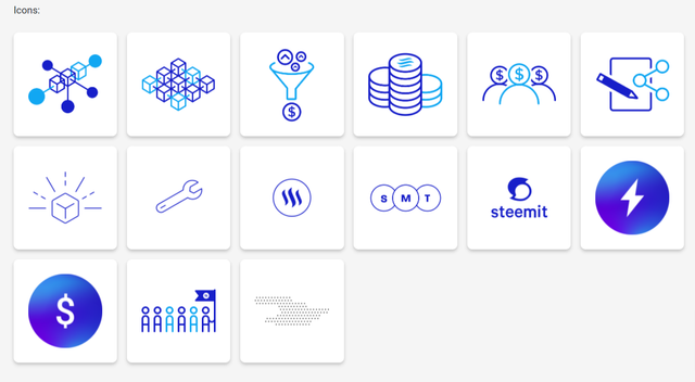
#steem brand icons as seen on steem.com
I'll love to talk a little bit about branding today. Specifically, about what makes a powerful brand. But first, take a look at this image below posted on Social Media a few days ago.

Image credit only included at bottom for purpose of the article's point
Forget about what's written on the image above for a second... Once you take a quick look at this image post above created by one of the most popular Social Media blogs in Anglophone Cameroon, you won't need to see their name before knowing who made the post... and they didn't even use their usual language
👏👏👏
So here's your gentle reminder that a #brand is much more than a #logo... it's an ensemble of visual and perceptive features that make you stand out in these #streetz.
As properly explained on Investopedia, The term brand refers to a business and marketing concept that helps people identify a particular company, product, or individual. Brands are intangible, which means you can't actually touch or see them. As such, they help shape people's perceptions of companies, their products, or individuals.
Photo by Alexey Mak on Unsplash
At the end of the day, your brand is informed by many things, but ultimately it is most informed by how people feel when they #experience you. A few of the other items which constitute your brand include:
- Yes, a Logo
- Your official colours
- Your Fonts
- Your use of shapes
- and more.
No matter what you do, be it as an organisation or as individual, it pays to create and maintain a palatable brand which will help you get known, help you sell and help you compete. So here are a few elements and practices that you can keep in mind and put into practice henceforth in order to promote your brand:
1) Colour and Font Selection (2 max)
Choose and stick to 1 or at most 2 colours which you'll use. Picking 2 colours is good because in visual design... "Less is always MORE". While one serves as a primary colour, the other will serve as a secondary colour.
2) Repetition
Your brand elements will only become more apparent to people as they encounter it multiple times. They'll only know your logo if they see it multiple times. They'll only know your colours, your brand, etc when they encounter it multiples... so if you want it to stick... #repeat!
3) Uniqueness
Of course, your brand should be unique. you'll stand out more if you show people something they're not used to. If you just copy what others are doing or using... you'll get lost in the crowd. The Greatest brands in the world are #unique.
4) and above all... #Quality
Ultimately, your brand is most informed by how people feel when they encounter... not what you say your brand is... not what they see... but what they feel. Concentrate on providing the highest quality you can provide and only make it better everytime.
Take the #steem brand for example,

steem logo from steem.com
You will notice that on their website, as well as any other publication which talks about Steem, you can pick up that the brand's primary colour is Deep Blue. This is also detailed on the brand page of the steem.com. They also make use of 2 shades
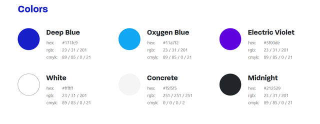
When you look look at steem assets in practice, you'll notice that the brand colour is heavy in all of their design gadgets (icons, flyers, etc.)
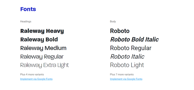
Also, as I mentioned earlier, steem has a clear specification of what Fonts they use. As you can see, 2 font-families (Raleway and Roboto) are the fonts of choice.
These are some of the building blocks of building a powerful brand.
The same can be seen with the #steemit brand.

Steemit logo From Wikimedia Commons, the free media repository
While I haven't come across a similarly properly documented Brand document as that of the #steem brand, you can tell from looking at the steemit site which we use and love that the brand's primary colour is GREEN. You can see it in the way the colour is used all over the site, in headings, tags and links. You can see that steemit seems to make use of the Source Sans and Helvetica Font families. You can also see the brand very apparent in the few times the @steemitblog uses any flyers in their posts like the flyer used on STEEMIT - A GUIDE FOR NEWCOMERS
You can also see how we @yems.group utilize the steemit brand colour when we've created posts in the past for @steem-cameroon, @thegreens and others. We always use steem's blue colour as secondary colour and when necessary (rarely) incorporate Cameroon's National Green/Red/Yellow colours to the design.

Flyer I designed for Steemit Training | Cameroon Steemit Program

Flyer I designed for Steem Cameroon First Anniversary
Whew!!! Let me leave it there for today. I hope you've learned something from all this blabbing.
If you only note one thing from this... it should be that:
a brand is much more than a logo... for the most powerful brands are the ones that are apparent even without the use of a logo. 💪🏿💪🏿💪🏿

and now, Image credit:
Oh! If you're used to anglophone Cameroonian Social Media... and you haven't guessed who created the post I used above to illustrate my point yet... Shame on You 🤣 then you need to up your game... and for the sake of our non-anglophone Cameroonian followers, it is a post from @betatinz.
I have learned alot from this.. Im not really verse with the brand and logo concept..
You said
So my question is can a logo be used as a brand?
why i am asking this is bcus, the image above is my logo which i usually call it my brand at the same time🤣🤓🤓
Thanks for your question @saxopedia...
Your Brand is MORE THAN JUST your logo.
Your logo is a (very big) part of your brand... But your brand is much more than that logo... your brand is made up of
I hope that answers the question
Wow, you are good at designing, I think steemit team should hire you to join their team or you will offer free service?? 🤓🤓
Yes yes yes... the Steem team should hire me...
All I'll ask is only for a few steem 🤣🤣🤣
Branding is an indispensable part of any business or organization. Especially for businesses. It has the ability to make you stand out. Infact as you rightly said, it is their identity in the streets
💪💪💪💪💪
That means it is very possible to consume a product without knowing its logo. So for a brand to stand out with the logo, the company will need to work on colors, fonts, and the use of shapes. Thanks for sharing, and using steemit as an example has opened my understanding in this domain.
Indeed it is... a brand is a powerful asset... and everyone needs to work on building one.
Thanks for reading and commenting
I think ill like to redesign and retouch my brand and logo
Great post bro
That'll be awesome... i wont mind lending my thoughts when you do...
Happy Branding... thanks fr reading and commenting
Great desinszr sir you are a great in such please can teach me one day nah
Absolutely... I'll probably arrange a few training programs on this...
Thanks for reading and commenting