Release: Calendar, TimeSelector & Toast — Complete Date/Time Picking and App-Wide Notifications
This release adds a full date/time picking system and a toast notification system to the library — an inline Calendar with day/month/year drill-down, a TimeSelector that shares its sizing language with Calendar, and a Toast/useToastStore pair for app-wide notifications. Here's how each one is built and how to use it.
Installation
All three components are available now:
npm install rn-markdown-editor
or
yarn add rn-markdown-editor
Calendar
An inline, Chakra-DatePicker-flavored calendar — single component, three drill-down views (day → month → year) — supporting single, multiple, and range selection with full controlled/uncontrolled parity.
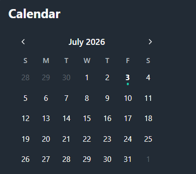
How it works internally:
The prop surface deliberately mirrors Chakra UI's DatePicker.Root, just swapping @internationalized/date's DateValue for a plain Date and Chakra style props for a single style prop. Every stateful concern — selected value, current view, and the keyboard/programmatic navigation anchor focusedValue — follows the same controlled-if-prop-supplied, uncontrolled-otherwise pattern independently, so a consumer can control just the view while leaving selection uncontrolled, or vice versa.
Rendering the three views is split into three dumb, presentation-only tables — CalendarDayTable, CalendarMonthTable, CalendarYearTable — that all read from a shared SizeTokens/colors shape rather than each inventing their own styling logic. CalendarDayTable is the most involved: it builds its grid via buildDayGrid, which computes a leadingOffset from the gap between the 1st of the month and startOfWeek, walks backward to a gridStart, then pads forward with a trailingToCompleteWeek calculation so every row is a full 7 cells — fixedWeeks simply forces the cell count up to 42 so month height never jumps between a 4-week and 6-week month.
View navigation is deliberately asymmetric by view: shiftAnchor pages a day-view calendar by month, a month-view calendar by year, and a year-view calendar by a whole decadeSize (12 years, matching the CalendarYearTable 4×3 grid) — because paging a year grid one year at a time would barely move the visible window. minView/maxView don't just block navigation; clampView and isViewAllowed are run against a fixed VIEW_ORDER array (day, month, year) so an out-of-range view prop is silently corrected rather than rendered.
Size tokens (cell, fontSize, gap, navButton, …) are resolved once per size via mergeSizeTokens, which layers a ThemeProvider config override on top of the built-in SIZE_TOKENS[size] default — the exact same merge function TimeSelector reuses, which is what keeps a Calendar and a TimeSelector rendered side by side visually consistent without either one hardcoding the other's scale.
<Calendar
  selectionMode="range"
  numOfMonths={2}
  minView="day"
  maxView="year"
  fixedWeeks
  showWeekNumbers
  onValueChange={({ value }) => setRange(value)}
/>
Key props:
| Prop | Type | Default | Description | ||
|---|---|---|---|---|---|
value / defaultValue | Date[] | — | Controlled / uncontrolled selected date(s) | ||
selectionMode | `"single" \ | "multiple" \ | "range"` | "single" | Selection behavior |
view / defaultView | `"day" \ | "month" \ | "year"` | "day" | Controlled / uncontrolled active view |
minView / maxView | DateView | "day" / "year" | Clamps how far the calendar can drill in/out | ||
min / max | Date | — | Selectable date bounds | ||
isDateUnavailable | (date, locale) => boolean | — | Per-date disable hook | ||
fixedWeeks | boolean | false | Always renders 6 weeks so month height stays constant | ||
showWeekNumbers | boolean | false | Adds an ISO week-number column | ||
startOfWeek | number | 0 | 0 Sunday … 6 Saturday | ||
numOfMonths | number | 1 | Renders multiple months side by side | ||
size / variant | CalendarSize / CalendarVariant | "md" / "outline" | Scale and visual treatment | ||
locale / translations / format | — | "en-US" | Localized month/weekday names and header title formatting |
TimeSelector
An inline hour/minute/(AM·PM) picker built as Calendar's React Native counterpart — three scrollable, snapping columns instead of a wheel-style native picker, sharing Calendar's size tokens and theme so the two compose cleanly in a combined date+time UI.
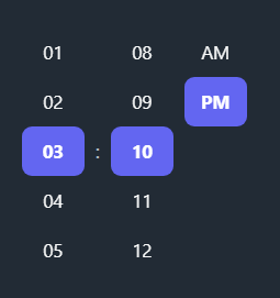
How it works internally:
Rather than defining its own scale, TimeSelector imports mergeSizeTokens and SIZE_TOKENS straight from Calendar.utils and re-exports them from its own utils file — a deliberate single-source-of-truth choice so a size="lg" Calendar and a size="lg" TimeSelector rendered together never drift out of sync.
Each column (hour, minute, and — only in 12h format — period) is the same generic TimeColumn<T> component, parameterized over string | number so it can drive an hour list, a minute list, or an ["AM","PM"] list through one implementation. Centering the current selection is handled by measuring nothing at all: since every row has a fixed, known itemHeight, the scroll offset needed to center a given index is computed arithmetically (selectedIndex * itemHeight - itemHeight * floor(VISIBLE_ITEMS / 2)) and applied with scrollTo({ animated: false }) inside a requestAnimationFrame, deferred one frame purely so the ScrollView has mounted before it's told where to sit.
Reading and writing a Date is isolated into a small pure-function layer (getDisplayHour, getPeriod, combineTime) rather than living inline in the component: combineTime takes the anchor date's existing year/month/day and only overwrites hours/minutes, converting a 12h hour+period pair back to 24h internally — the same "touch only the relevant portion of the Date" discipline Calendar uses for its own day-only selection. isTimeOutOfBounds deliberately compares only minutes-since-midnight against minTime/maxTime, ignoring their date portion entirely, so a caller can pass any arbitrary Date as a time-of-day bound without worrying about which day it's set to.
Selecting minuteInterval doesn't filter a full 0–59 list at render time; buildMinuteList builds the stepped list directly (clamped 1–30) so an odd interval like 15 produces exactly [0, 15, 30, 45] rather than a 60-item list with most entries hidden.
<TimeSelector
  format="12h"
  minuteInterval={5}
  defaultValue={new Date()}
  onValueChange={({ value }) => setTime(value)}
/>
Key props:
| Prop | Type | Default | Description | |
|---|---|---|---|---|
value / defaultValue | Date | — | Controlled / uncontrolled time (only hour/minute read) | |
format | `"12h" \ | "24h"` | "24h" | Adds an AM/PM column when "12h" |
minuteInterval | number (1–30) | 1 | Step between selectable minutes | |
minTime / maxTime | Date | — | Time-of-day bounds (date portion ignored) | |
anchorDate | Date | — | Year/month/day the uncontrolled value is anchored to | |
size / variant / accentColor | — | "md" / "outline" | Shared with Calendar's theming | |
translations | { am, pm } | "AM" / "PM" | AM/PM column labels |
Toast
An app-wide toast notification system — a ToastContainer that renders anywhere near the app root, plus a useToastStore/toaster pair so any component can fire a toast without prop-drilling a handler down to it.
How it works internally:
State lives entirely outside React, in a zustand store (useToastStore), which is what lets a plain module-level toaster.success({...}) call work from anywhere — a network layer, a form validator, an event handler — without needing access to a hook or context. addToast covers the simple message + type case; addToastAdvanced covers the richer title/description/action case and, notably, only sets the auto-dismiss timeout when no action is present, since a toast asking the user to make a choice shouldn't disappear out from under them on a timer.
ToastContainer positions itself once via useSafeAreaInsets and a config.position ("top" or "bottom"), then simply maps the store's toasts array to ToastItems — the interesting work happens per-item. ToastItem and its child ToastIcon are both wrapped in React.memo, and every handler passed into them (onDismiss, onAction) is wrapped in useCallback keyed only off the toast's own id — so adding a fourth toast to the stack doesn't re-render the three already on screen.
Color resolution runs through useToastColors, which looks up a per-type (success/error/warning/info) base color set from the theme, then layers any config.components.toast.colors[type] override on top — the useMemo dependency array intentionally lists each individual color token it reads rather than spreading the whole colors object, so the memo doesn't invalidate every time an unrelated part of the theme object changes identity. The description text under a title doesn't get its own theme token at all; it's derived on the fly as the foreground color with a "B3" hex-alpha suffix appended, giving a consistent ~70% opacity "muted" look for any toast type without a second config entry to keep in sync.
Entry animation is a simple Animated.parallel fading opacity in and sliding translateY from -20 to 0 over 300ms, both driven with useNativeDriver: true so the animation runs off the JS thread.
// Mount once, near the app root
<ToastContainer />

// Fire from anywhere — no hook, no context needed
toaster.success({ title: "Saved", description: "Your changes have been saved." });
toaster.error({ title: "Upload failed", action: { label: "Retry", onClick: retryUpload } });
Key exports:
| Export | Type | Description |
|---|---|---|
ToastContainer | component | Renders the active toast stack; mount once near the app root |
toaster.success/error/info/warning | functions | Fire-and-forget advanced toasts (title, description, action) from anywhere |
useToastStore | zustand hook | Direct store access: toasts, addToast, addToastAdvanced, removeToast |
Key config (ThemeProvider's config.components.toast):
| Field | Default | Description |
|---|---|---|
position | "top" | "top" or "bottom" screen anchor |
colors[type] | theme toast* tokens | Per-type { background, foreground, icon } override |
minWidth / maxWidth | 280 / "90%" | Size bounds of each toast |
borderRadius / paddingHorizontal / paddingVertical / gap | 8 / 16 / 12 / 12 | Layout spacing |
fontSize / titleFontSize / descriptionFontSize / iconSize | 14 / 14 / 13 / 20 | Typography scale |
Wrapping up
Together these three pieces round out a common app-shell need: a themeable inline date/time picker pair that share one sizing language, and a toast system that any part of the app can fire into without needing a ref, a context, or a prop passed down. All are available now and reuse the theme/config plumbing already established by the library's other components — no new peer dependencies beyond zustand (Toast) and date-fns (Calendar), both of which the library already depends on elsewhere.