My First Client Work: How I Designed This Jersey Flyer From Scratch | A Graphics Design Journey
Greetings Steemit family! 👋
If you read my intro post, you already know I'm Charles — a final year Criminology and Security Studies student at the University of Delta, Agbor. But today I'm not here to talk about crime and security. I'm here to show you another side of me that most people around me don't even know exists yet.
I am learning graphics design.
Not in a classroom. Not from a lecturer. From the internet — YouTube tutorials, online courses, trial and error, frustration, and starting over. Every single day after school or late at night when everywhere is quiet, I open my phone and practice.
And recently, something happened that made all those late nights feel worth it.
Someone trusted me with their business.
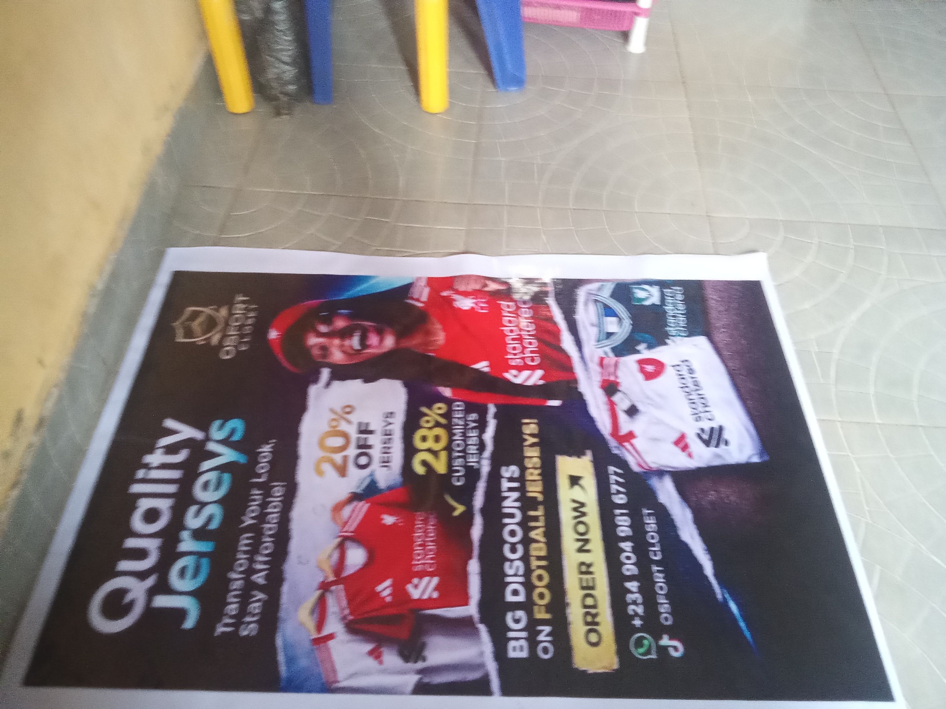
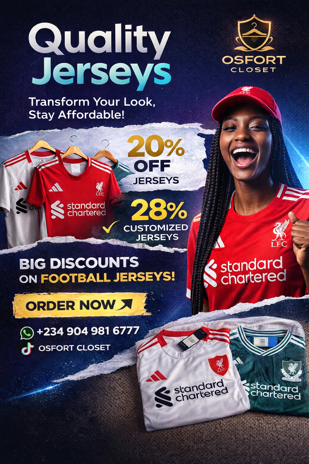
A small business owner — Osfort Closet, a jersey and clothing brand — asked me to design a promotional flyer for them. A real client. Real expectations. Not a practice exercise.
I won't lie to you, I was nervous. What if it didn't come out well? What if they didn't like it? What if I wasted their time?
But I sat down, I focused, and I created this 👇
My Process
Here's how I approached it:
- Understanding the brief
The client needed something that communicated quality, affordability and football energy all at once. Liverpool jerseys were their main product so the color direction basically chose itself — red, white, gold. - Building the background
I went with a dark navy/space-inspired background because it makes colors pop. In design, contrast is everything. If you want something to stand out, put it against something dark. - The torn paper effect
That ripped paper texture layered across the middle — that was my favorite part to work on. It adds depth and gives the flyer a raw, energetic feel that matches the football theme. - Typography
Big, bold headline at the top. Supporting information in the middle. Clear call-to-action at the bottom. I always think of a flyer like telling a short story — grab attention, give details, tell them what to do next. - The finishing touches
Gold for the discount percentages because gold = value in the mind of a customer. The "Order Now" button in gold as well to draw the eye straight to the action.
What I learned from this
Designing for a real client is completely different from designing for practice. When it's practice, mistakes don't cost anything. When it's a real business, you feel the weight of responsibility. That pressure actually made me better.
I also learned that design is communication. Every color, every font, every spacing decision is saying something to the person looking at it. My job as a designer is to make sure what the design says matches what the client needs people to feel.
I also used ChatGPT to help me think through the layout structure and refine the promotional text — because good designers use every tool available to them. In 2025/2026, knowing how to combine design tools with AI assistance isn't cheating. It's working smart.
Where I'm going from here
I'm still learning. I'm still making mistakes. But I'm posting this because I want to document this journey openly — the growth, the struggles, the small wins.
If you're also learning a skill from scratch, especially here in Nigeria where resources are limited and people around you might not understand why you're always on your phone "doing design" — just know someone out here gets it.
We keep pushing. 💪
Tools used:
Canva (design) | ChatGPT (creative brainstorming & copy assistance)
Feel free to drop feedback — harsh or kind, I can take it!