Thank you for your contribution.
I know you already did 'align center' on the logomark and logotype. Even thoughthe logo is technically balaced but it's not optically balanced.
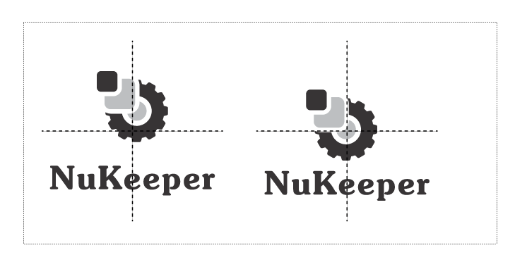
I think sans serif font will be more suitable for the logomark.
Your contribution has been evaluated according to Utopian policies and guidelines, as well as a predefined set of questions pertaining to the category.
To view those questions and the relevant answers related to your post, click here.
Need help? Write a ticket on https://support.utopian.io/.
Chat with us on Discord.
[utopian-moderator]
Although I do not agree with your assessment, now one must forget the technical part of the design to make it pleasantly visual?
Here you can see the evidence that is perfectly aligned and balanced