Steemit Crypto Academy Contest / S15W4 - Death Cross Vs Golden Cross
Pixabayedited using inshot
Technical analysis is a way of analyzing financial markets by using charts and statistical indicators to foretell future price movements. It is based on the idea that prices moves in trends and that previous price movements can help foretell the future ones. Technical analysis apply a variety of indicators, such as moving averages, oscillators, trend lines, and volumes to make sense of price data and identify patterns. These patterns can help traders make decisions on whether to buy or sell an asset.
Patterns in technical analysis are visible patterns that are used to foretell/predict future price movements in the financial markets. They're also based on the study of historical data and price flow. Two of the most well-known patterns in technical analysis are the "Death Cross" and the "Golden Cross" which is our focus for the 4th week of the Steemit Engagement Challenge Season 15.
Here is a publication with detailed explanation about their meaning, differences, application and combination.
In my own words, the "Golden Cross" is a pattern that occurs when. The shorter-term moving average (e.g 50-day) crosses above the longer-term moving average (e.g 200-day), motioning that the present trend is up and that prices are expected to continue ascending. This is a mark that there is confidence and strength in the market. Traders often see the Golden Cross as a holy grail chart pattern which when seen, is been viewed as an indicative of a strong market.
Do you know that the golden cross, has three stages/phases to it formation.
- A first stage where. downtrend that finally ends as selling is decreased.
- A second stage where the shorter moving average crosses above the longer-term moving average.
- Finally, the third stage where there's is continuation on the uptrend, hopefully leading to higher prices.
On other hands, the "Death Cross" is a pattern also, that occurs when the shorter-term moving average (e.g 50-day) crosses under the longer-term moving average (e.g 200-day), motioning that the present trend is down and that prices are expected to continue depreciating (falling). This is definitely a sign of weakness and gloom in the market. The Death Cross is a chart pattern also which indicates the progression from a bull market to a bear market. Traders who believe in the reliability of this chart pattern, says that the security is "dead" when this bearish (Death Cross) moving average crossover occurs.
Just like the Golden Cross, the death cross, has three phases to it development on a chart.
- The first phase of long-term growth and growth apex.
- A second phase also known as the best phase - death cross formation. The 50-day moving average crosses below the 200-day moving average.
- And finally the third phase where a bull trend turns into a bear trend and selling strength grows.
It's important to note that these patterns are not perfect signals, and that the influence of other factors should be considered when making decisions in the financial market. But they can be useful tools to understand the market and identify potential opportunities.
BTC/USDT pair (Golden Crossover)
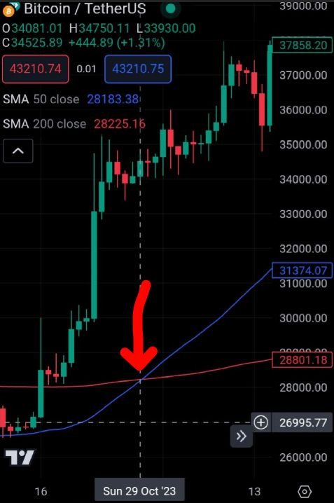
screenshot from trading view app
This is a chart of the Bitcoin/Tether Us pair on Sunday the 29th of October 2023. The shorter term moving average 50-day (in blue colour) went directly above the longer-term moving average 200-day (in red colour) showing that the trend at that time was up and the price were expected to continue rising.
Crossover of Death
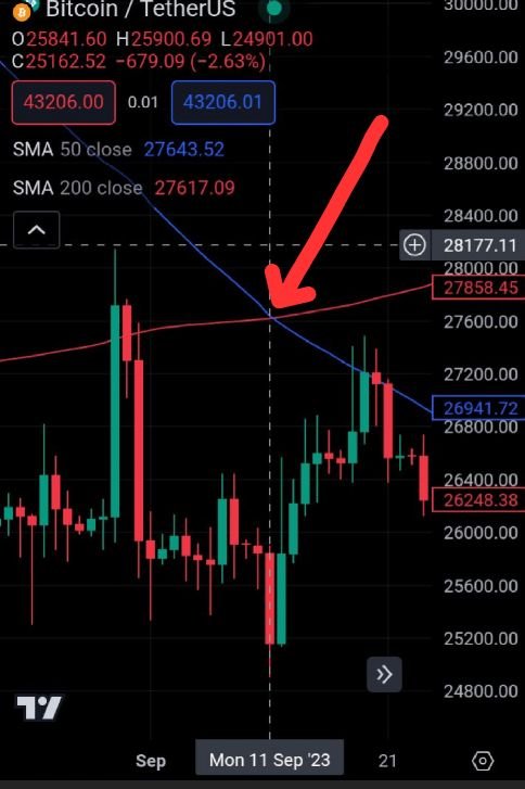
screenshot from trading view
As the opposite of the golden crossover, in this chart on Monday 11th September 2023, a death crossover occurred. You can clearly see that the shorter-term moving average 50-day crossed under the longer-term moving average 200-day which is therefore interpreted that the price was down and also expected to continue falling.
STEEM/USDT pair (Golden Cross/Crossover)
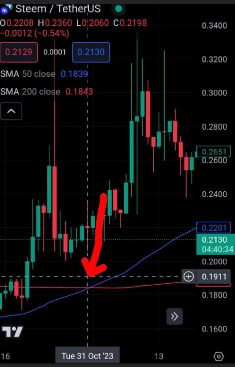
screenshot from trading view app
Approximately Tuesday 31st October 2023, a Golden Crossover occurred which can be clearly viewed from the screenshot above that the shorter-term moving average 50-day crossed above the longer-term moving average 200-day to imply an uptrend and expectation of continuous rise in price.
Death Cross/Crossover
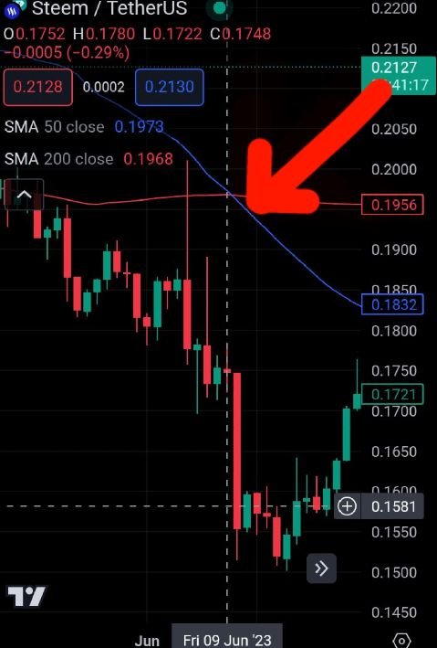
screenshot from trading view app
From the chart above, on Friday 9th June 2023, a death crossover occurred. The shorter-term moving average 50-day crossed below the longer-term moving average 200-day. As we've known about the death cross, it showed that the price trend was down and is expected to continue falling.
In pure technical analysis, these two patterns are the opposite of each other. Below are the possible differences between the two.
| Golden Crossover | Death Crossover |
|---|---|
| 1. A golden cross signal or crossover suggests a long-term bull market going forward | A death cross signal or crossover suggests a long-term bear market. |
| 2. The longer-term moving average is considered as a major support level when a golden crossover occurs | The longer-term moving average is considered as a resistance level for the market from that point forward when the death crossover occurs. |
There are two indicators which I'd like to recommend to be added to the Golden Cross and Death Cross patterns to make technical analysis more effective at the moment of taking a decision.
The first I would like to add to the mix is the Relative Strength Index (RSI). The RSI is a strength/momentum indicator that measures the speed and change of price movements. It's a good way to gauge if a market is overbought or oversold. This is to say that it can helpt o identify potential turning points in the market. A general reading of the RSI indicator above 70 is considered an overbought condition while a reading Below 30 is considered an oversold condition. Below is a STEEM/USDT chart with the RSI indicator.
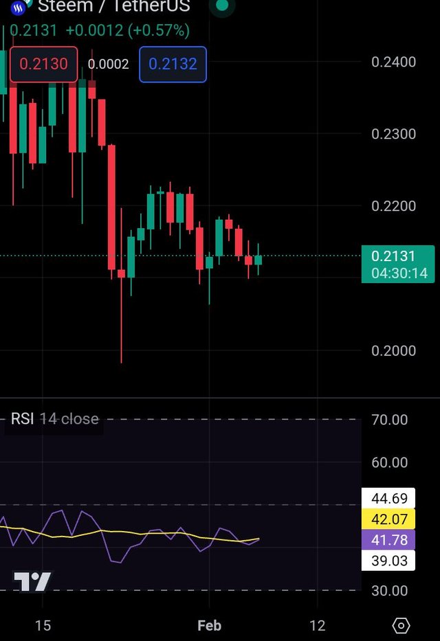
Screenshot from trading view app
Another indicator I'd like to recommend is the Moving Average Convergence Divergence (MACD). The MACD is a trend-following indicator that helps to identify changes in momentum. It is like the RSI but, it's based on different calculations and give a somewhat different view on the market.
The MACD is calculated by subtracting the 26-day exponential moving average (EMA) from the 12-day exponential moving average. The signal line, which is a 9-day EMA, of the MACD can be used to spot out entry and exit points in an asset. A positive MACD reading above the signal line is generally interpreted as bullish, vice versa. Below is a STEEM/USDT chart with the MACD indicator
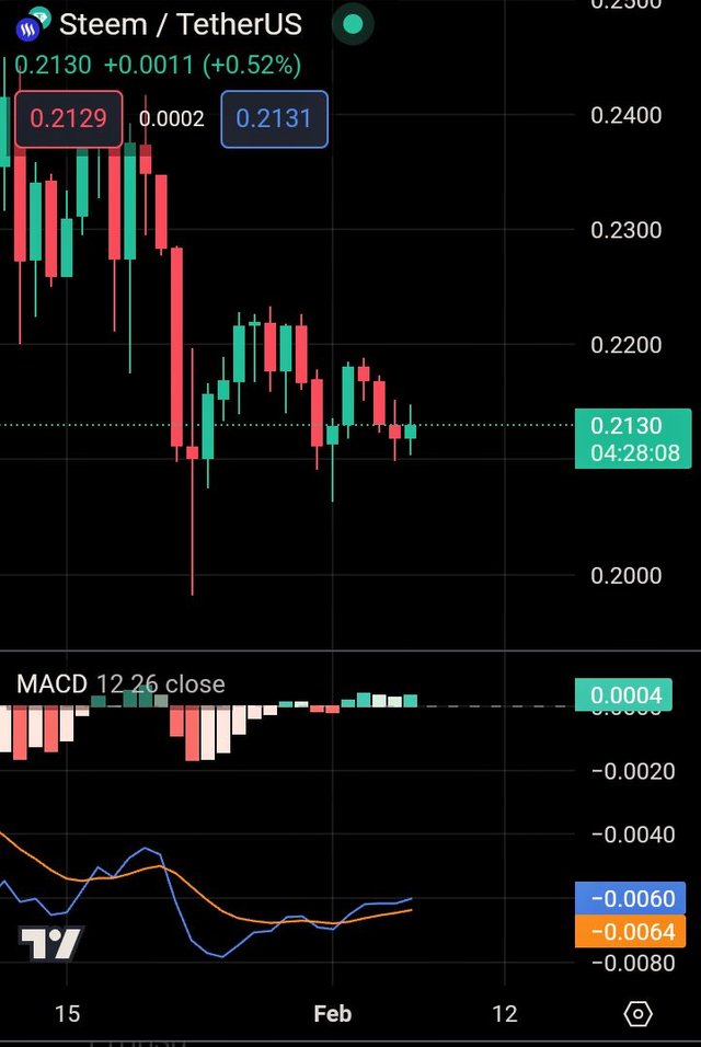
Screenshot from trading view app
I believe that combining the RSI with the MACD indicators and the Golden and Death Crosses can give a versatile and all-rounded picture of the market, and help to make more logical decisions..
In conclusion, the Golden and Death cross are two popular and somehow powerful technical indicators that can be useful for identifying potential market trends. The Golden Crossover occurs when the 50-day moving average crosses above the 200-day moving average, while the death crossover occurs as the opposite of the golden crossover. The 50-day moving average crosses below the 200-day moving average.
It's important to understand that these indicators are not always perfect and that other factors should be considered so as to make informed trading decisions.
Note: Any information displayed in the above publication is not a guarantee to take personal trading decisions. I'm not a financial advisor, and so they are not financial advises. Do well to make your own researches.
Thanks for reading.
I invite @bossj23, @jozzie90 and @deetalka6.
Upvoted. Thank You for sending some of your rewards to @null. It will make Steem stronger.
Can any of this indicator be used to analyze the current football match?
You have given clear and in simple language the differences and the definition of the Golden cross and the death clause and the use of the graph and then explanation and elaboration you have given it is more defining it and it makes clear for everyone and you always use very simple language.
And the last question you have answerd very well and I must say there a lot of hard work behind this post and a best of luck for your participation
Greetings friend,
You really nailed it with your explanations of the Golden Cross and the Death Cross. Your use of simple language made it so easy for everyone to understand. The way you defined and elaborated on these concepts was truly impressive. It's clear that you put a lot of hard work into your post, and I wish you the best of luck with your participation and keep up the fantastic work.
It isa pleasure reading through your post.
° you have clearly explained what death cross and golden cross is to my satisfaction. Your usage of the btc chart to explain the two chart patterns was awesome.
° you also mentioned 2 differences between the two chart patterns which is laudable.
° Your choice of RSI and MACD as an indicator to be used in conjunction with golden cross and death cross is fantastic. Remember you can reset both indicators to short range moving averages too.
Overall. I read your post with great delight.
I wish you the best in this engagement.
Hello dear, greetings to you. I hope you are enjoying the sweet moments of your life.
We use Moving averages for finding out both the Patterns. Yes you are true that these Patterns show us the future price. The"Death Cross" tells us the price will dump, while the "Golden Cross" give us a bullish signal. The market will raises whenever golden crossover happen.We use 50 days moving average and 200 days moving average here.
You have shown us the beautiful analysis of BTC and STEEM Coin using moving average. We can clearly see the movement of both the coins following completely the analysis. This is the best strategy I believe for all the traders. Too many traders use it for long term strategy. Another indicator you said you are using is MCAD. Yes this is an easy and authentic indicator too.
Wish you best of luck in the contest, keep blessing.
Ada kondisi dimana salib kematian seharusnya menunjukkan sinyal harga akan turun, namun kenyataannya sinyal tersebut tidak membuat harga turun mendalam. Untuk lebih jelasnya Anda bisa melihat postingan saya tentang ini.
Ciertamente los patrones se utilizan en el análisis técnico para predecir futuros movimientos de precios en el mercado.
Básicamente los precios se mueven según las tendencias y es por ello la gran importancia que tienen los indicadores o patrones para el análisis técnico.
El RSI y la MACD son indicadores útiles para combinar con las cruces de la medias móviles y así detectar indicios de alguna falsa señal.
Gracias por compartir, ¡Saludos y éxitos!
Your post gives detailed information about technical analysis. You have clearly explained about "Golden Cross" and "Death Cross". Your use of simple language helps users understand. A lot of hard work has gone into your post, so best wishes for success in your participation.