Logo design for Z-GAMES

Repository
Linked Task Request
Pull Request

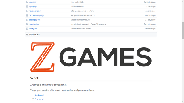
In this article I will be presenting the logo proposal made for the Z-GAMES project, the cuel is an open source project with its source on GitHub.
The owner of the project was looking for collaborators who could make a logo for his project, so I contacted him and I presented my proposal. Z-Games is a WEB platform that is in development and growth, the cd stores games developed by the same owner of the project, currently within the platform are hosted two games, No, Thanks! and Perudo.
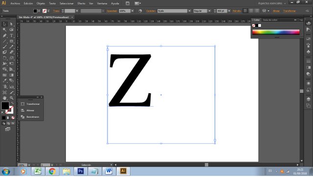
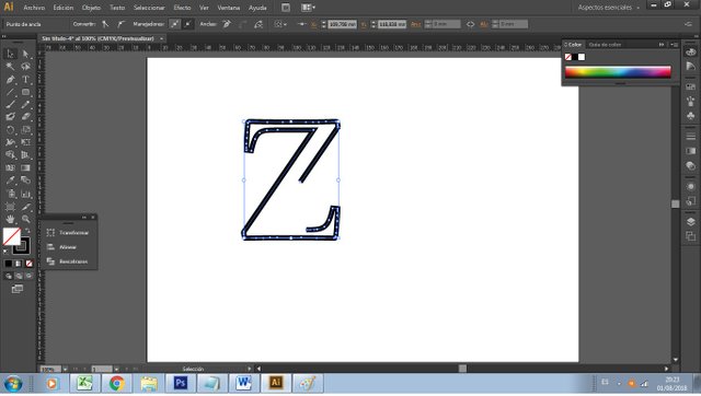
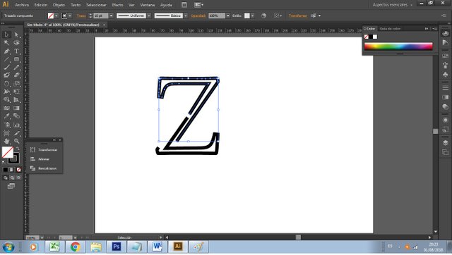
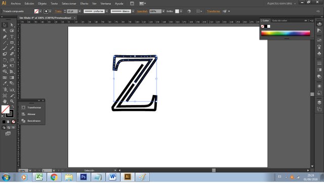
My proposal is based on giving personality to the letter Z and in this way the project is recognized at first sight, Jugue a little displacing some lines of the letter Z to give it a minimalist and unique touch, the final result was a letter Z unique clean and stylish.
Design details
Below I present some details of the development of the design, some variations and features that make this design an image that is pleasing to the eye and that can be used in any presentation that the project owner wishes to make.

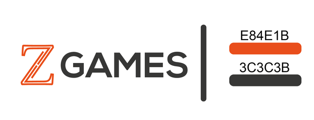

NYALA
Only the letter Z
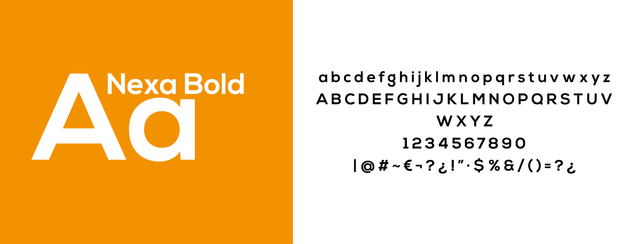
NEXA-Bold

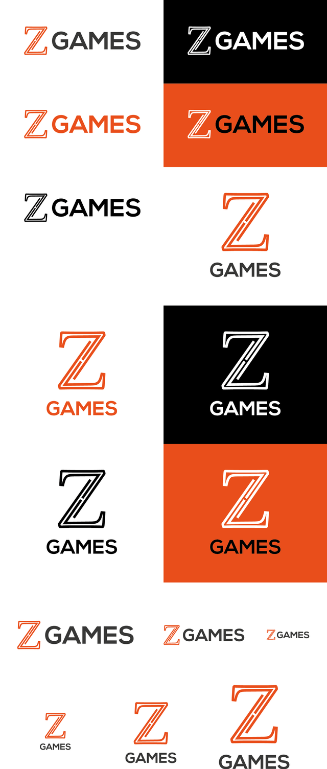


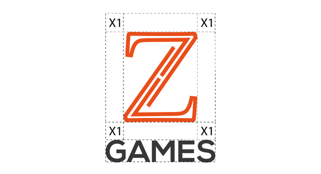

*Flexible in any size.
*Easy to remember.
*It can be used in different colors.
*All files in vector format for future modifications.


Original Files
Google Drive
Proof of Work Done
Proof of Authorship

This work is under License of Creative Commons Recognition-Share Equal 4.0 International

Hi @richardbmx, thank you for your contribution.
Very nice logo, i really like the simplicity of the letter z, i understand your intention to give the letter Z minimalist and unique touch so it can be recognized as the logo of the project, and i really really apreciate this kind of work and that's how i always told contributors to do :). However, the letter Z itself is kinda problematic, as you can see, if you do a google search with keywords "letter Z logo" you will find dozens of similar letter Z logo that are constructed with lines and kinda similar to each other. this problem make your intention to make your logo to be recognized as the project's logo in first sight will not work because people has seen to many similar logo. Overall you did great work by explaining your concept and intention to the project really well.
In the logomak itself, i think there are few things that can be tweak to make it even better. see image bellow:
Your contribution has been evaluated according to Utopian policies and guidelines, as well as a predefined set of questions pertaining to the category.
To view those questions and the relevant answers related to your post, click here.
Need help? Chat with us on Discord.
[utopian-moderator]
Thank you for your review, @nilfanif! Keep up the good work!
Congratulations @richardbmx! You have completed the following achievement on the Steem blockchain and have been rewarded with new badge(s) :
Click here to view your Board
If you no longer want to receive notifications, reply to this comment with the word
STOPDo not miss the last post from @steemitboard:
Hi @richardbmx!
Your post was upvoted by @steem-ua, new Steem dApp, using UserAuthority for algorithmic post curation!
Your post is eligible for our upvote, thanks to our collaboration with @utopian-io!
Feel free to join our @steem-ua Discord server
Hey, @richardbmx!
Thanks for contributing on Utopian.
We’re already looking forward to your next contribution!
Get higher incentives and support Utopian.io!
Simply set @utopian.pay as a 5% (or higher) payout beneficiary on your contribution post (via SteemPlus or Steeditor).
Want to chat? Join us on Discord https://discord.gg/h52nFrV.
Vote for Utopian Witness!
Hi, we are holding a close logo design contest with grand prize of 50 STEEM and each participant will get instant 1 STEEM as gift.
If you are interested please come and join us in our private Discord channel: https://discord.gg/N5JVChk