Hi @richardbmx, thank you for your contribution.
Very nice logo, i really like the simplicity of the letter z, i understand your intention to give the letter Z minimalist and unique touch so it can be recognized as the logo of the project, and i really really apreciate this kind of work and that's how i always told contributors to do :). However, the letter Z itself is kinda problematic, as you can see, if you do a google search with keywords "letter Z logo" you will find dozens of similar letter Z logo that are constructed with lines and kinda similar to each other. this problem make your intention to make your logo to be recognized as the project's logo in first sight will not work because people has seen to many similar logo. Overall you did great work by explaining your concept and intention to the project really well.
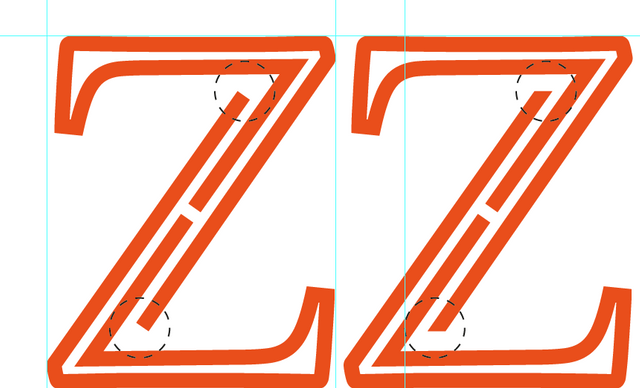
In the logomak itself, i think there are few things that can be tweak to make it even better. see image bellow:

Your contribution has been evaluated according to Utopian policies and guidelines, as well as a predefined set of questions pertaining to the category.
To view those questions and the relevant answers related to your post, click here.
Need help? Chat with us on Discord.
Thank you for your review, @nilfanif! Keep up the good work!