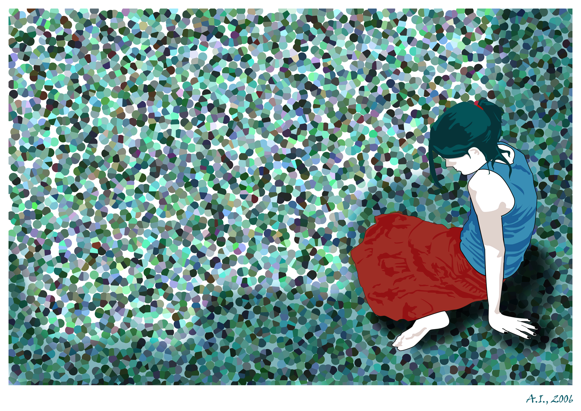
Fighting loneliness with color: two digital illustrations
I had named these two digital drawings "Loneliness" 1 and 2 back in 2006 when I designed them.
I am not keen on giving titles, but I had to save the file somehow! (lol)
During my early illustration experimenting years, color and structure were of vital importance for transmitting the right emotions.
The main figures were created as vectors in Adobe Illustrator and the background was made in Photoshop. These were early works when I was trying to improve my framing skills - an important element that also played a vital role during the coming years when my passion for photography begun.
As for loneliness ... what can I say? We take what life gives us and we turn it into something better.
Hope you all have a nice and creative week!
Aphrodite


They are beautiful! Love the colors of the second one with the context of loneliness
In the first drawing, loneliness is much more. It is emphasized by cold tones.
The second is not so straightforward. thoughts of loneliness would not have appeared if not for the naming :-)
~in the second one, framing is the key to show she's cut off the picture, kind of isolated :))
thank you for dropping by and for ur comment :D
I have an association with a girl sitting on the beach by the sea :-)
I like them. I've always liked art...
~glad u do! thnx for dropping by - have a lovely day :))
This post was shared in the Curation Collective Discord community for curators, and upvoted and resteemed by the @c-squared community account after manual review.
@c-squared runs a community witness. Please consider using one of your witness votes on us here