Hella Big PromoArt Illustration Made for Solstar Games' BattleBlox (Steps and Theory)
Hi everybody!
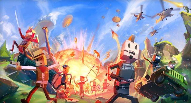
There are many, many artworks that I did in my professional career. Some of them bigger, some of them smaller. And guess what! This is one of the biggest!
(All the images are my own creation and so I own the rights of them)
So I don't know how familiar you are with this game called BattleBlox, but it is actually a pretty nice FPS with Minecraft's style. Of course, a little bit stylized and with hella more elements due that it is like the Call of Duty of the Minecrafts. You can also check it in HD in my Artstation, just in case you want to see all the little characters I put in scene (something like 30+).
This was also an Illustration that makes me remind you how s%!tty bad it is to not have art direction and be your own boss with the guidelines in your own artwork. Because if it would be your own work, it is totally fine: you know what you want to do and the direction you want to state. But if it is for a client (and actually this client is a big fish with a big budget), then you feel you are falling apart and nothing is entirely certain.
I also want to be transparent with the earnings for this because you as an artist must know how much such a work should be valued (even though the price could even be higher for such a huge artwork). And for this one the whole budget, without almost iterations (made by the client at least) was 1500USD. Such a perfect client!.
Sketching
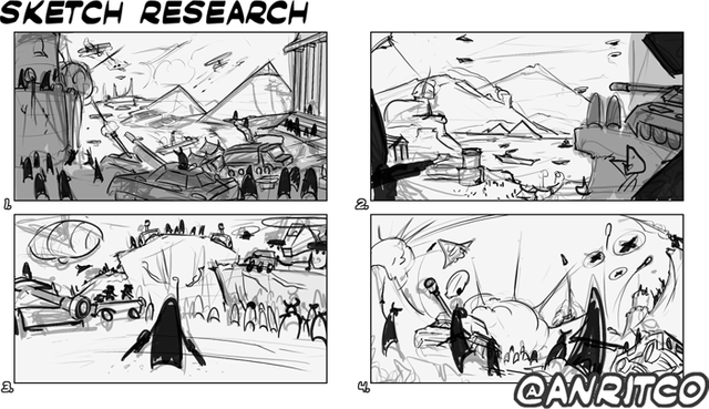
Even tho' it was a really well paid job, it took me a lot of time to make it real, and I will show you why:
Starting from the sketch research (as I call it to sound cooler), the idea is to make very loose thumbnails to show to the client different approach for the same idea. Which in this case was really really complex: A LOT of simple characters with each single one of them with a personalized design and clothing taken from different historical moments and making them all to live in the same canvas without bothering the eye or breaking the concept apart.
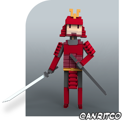
There was also needed to create the feeling (for the spectator) of getting onto all these different historical moments. And that all of them could feel, some how, powerful in front of the others (which is hard when you have an assault tank from 2010 and low poly black-hawks helicopters against crusaders and gladiators armed only with swords.
The feedback came fast and I put my self back to work almost immediately. I gathered all the references provided by the client (which included early concepts and dressing from characters, ideas of the backgrounds and scenarios, color palettes, and put it all together.
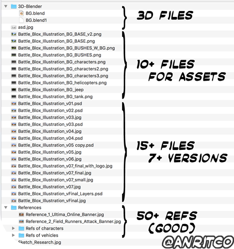
See, since this time the characters were merely boxes, I thought (well thought by the way) that 3D base would really help to build this up from a solid base. Even tho I've failed miserably many times already with such software never used a 3D program before.

The struggle was real. But in the end I could make a lot of assets that ended up following the composition. See, the 3D tool is something really REALLY useful when it s about testing new points of view because you have already your elements there, you just turn the camera onto different directions and BOOM! Everything follows it. If We would need to do that in a 2D medium. We would probably need to remake the whole piece.
Cleaning the mess
The decision was clear, the base was set up, now (before sending it to the client) we gotta make it look attractive, so we make sure that the client agrees that the artwork is going throught the right way and along his vision of it (Yes, explosions always help huehuehue).

After receiving the approval from the client (and after some days that I didn't even see this artwork, I realized that something was going wrong: I put two main focus points.
And this is why I also say that you have to ALWAYS KEEP IT SIMPLE! Which in this particularly case means to stick to one single focal point.
I want to make a little pause here to say the following: If you got to read until here I want to ask you to write in the comments something related to ducks (such as "damn! I am a duck!", "nice duck you have over there Anritco!", "do you know where I can buy ducks in this platform"?), so I will make sure that you are not commenting watching the images only (And i m not losing my time writting when I could only add images huehuehue). These who do, I will upvote fifteen percent (still not too much due to my crappy sp), but it s something. =))
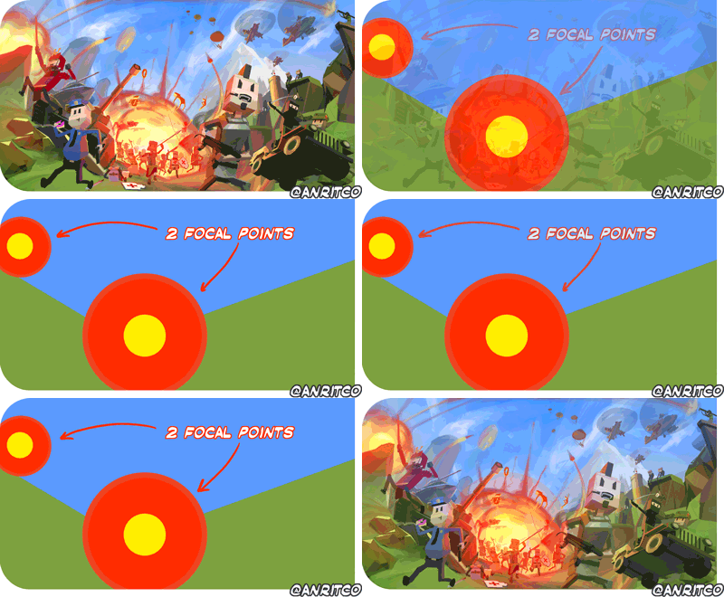
Avoiding this since the beginning would save me a hella lot of time of re-rendering and struggling with the leftover layers from the previous result.
Just to show up what I changed from one stage to the another, I will make another Gif just for you, so it will be easier to understand instead just placing one image at the left of the another and you compare with what you think that changed.
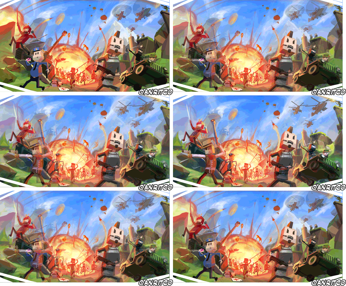
Not many things to do after that.
Since this was a promotional art of the game, It needed to show the logo from the game itself. So my client requested me to place it at the top (that was actually digested since the sketching stage) and show him how it would look.
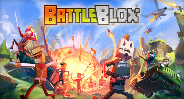
I decided to offer him to re-do the logo of the game because it was really killing the painting I did for them. But he rejected my offer.
I hope you enjoyed this and also learn something from it! This artwork is a bad boy I m really proud of and I wanted to share it with all of you!
- Edited (24hs after posting): The duck prize is no longer available, you can still comment it tho'.
Good post, and thanks for all thoso details
you right @hamzaoul
This comment has received a 0.12 % upvote from @booster thanks to: @hamzaoui.
bad boy indeed. thanks for sharing...i enjoyed it...
Thanks @kenhudoy !
welcome dear....
also do check my post on family versus office i sent last week which is very inspiring and follow for more...
thanks
meep
meep meep
meep
Duck says quack, quack, quack! And I say great art. It's a nice idea to have a concept in 3d.
I decided to rise it to 30% since you are the very first one that read this what I wrote, thank you for restoring my faith in humanity =)
:D
Actually I am going to change that and give you another with 100%, thanks again @luja!
Not sure why I wasn't following you before, but I am definitely following you now. Absolutely fantastic piece of artwork, and I love that you walked the rest of us through the process. Perhaps I'll have to do that for my writing one of these days. Keep up the awesome work!
It would be completely awesome ! If you do, please let me know! I am very curious about it !
Incredible work and effort. Keep it up!
Congratulations! This post has been upvoted from the communal account, @minnowsupport, by Anritco (Nic Morales) from the Minnow Support Project. It's a witness project run by aggroed, ausbitbank, teamsteem, theprophet0, and someguy123. The goal is to help Steemit grow by supporting Minnows and creating a social network. Please find us in the Peace, Abundance, and Liberty Network (PALnet) Discord Channel. It's a completely public and open space to all members of the Steemit community who voluntarily choose to be there.
If you like what we're doing please upvote this comment so we can continue to build the community account that's supporting all members.
Great work ! thanks for the step by step and the thought process insights ! will be following for sure !
Saya suka postingan anda
@anritco I love playing games over mobile and PS. Wanted to play 3D
nice posting!!