@SnowWhite Portrait ! Sick Colors and Slav Beauty!
Hi Everybody !

(Before we get started: All the images are my own creation and so I own the rights of them)
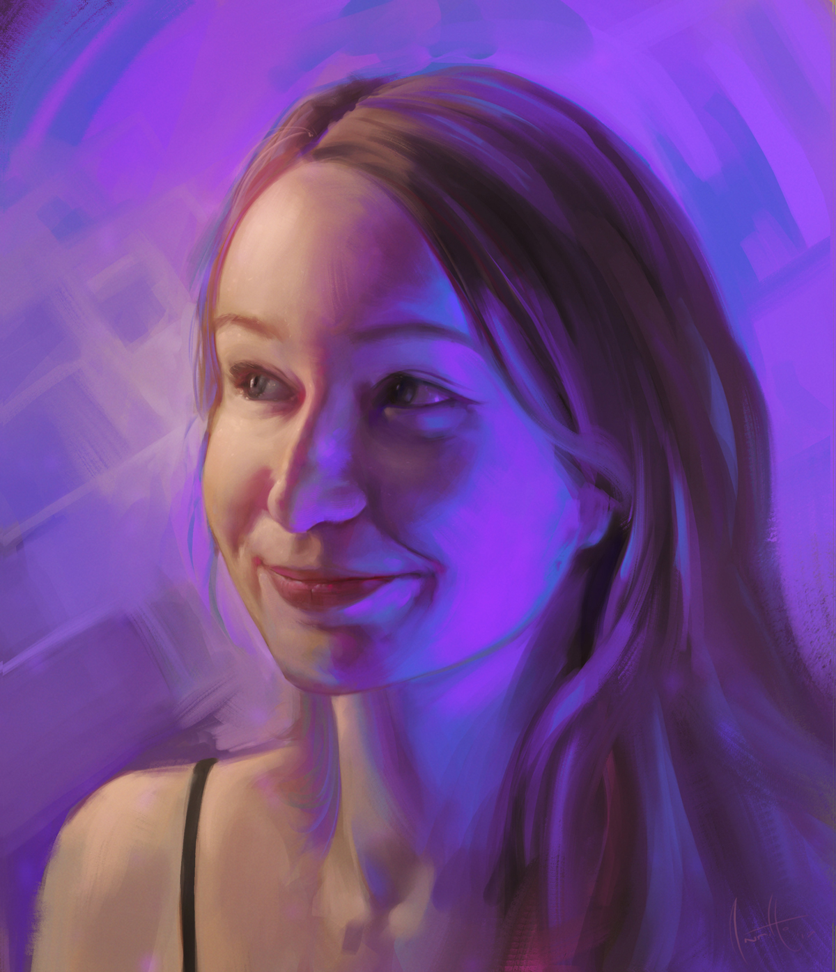
(I'm a lucky guy since I'm living in Poland atm!) So I decided to ask to my super-duper-wubalubadubdub friend @snowwhite (who is not only a beautiful lady but also an amazing human being and a super smart person with amazing ideas for improving Steemit and your own life through healthier habits) to make her a picture with some color light from one side and another warmer from the another.
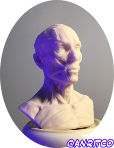
Watch this little example I did with a 7x7cm head 3D printed sculpture I bought in chinese store for super cheap! **Actually is very useful to have sculptures for better understanding of the volumes.
I also have a whole male body (25cm tall gray guy) with its gray skin and map of the muscles. (that you can see on the left image) And I can tell you with all confidence that this is SO useful that I'm thinking about buying the female version of it, but in better quality (kinda from Amazon or Ebay instead asian market... naaaah let's go asian :D).
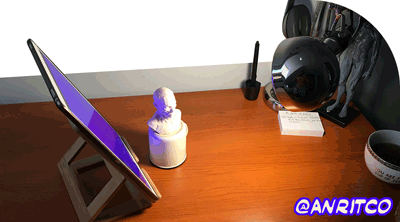
You can also see how the lighting set up was while making the picture of @snowwhite. Nothing really fancy, just took an Ipad set up with purple background and my desk light. And voilá!
As we saw in the previous portrait of mine (that was actually a self-portrait) we are making a study using elements that are already there, we don't really need to add or take any element that we didn't see in first place. Of course, in my case I added that background and that magical-atmosphere thanks to the exaggerated purples and scatter transitions almost everywhere.

Since I had it much easier I decided it was a nice idea to start harder this time: instead defining the base with lines, I went entirely with shapes and strokes since the beginning.
A good approach to start the image from the scratch is to NEVER START SKETCHING ON WHITE.
Glad you asked! See, the less elements we have at same time present in our minds, the better. And by placing a 50% gray we are making sure that we are not starting from an entirely highlighted painting but from the mid tone. Therefore our minds will be able to think in shadows and highlights separately. This will also mean that we HAVE to think first in shadows, and then in highlights, and never abuse from the contrast but at the end (making sure that we will have enough range for making strong highlights on strategic places).
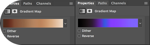
Once that the values and a considerable amount of details are placed on the canvas, we will add the colors! And this time I did two gradient map adjustment layers.
In the following gif process you can see how I applied them one after the another and with that we had a very rough base to start the... wait for it!...
...Rendering!

Definitively my favorite word! I always mark the details with super saturated color accents (such as lines and areas of work) as you may saw in my previous post. These are really important in this particular art-piece since I wanted to create a very magical and spiritual atmosphere or aura. Purple plays a major role in this since the meaning it has for we, the humans.
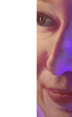
At the end, the only thing I modified (besides of proportions and getting the lady in the canvas closer to the lady in reality -and also keeping the stylization for this one!-) was the exaggerated scatter between the light areas and shadow areas.
Scatter tho is an EXTREMELY complex subject that we won't explain this time because it would be too much writting, and it would make from the post something completely boring.
So let's avoid it and just assume that this scatter gradients are making the whole texture of the skin look even more alive. And this is because under the skin we can find the blood vessels (with blood). And the light that goes through the skin (which has transparency) comes out from another side tinted by red. But we are painting and we can just lie a little bit for good of the final result, right?
Said that, Thank you so much for your support and mostly for reading until now!
Bye!
This post received a 4.0% upvote from @randowhale thanks to @anritco! For more information, click here!
Good piece of art, snowwhite looks like a lady with a lot of character as well!
Hohoho and she is ! If you are close to her, becareful ! ;)
Looking at the post of @streetstyle, you got interested in you.
This is a very good idea, is not it?
I have two tablet PCs and two notebook PCs.
I am also thinking that I would like to draw pictures using Photoshop.
@asim
Then go for it a show to the world what you got! =)
that's a great portrait @anritco. I loved the progress gifs too.
well done
in a rush, but greta stuff
Thanks a lot ! =)
This is incredible! I loved seeing your process with applying your light sources so you had a life situation to look at to better understand how that would look in real life. I have never thought of doing this before, but I think I may try this next time it applies. Lighting is not always my strongest feature in my stylist approach to my work, but this is a great way to get better - especially for someone like me who still relies on physical representations to get good drawing results. Thanks for sharing your post is awesome - I like the gifs! It makes everything so much more fun to look at! :)
Thank you so much ! I'm really happy that you liked and that you found this useful !
If someone feels inspired by watching my work then I think I succeed <3
I need to follow you my friend
We people normally never realizes what physical interaction of light is going on in the scene. All the subsurface scattering, reflection, and so on. I understand how much time it has taken you to do the scattering. I know because I am a 3d artist as well ;)
Damn right! and this is why being an artist is actually so hard... you can't really be an artist reading only books, you gotta go out there and analyze what's actually going on in the scene. It's super important to practice.
I'm glad I have a fellow here :D !
Awesome art! It was so cool to see the rendering process. Keep up the good work :)
Thank you so much @luja ! =))
Looks great!