Rebranding of California Science Center // 컨셉 리브랜딩
Hello, my fellow Steemians. I would like to share my design project that I did last summer in my class. :)
So, what is rebranding?
It is the change the corporate image of a company or organization.
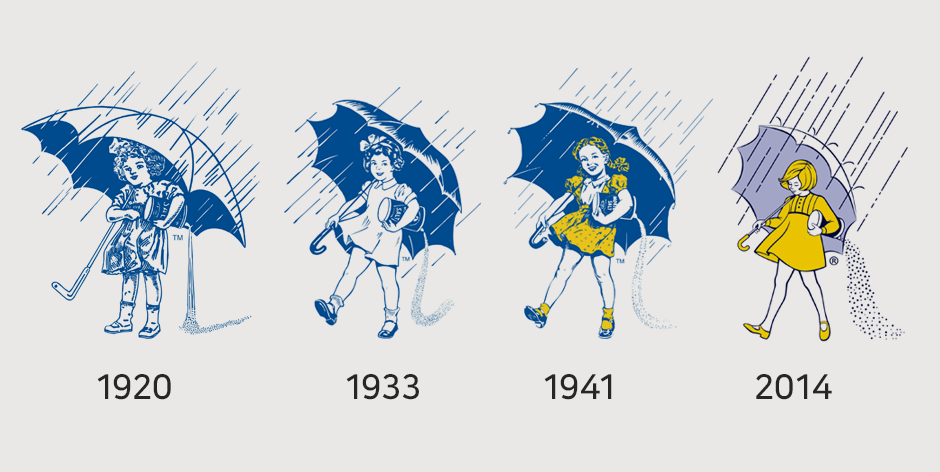
For example,

The famous girl with an umbrella.
The rebranding do not have to be too dramatic, it can still hold the same idea and just different in style.
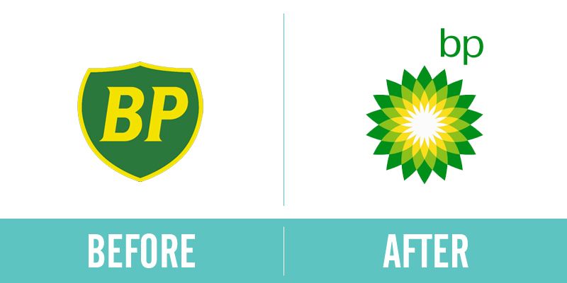
and...
The new eco-friendly BP! Very successful one at this.
So, you have brief idea of what rebranding is :) Let's move on!
Brief: I rebranded California Science Center. CSC is a nonprofit organization that runs by Los Angeles County. It was part of the project that was covered in the graphic design class at CSULB.
Issue: The current branding of California Science Center does not embody the idea of California and Science.
Challenge: Create a corporate identity that works for wide range of people. It should be fun and family-friendly while it holds some degree of sophistication and aesthetics in its design. The brand should embody authority but not be too assertive to the visitors. The branding must speak trustworthiness enough to appeal to young adults and students, the main demography of the visitors.
And here's my solution.
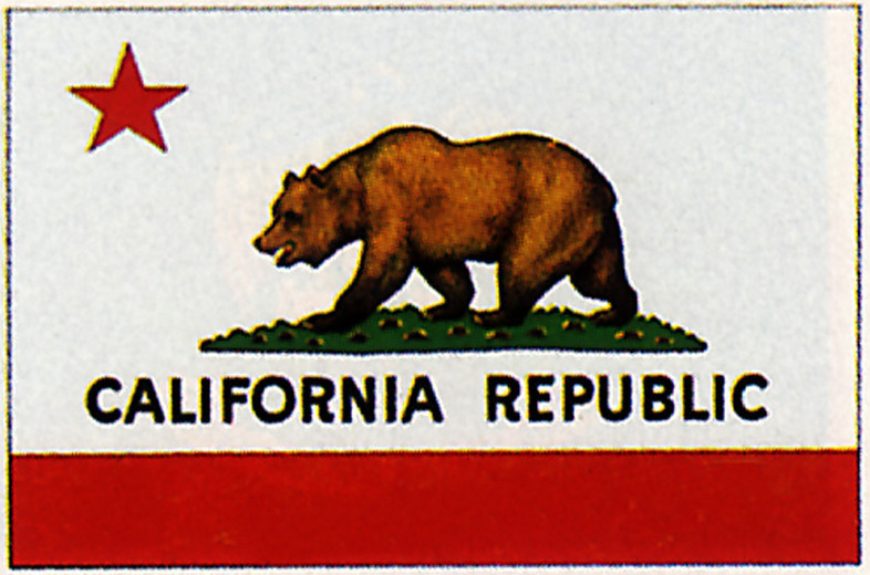
The star of the logo is inspired by the flag of State of California:
Wave line on the bottom of the logo can be interpreted in two ways. A Pacific Ocean wave, or DNA strand.
The main image, circle with orbiting  circular objects, also has two meanings: atom with proton and electrons orbiting, or solar system with orbiting planets :)
Redesigning of their website.
If you like my posting, please follow me @Carrotcake :)


고생했어요. 나중에 예쁜 포트폴리오가 되겠네요.
흐흣 지금까지 만들어만 놓고 방치했던걸 정리중 입니다. 스팀잇을 시작하니까 부지런해졌어요 ㅋㅋ 보러 와주셔서 감사합니다 :)
I love your choices for branding design, good job!
Thank you :)