🎨 Artistic space #8 - The Glamorous Pop Art
Hi Steemit family!
Hello again, in this issue of Arctic space I will deal with one of the most emblematic themes of the twentieth century: the emergence of an art that brought common people and objects to museums criticizes the consumption and the lack of control by the emerging media that allowed this movement to emerge. this is Pop Art.
Pop Art emerged as a reaction to Abstract Expressionism, fundamentally from a change of sources: the surrealist roots of that movement were replaced by the Dadaists of Pop, given the interest of its forerunners in the frontiers of art, and by Duchamp, the first to exhibit everyday objects, mass-produced, in galleries or museums.
Yves Klein is also considered the antecedent of Pop for his use of monotony and indifference, which relates him to Warhol, but the previous experimentations with the possibilities of collage, which the Cubists invented to explore the differences between reality and representation, were vital for the birth of this current. Dadaists and Surrealists expanded their potential and in the post-war period, it became the art of assemblage, which allowed art to be created from pre-existing and diverse elements between which a relationship is established. In 1961 MoMA dedicated an exhibition to "The Art of Assemblage", a medium that would be the starting point for the environment and the happening.
The birth of Pop Art also had a lot to do with post-war English and American culture: it took its first steps in the United Kingdom and grew as a result of the debates raised in the Independent Group at the ICA on the new urban American culture, in which the romantic solemnity of British art in the 1940s was questioned.
Its promoters turned triviality into a subject worthy of aesthetic treatment and monumentalized it by resorting to enlargement and reflecting the icons of mass culture intelligently and critically. Despite its popular momentum, the style was guided by Duchamp's claim that art should be, first and foremost, intelligent. Even if the issues addressed were banal, the aesthetic media of Pop artists used to be sophisticated. This was an art of critical reflection that demanded the absence of prejudices both on the part of the artists and on the part of the audience.
The more pragmatic American pop creators were inspired by advertising; in England, the representation of the symbols of mass production and consumption predominated. They sought to shape art that was as vital and diverse as contemporary life after World War II, accessible to all layers of society, and opened the doors between art and everyday life, between art and kitsch.
The defend lenders of the banal.
Considered a neo-dadaist by some experts, Robert Rauschenberg explored in his assemblages the minimal, unstable and ephemeral. Trained at the Academie Julien and at Black Mountain College, next to Albers, he painted in the fifty totally white paintings whose image was the spectator's shadow, or totally black, after the monochromies of Fontana and Klein. Later he tested the Combine Painting, combining painted surfaces and glued objects when generating self-stable three-dimensional pieces (remember Monogram).
His aesthetic philosophy is related to that of John Cage, favorable to "defocus" the spectator's mind and induce him to open up to his conscience and environment. His living paintings surround or almost surround, those who observe them.
Jasper Johns' work is more disciplined and ironic. Unlike Rauschenberg, he used isolated and banal images (numbers, targets, maps, flags) that stand out for their apparent lack of relevance: the spectator seeks a concrete meaning; the artist creates a surface.
Johns was interested in pictorial inertia and the notion of painting as an object, rather than a representation. He sometimes assembled canvases underlining the point at which rulers, spoons or brooms are joined or glued. Together with Rauschenberg, his work represents a departure from pure painting.
Jim Dine, an assemblage painter who studied the varieties of reality, is related to them: he fixed one or several prefabricated objects to his canvases and accompanied them with loose brushstrokes.
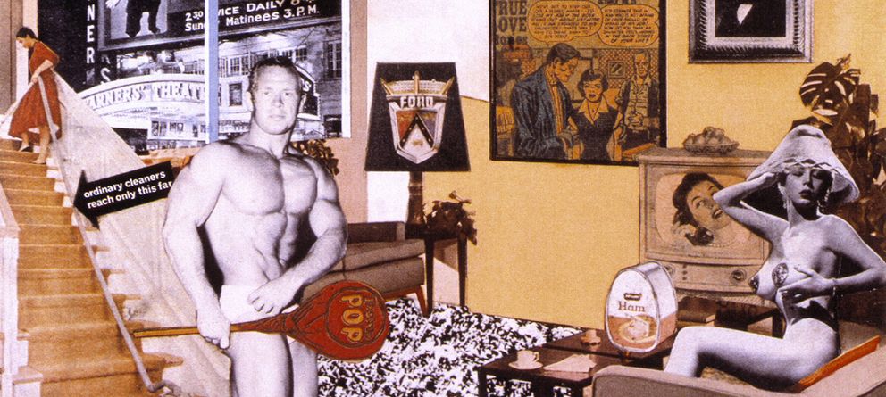
Richard Hamilton, a member of the Independent Group, presented in 1956, in the exhibition "This is tomorrow" of the Whitechapel, his fundamental work: What makes today's homes so different, so attractive. In it we see an athlete cut out of a bodybuilding magazine and a stripper, and the first carries in one hand a lollipop with the word Pop.
This work inspired many of the ideas that would govern the movement and summarizes its characteristics: a mixture of fascination and irony for the symbols of American opulence; it is a collage, a typically pop technique and its composition are sophisticated, full of allusions, in contrast with the banality of the subject treated.
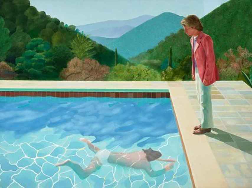
David Hockney was educated at the Royal College of Art and initially adopted a faux-naif style taken from press cartoons and children's drawings of careful irony. Author of engravings such as those in the series The Feats of the Libertine, on the American Dream, his painting gradually became drier and closer to realism: some of his Californian landscapes evoke Hopper.
A stylistic debtor of R.B. Kitaj, he sought to create an understandable visual language in the context of a new figuration. His approach is not illusionist and his figures are abbreviated pictorial signs. His pleasure in telling stories stands out.
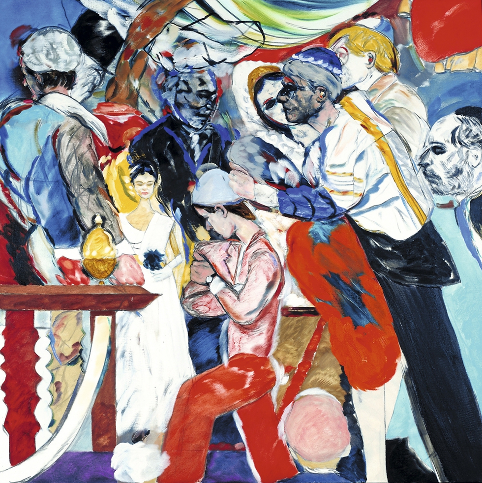
Kitaj, for his part, was the author of a complex and hermetic work that evokes Ezra Pound's literature. It included dense patterns of eclectic images that demanded an intellectual attitude from the public. Good draftsman and dry colorist, his production was almost always graphic and literary.
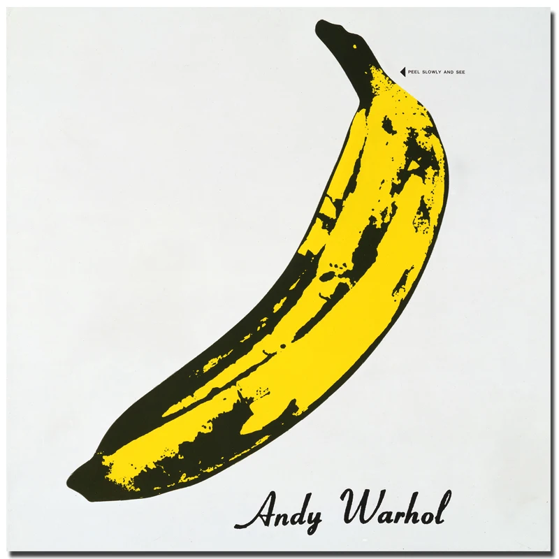
Warhol painted, filmed films and sought a notoriety close to that of celebrities. He declared that he wanted to be a machine capable of making industrial products instead of paints.
His pictorial language is nourished by common places and impersonal machine-produced objects of the 1960s. He used the strength and visual vitality of advertising, which pays more attention to packaging than to content and accepted popular customs and heroes without judging them. By assuming their inevitability, he makes them easier to handle than if he were to oppose them.
Other times he seeks to anesthetize our reaction to what he teaches us because it includes morbid associations: Jackie after Kennedy's assassination, Marilyn after her suicide, accidents, snapshots of criminals... He repeated images in photographic enlargements that he serigraphed on canvas modifying them only with layers of synthetic color. Repetition and color are his keys.
Roy Lichtenstein began working with comic strips in which he reproduced meticulously to the dots. He said that his work was different from the initial strips in that each brand is in a different place. For him, the act of looking is based on a way of constructing a unified pattern of vision, so he sought to induce us to question our (artistic) scale of values.
Like him, Rosenquist accepted the limitations of the flat surface and was largely formalistic. His fragments of billboard images are mixed with abstract effects.
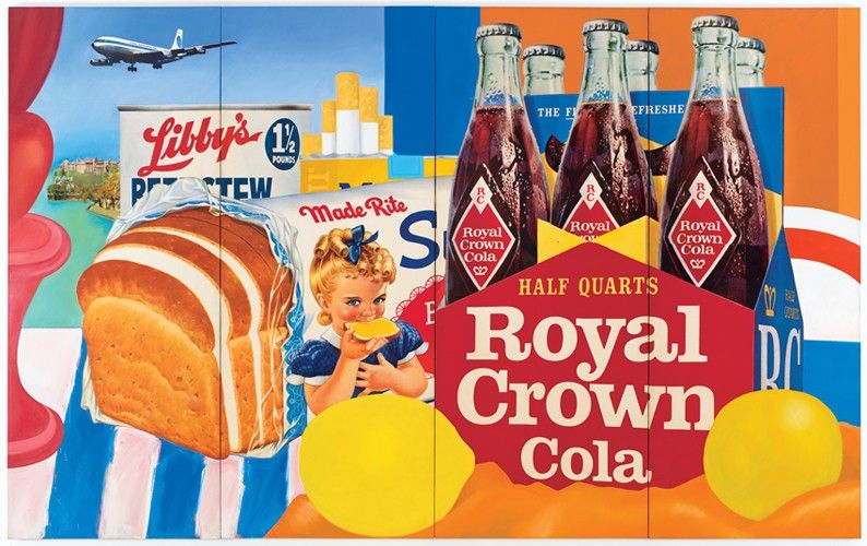
Tom Wesselman's nudes became flat, arbitrary silhouettes from which all human presence disappears. He demonstrates that Pop, despite being a figurative movement, does not use the image observed first hand, but processes it.
Kienholz approached the trend of Funk Art for its search for the sickly, ragged, vulgar, vicious and sexual, as opposed to the somewhat impersonal purity of much contemporary art. That current was more than a passing fad and created some of the most alarming images of 1960s art.
Thank you for reading
If you liked reading this article, feel free to FOLLOW ME, UPVOTE and RESTEEM! It's always appreciated =D. Thank you all for your support and see you soon for the news flamingirl's adventures!






Best art
Posted using Partiko Android
Yes! =D