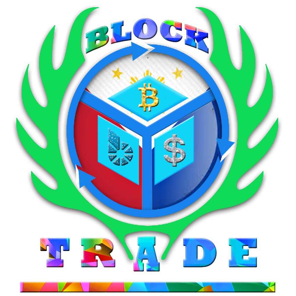
10 Basic Steps Logo Editing
Good Day steemit users and members,
I may not be the best person to share this, but I will try my best to share a little of something about how did I start and how did I come up with this design. I created the design when I found out that Block Trade was having a competition with regards to Black Trade Logo. Since the competition is over, I would like to share this to you guys. This is my first post on steemit. I hope you like it. :)
Block Trade
What is a 'Block Trade'?
Based on my research, a block trade is also known as a block order, is an order or trade submitted for the sale or purchase of a large quantity of securities. A block trade involves a significantly large number of equities or bonds being traded at an arranged price between two parties, sometimes outside of the open markets, to lessen the impact on the security price. In general, 10,000 shares of stock, not including penny stocks, or $200,000 worth of bonds are considered a block trade.
Recently I have read a blog/post in steemit.com and it said that Block Trade is looking for its logo. Block trade used steemit to achieve their goal and in behalf of steemit members we are thankful that they used this medium for us to showcase our unique ability and talent in designing and creating the said “Block Trade Logo”.
I may not be that good at designing and creating a logo, but since I know a little about Photoshop editing… I will try to invest my skills and the best of my effort to produce simple output of the said logo.
The Creation
The design of this Block Trade Logo was my very own imagination and in order to achieve that goal, I generated 10 steps to finish the desired logo
- I started a polygon with 6 sides in order to create a cube that came out through my mind because the cube illustrates the block from the name of the logo itself.
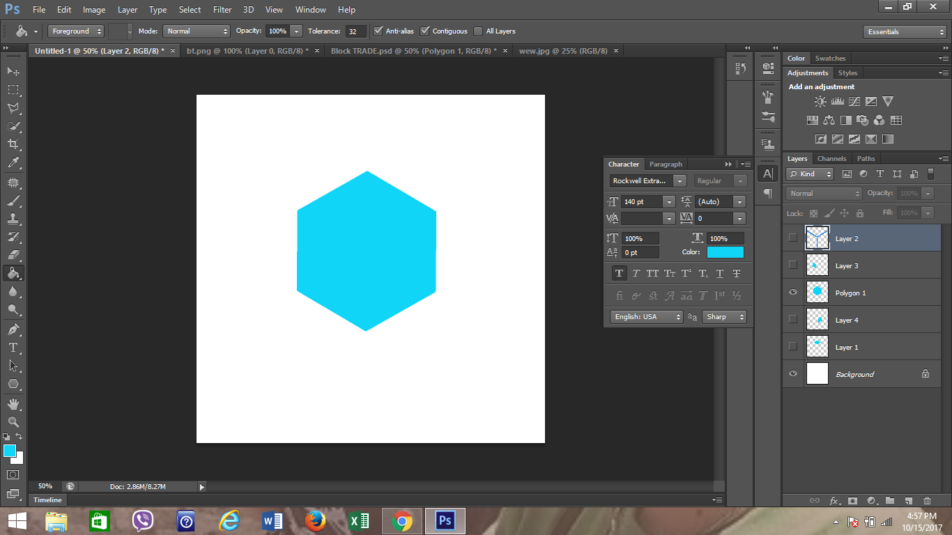
- In order to make it realistic and 3-dimentional, I broke the polygon with 6 sides into 3 pieces and place them few millimeters apart.
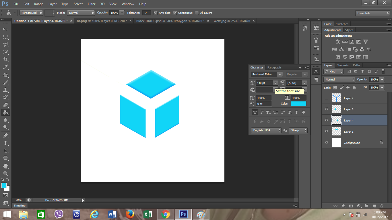
- I created a Y-shaped object to separate the partitions apart because every part will have its corresponding symbol that represents the exchange/trade.
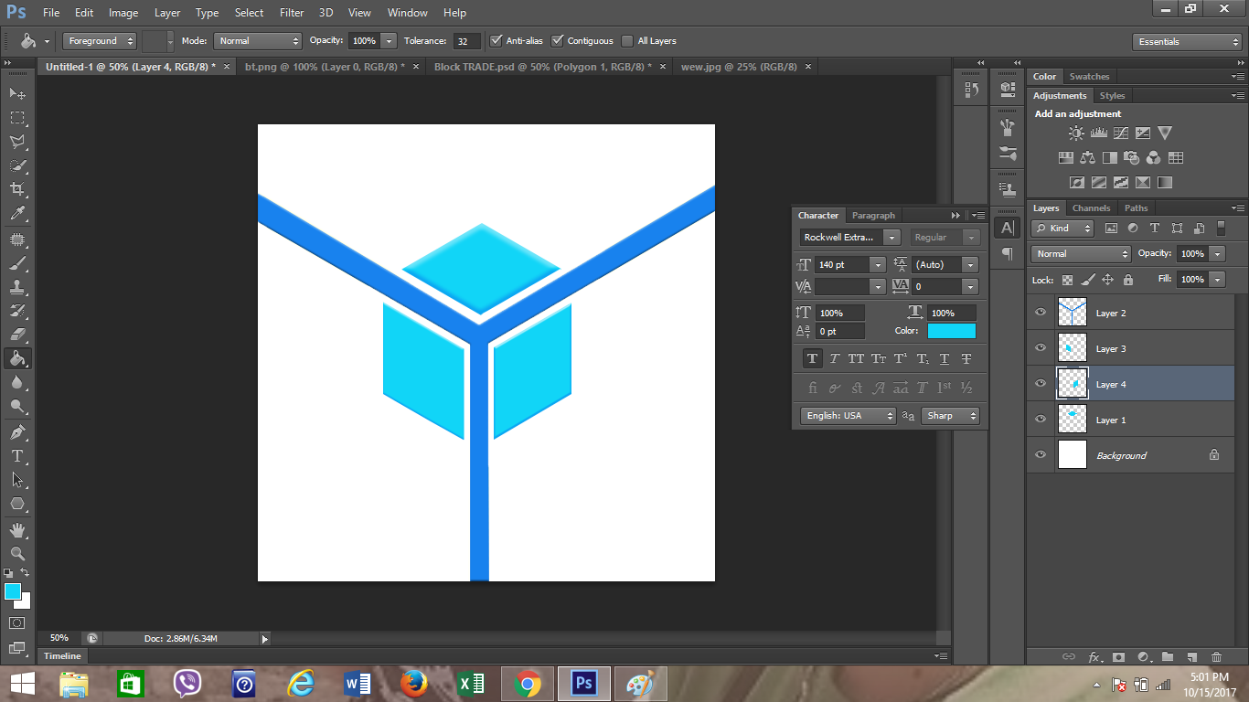
- I did copy the first part of the logo which is to be placed at the center.
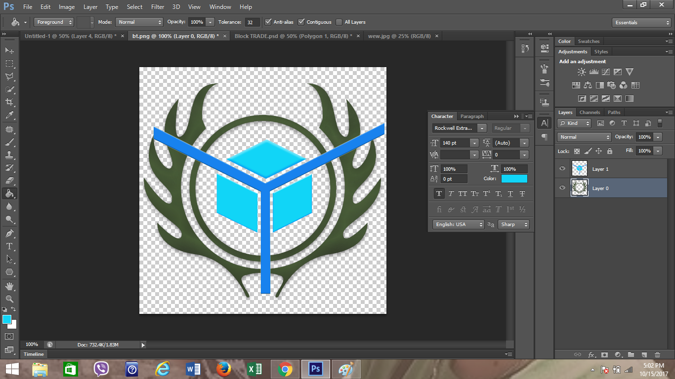
- Resizing the image of the first part in order to fit perfectly at the center and erase all unnecessary parts.
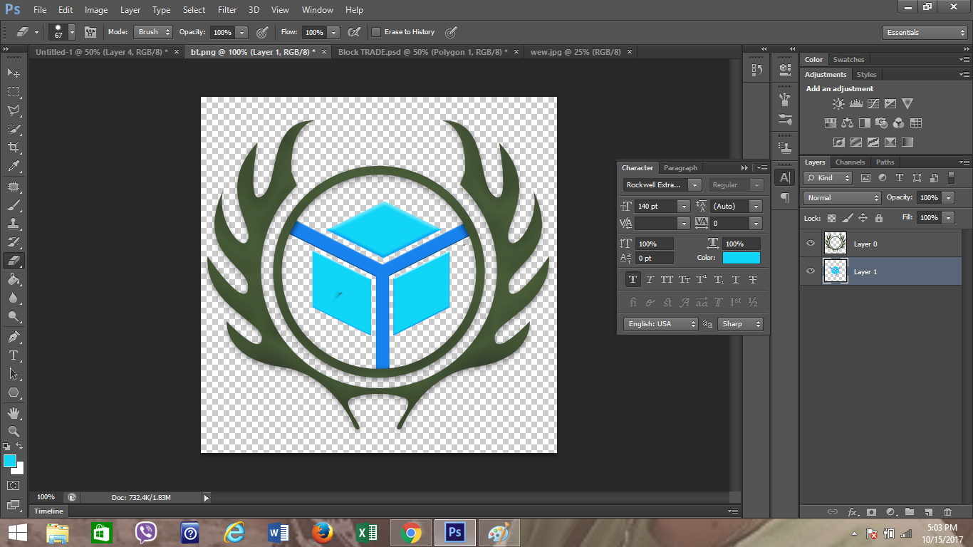
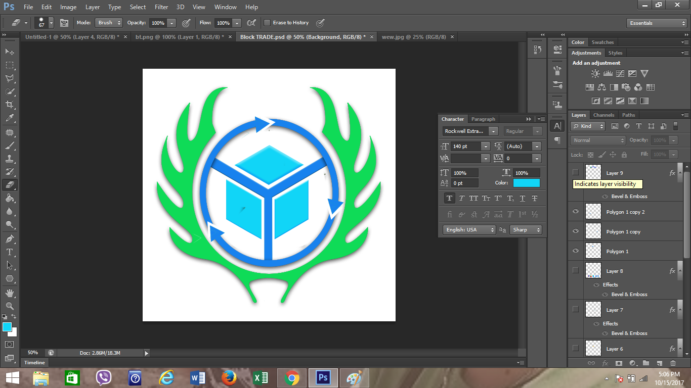
- I did create some changes and modification in order to balance the color and the lightness. As you can see, there is an arrow circling around the cube because it illustrates the circulation and exchange in value coming in and out of the Block Trade by means of investing and the withdrawal terms.
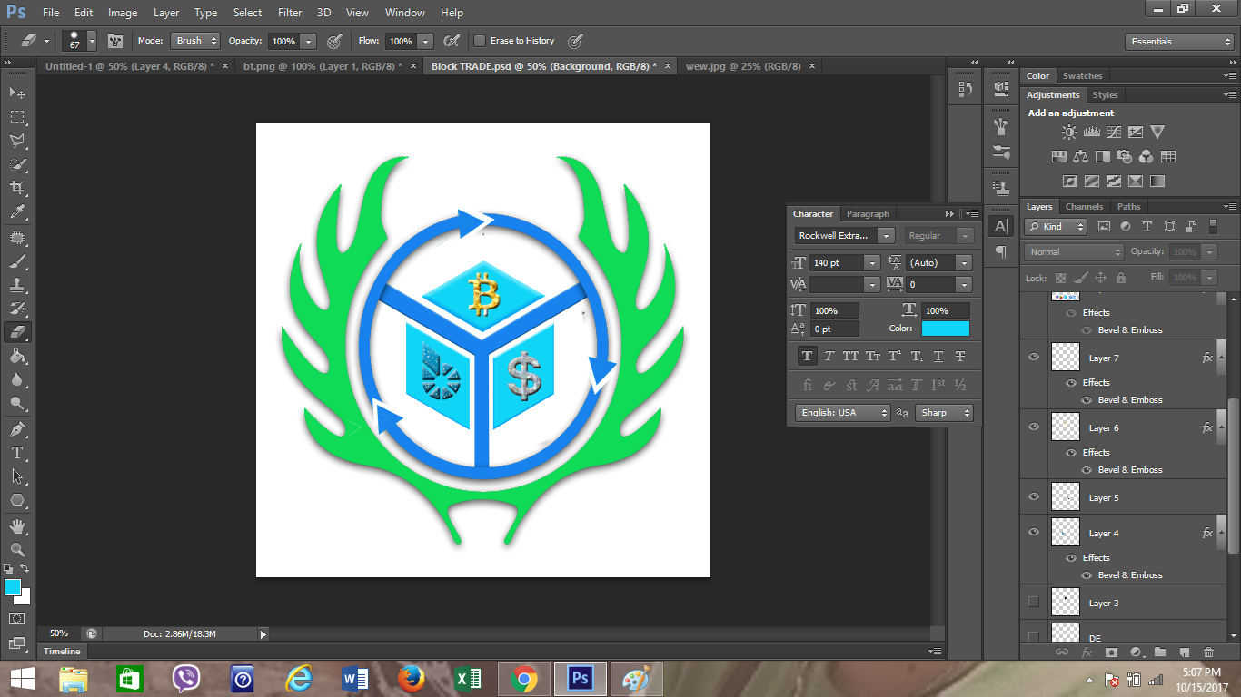
- I placed the bitcoin, bitshare and dollar symbol at the center of each partition because the services with the desired logo centralized the three exchange rate or value.
- I put the first word which is “BLOCK” at the top most and the “TRADE” at the bottom to create an impression in a simplified way.
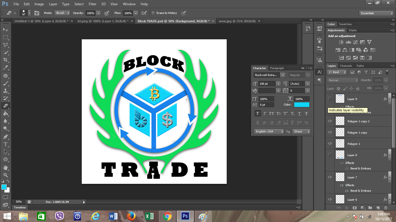
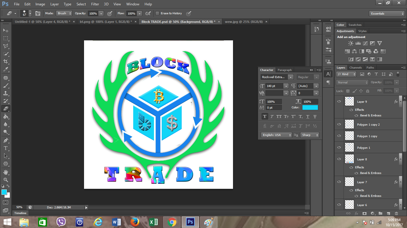
- I enhanced the outer layer of the text in order to have variation in colors.
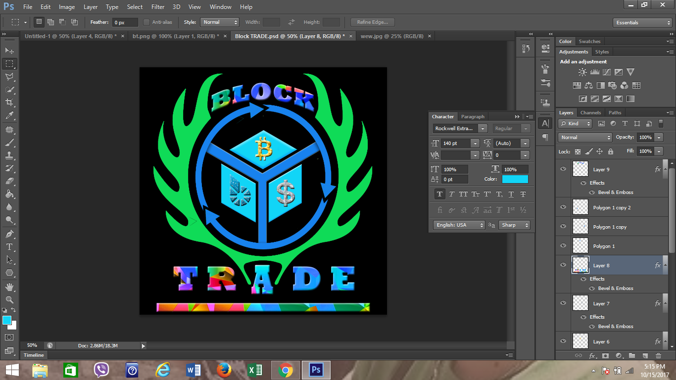
- Lastly, I changed the background color into black so that it will give emphasis to the lighter color which refers to the logo.
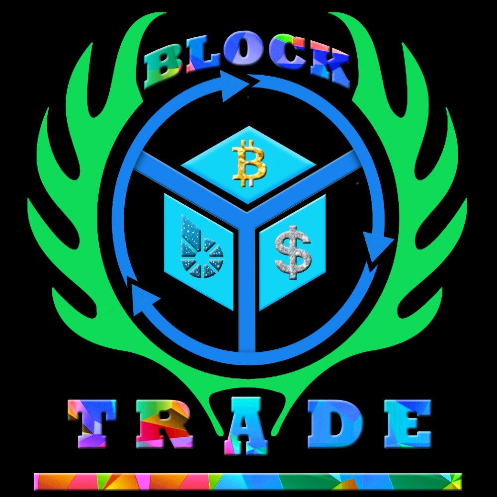
The BLACK TRADE Logo
The design of the Block Trade logo was being simplified in order to give emphasis and highlight to its main objective. It shows the trust that binds the cube including the circulation of money by means of bitcoin, dollar and also including bitshare. The logo itself illustrates the type of protection or how your money is protected when you are inside or when you are already an affiliate of the Block Trade. The circulation of arrow inscribed on that logo represents the security of services and processes inside the network. That is how the Black Trade Logo was made.
Since I am a Filipino, I also created a BLOCK TRADE PH logo with a Philippine Flag inscribed in a circle.
