Portrait
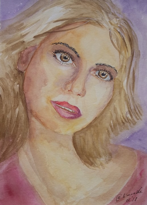
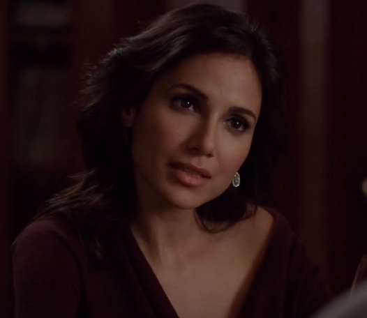
Main idea about the portrait is to make it similar to original. That's why I post a screenshot of reference to be able to compare and see what can be done better. I took it from a movie, and the actress is not so popular.
What I like about it - yellow shadow of evening light, color of skin in shadow, flecks on hair. And this time I managed to make eyes deeper.
What I do not like... I won't write here. There's a long way ahead, and I need some experiments.


upvote for me please? https://steemit.com/news/@bible.com/6h36cq