The importance of using a grid for logos
What is a grid?
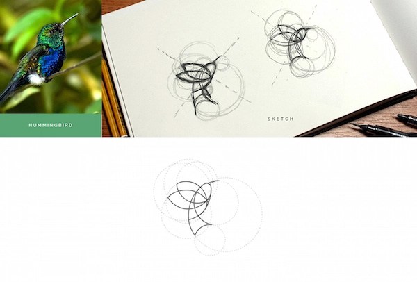
A grid is a tool widely used in the construction of logos that gives the ease of creating shapes with geometric harmony and helps to justify in a mathematical way in the blank space the construction of the logo. Usually, the grids are square with horizontal and vertical lines; similar to the squared notebooks, but not all the grids are the same and there is a range of them, even there are designers that create a unique grid for each project.
Some types of grids.
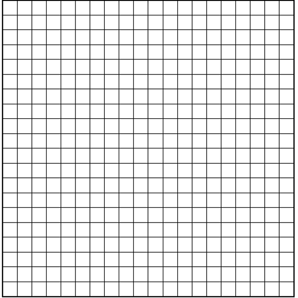
Primary grid: it is the one that contains only horizontal and vertical lines:
The secondary grid: divide the primary squares in half, keep in mind that the smaller the squares the better the details of the logo:
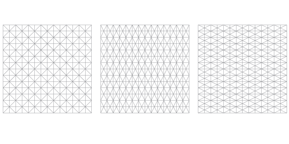 Adds diagonal lines to the previous fragmented reticles plus space. It is possible to have lines at 45º, lines at 60º and lines at 30º or commonly called isometric grid.
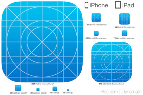
- The constructive grid of ios:
 Font
Font
What do the grids contribute to the design of logos?
Primary grid: it is the one that contains only horizontal and vertical lines:

The secondary grid: divide the primary squares in half, keep in mind that the smaller the squares the better the details of the logo:
 Adds diagonal lines to the previous fragmented reticles plus space. It is possible to have lines at 45º, lines at 60º and lines at 30º or commonly called isometric grid.
The use of grids helps the organization of the elements, the concentration, and planning of a logo, it also gives the possibility to create harmony easily and polish or perfect small and large errors of the design that is being made. The grids as I mentioned is a great way to justify what has been done and to show the creation process to a client. This gives the impression of professionalism. And in this way, you show him that things do not come out of anything, and that creation takes its methodology.
Clearly, not all logos are created through a grid and there are logos that do not have or need, the use of a grid depends on one hundred percent of the designer. And like many things in life, the grids have a negative aspect and that is that the excessive use of generic grids restricts creativity, since you are trapped in specific patterns and forms, this means that, instead of thinking about the best way to convey a message, think without realizing how to build a logo through a grid and at the same time meet the need.
this type of action involves creating logos that convey the same feeling and begin to have some similarity, for this kind of thing there are designers who turn the tables and create unique grids for each logo as mentioned at the beginning. @theaustrianguy @welcoming
 font
font
